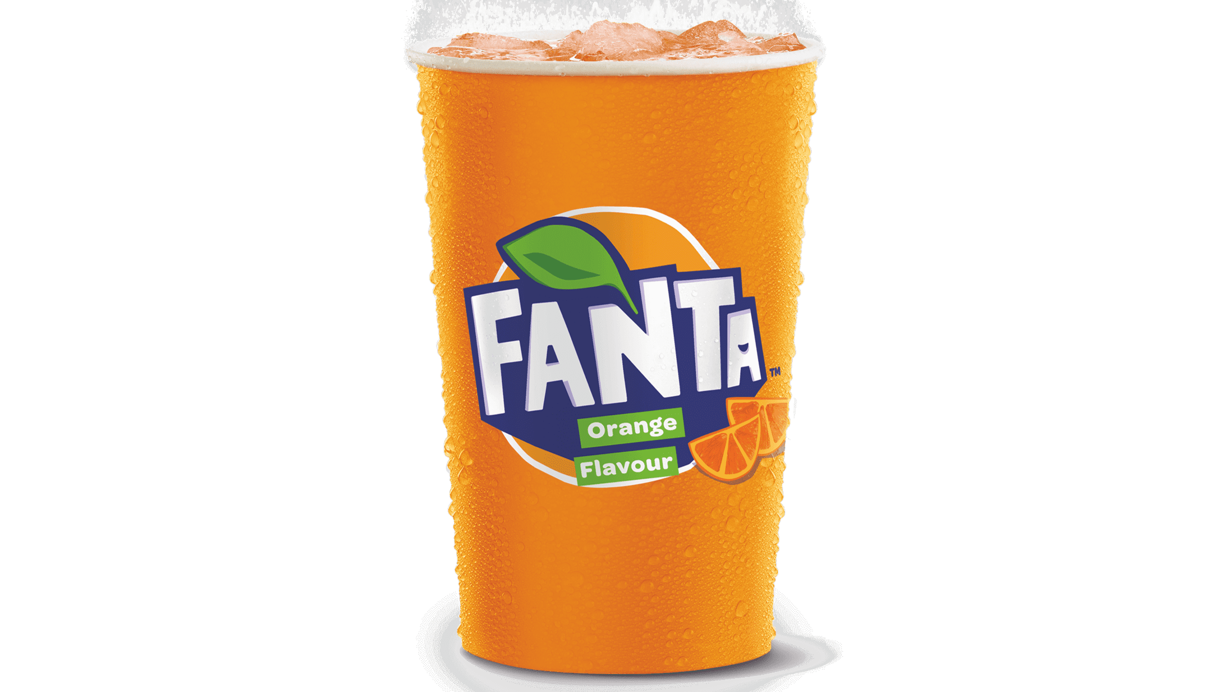
Fanta is a multi-flavored carbonated beverage developed by The Coca-Cola Company. This refreshing drink made its debut back in 1940 and has since become a popular choice among soda likers. The beverage’s main taste is orange, but there are many more.
Meaning and History
![]()
It was a creative response to the challenging times, offering a delicious alternative that captivated taste buds with its unique flavors.
It was created of sugar beet, whey, and apple pomace. The title reflected the approach that the Coca-Cola Deutschland top manager at the time used to inspire his workers- ‘use the creativity’ (Fantasie in German)
It has consistently adapted to changing consumer preferences and emerging trends in the beverage industry, ensuring its continued relevance and popularity among a diverse audience. New flavors appeared: orange, berry, grape, pineapple, strawberry, and others.
Their logo has transformed to reflect the brand’s growth and adapt to contemporary design aesthetics. Each iteration of the Fanta logo tells a story, capturing the spirit of the times while maintaining the essence.
What is Fanta?
Fanta is a carbonated beverage, produced by Coca-Cola since 1940. Its main taste is orange, although its flavor range varies from apple and various berries to mango and the one called ‘Exotic’.
1940 – 1962
![]()
The initial introduction of the brand showcased a Gothic-inspired font for the Fanta logo. The lowercase characters, in complete black, deviated slightly from the vision of a vibrant and sweet soft drink.
1962 – 1970
![]()
In 1962, a transformation occurred, presenting a more colorful ambiance with a blue rectangular backdrop featuring a curved upper part. The typography shifted towards a more angular, yet whimsical and slightly cartoonish appearance. Furthermore, the color transitioned to white.
1970 – 1980
![]()
Further experimentation with fonts occurred. The letters adopted a softer, somewhat childlike appearance. This time, however, they were rendered in black, and three orange dots stood atop the right bar of the character ‘N’.
1980 – 1995
![]()
The logo of 1980 incorporated many letterforms from the 1955 design, except for the ‘F,’ borrowed from the 1972 version. Blue was chosen as the primary hue, while the orange dots at the top were intensified with enhanced saturation and complemented by a brand-new green leaf.
1995 – 1997
![]()
In the 1995 iteration, the image stayed largely unchanged but got a bit lighter hue. Notably, the ‘orange’ image above the lettering, was changed. It was composed of two color strokes: a wide orange stroke alongside a narrow green stroke.
1997 – 2008
![]()
In 1997, they approved an additional logo: the caption design from before was styled as a painted logo with sharper tips.
1997 – 2004
![]()
During the early years of the 21st century, Fanta used a symbol built on its former variant. The text kept its distinctive appearance and hues but received a white contour. The leaf went through a vertical redesign and found its new placement above the characters ‘T’ and ‘A’. The backdrop embraced more consistent orange elements with blurred gradient swirls in a similar color code creating a vibrant visual effect.
2000 – 2004
![]()
The subsequent iteration retained the core elements but adopted digitization, resulting in a logo with amplified visual elements. The orange backdrop, in particular, transformed into a quadrangle image resembling a vivid juice representation.
2004 – 2008
![]()
The logo no longer has a bright, vivid, orange background. The designers used a font similar to the one featured in the previous logo. The inscription was printed as if it was going into the horizon. The blue color enhanced the brand recognition. The logo also had a green leaf, which is characteristic of Fanta logos. The name of the company was the center of the emblem just like in many of the other logos.
2008 – 2010
![]()
It was not long before the company brought back the orange. The fruit in the background now had a perfect round shape, while the leaf was done in two shades of green and had no blue in it. The inscription had the same style as earlier, although the letters were redrawn. The inscription was done in dark blue with a white outline. The logo instantly attracted attention and arose positive emotions. Orange radiates happiness and energy. It also reflects enthusiasm, success, and determination.
2008 – 2016
![]()
The logo components were darkened, and the rotation degree decreased. The letterforms adopted a more bloated and inflated appearance, while the leaf was drawn with two contrasting shades of green.
2010 – 2016
![]()
The letters received a white contour, and a large orange circle was set behind the primary elements in the 2010 symbol.
2016 – today
![]()
A new typography style emerged in 2016, drawing inspiration from the 1972 variant but adopting an angular and comic-like aesthetic. The letters were rendered white and decorated with a purple underscore, reminiscent of a downward-oriented triangle without a tip.
2017 – 2021
![]()
In 2017, the logotype changed as the large background shape disappeared. The fresh rendition showcased a white-contoured geometric text in all caps. It harmoniously rested on a bright orange circle with a green, blue-contoured leaf, which stood atop the right bar of the character ‘N’, adding a touch of playfulness.
2023 – today
![]()
Recently, Fanta introduced a minimalistic brand. The name was re-rendered as a white capitalized caption with thick, angular serif-free typography. The blue-contoured text was decorated by a solid blue shadow below the letterforms, reminiscent of a triangular shape from the 2016 design.
Color
The presence of the orange hue in nearly all variants of the Fanta badge can be attributed to its association with the fundamental ingredient of this “sunny” drink. However, with the 2023 reinvention, the chromatic palette was simplified to consist solely of blue and white tones.
Font
The primary Fanta badge showcases a bold title case name caption of a serif-free typeface with the title case characters of unequal length.