It is Budweiser’s flagship low-calorie alcoholic beverage. There are four ingredients in it. Yes, that’s it! All that goes into making Bud Light is hops, barley, water, and rice. Bud drinks are sold across the country as a more affordable beer. By the way, the Anheuser-Busch concern was the first in the world to indicate on a beer bottle not only the expiration date of the drink but also the time of its production. This increased sales of Bud beer as customers liked the company’s openness.
Meaning and History
![]()
Evidence suggests that Czech Budweiser beer dates back to 1531 when it was even served to King Frederick I. Still, the Americans aren’t giving up. As a result, the beer controversy has persisted for nearly a century and is not expected to end anytime soon. Bud beer in the American version was also originally called Budweiser. The brewery that produced it was founded 43 years earlier than the Czech enterprise, in 1852, by the son of a German brewer, Adolphus Busch, and his father-in-law, Eberhard Anheuser. It was named “Anheuser-Busch”. In 1876, the Anheuser-Busch company released that same controversial product, which quickly caught the taste of the American consumer. It has been known exclusively as Bud Light since late 1984.
What is Budlight?
Being the most consumed beer in the US, with 13.24 percent of the market, Bud Light has established itself as a pop culture icon, synonymous with relaxed drinking without feeling heavy. Despite being consumed widely across the nation, Bud Light is not without opponents.
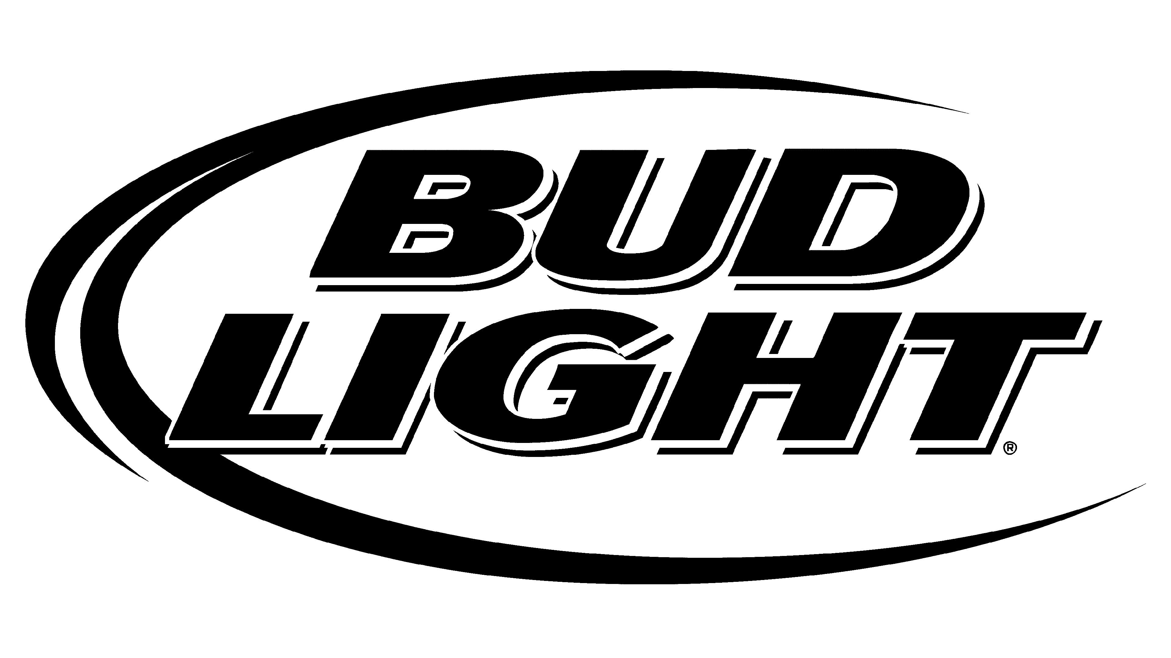
Budweiser Light
1982 – 1983
![]()
The logo is a classic representation of the Budweiser Light Beer, emphasizing its identity as a lighter version of the traditional Budweiser brew. It features a central, horizontally elongated oval encased within a double border, the outermost being a thin black line and the inner a thicker red one, suggesting a premium quality. Inside the oval, the word “Budweiser” is written in bold, serif, blue font arched along the top. Below it, the word “LIGHT” is given prominence in larger, capital letters, also in blue, which is spread across the width of the oval, emphasizing the product’s lighter quality. Underneath “LIGHT,” the word “BEER” appears in smaller blue font, directly informing the viewer of the product category. At the very top, within the upper segment of the oval and above the brand name, is a stylized Anheuser-Busch A&Eagle emblem in red, serving as the company’s trademark symbol. The entire design is stark and straightforward, reflecting the brand’s longstanding heritage while also appealing to contemporary tastes with its clean lines and bold color contrast.
1983 – 1984
![]()
A bold, simple logo was presented in 1982. The name was printed in two lines, which had the same width. This meant that the second line featured significantly larger characters. At the same time, the logo had a balanced appearance. The red frame with rounded corners added a touch of confidence. It would be hard for this logo to get lost.
Bud Light
1984 – 1990
![]()
First of all, this logo marked a new era in the brand’s history. Although the concept remained the same and even the font was preserved, this version looks very different. Since the name was shortened, both lines have the same size of characters. There is no more powerful red and the blue is not as dark. When the two logos stand next to each other, this version looks faded. Alone, though, it is a nice, minimalistic logo.
1990 – 2008
![]()
The shape of the logo is now oval with a frame that has a three-dimensional appearance and fades towards the right side. The designers used a very similar bold, sans-serif font, which enhanced recognition. The red color was brought back and used as a shadow line, adding some volume to the characters. The latter were italicized and featured an even lighter shade, but thanks to the red accent, the inscription stood out against the white background. There was also a version where the blue and white colors were inversed, making it stand out on a light background.
2008 – 2013
![]()
The font was changed again, although not drastically. However, there was no red shadow, which created a simpler and cleaner look. The oval frame was faded even more on the right and appeared flat here. This version first appeared on the Two and a Half Men show as part of the ad campaign.
2013 – 2016
![]()
The new design features more complex and advanced design techniques. The oval frame, which now looks more like a moon shape has a metallic finish and an extra red line. The inscription is now done in white using a different font and features a shadow that gives it an appearance of volume. The most noticeable and striking element of this logo is the blue gradient as well as the water drops at the bottom. The latter looked especially realistic, making one desire to try the drink and quench the thirst.
2016 – Today
![]()
In 2016, the company brought back a minimalistic logo. It featured the same font that was used in the 1990 logo, but the letters were printed straight. The inscription was done in a familiar shade of blue, while the rectangular frame with rounded corners had a lighter shade of blue. It was a perfect way to reflect the long history of the brand. Although the logo was presented to the public in 2015, it was officially launched during Super Bowl 50, making it a perfect timing for attracting more attention to the brand.
Font and Color
Different shades of blue with a white background were used by the brand for the logo throughout history. Blue is seen as a sign of stability, confidence, and reliability. It’s calming and soothing and symbolizes the positive. It might also be hinting that the brand is oriented toward blue-collar workers.
All the Bud Light logos feature clean, bold lines, creating an image of a confident company. The latest logo uses a bold, sans-serif font called Universe Next with straight, clean lines. It was created by Mr. Adrian Frutiger and released by Linotype Design Studio in 2010.