Nike Logo
Tags: sports shoes | sportswear | USA
The Nike brand does not need an introduction. It was not always like that. Knight’s first investment in his firm was $500 and the trunk of his truck served as a first place for the retail sale of shoes. Although its shoes were specifically made for athletes, which was a relatively empty niche at the time, it was Michael Jordan who helped the new brand to grow. The only serious competitor for Nike’s own product was Adidas, but it was too expensive for the average buyer.
Meaning and History
In 1964, Phil Knight, a professional runner, decided to start a company with his athletic coach, Bill Bowerman. “Blue Ribbon Sports”, though, was only a distributor of Japanese footwear manufacturer Onitsuka Tiger. By 1970, the company already had several outlets. In 1971, the founders developed and released their own model of sports shoes. In 1978, the company officially becomes Nike, Inc. This name, coined by Jeff Johnson, the first Nike full-time employee, was short and easy to remember. It is the name of the Greek goddess of victory. This association obviously had a really positive impact on aspiring athletes and the brand’s ability to succeed in the competitive market.
What is Nike?
Nike produces sportswear, footwear, and accessories, develops applications for mobile devices, and also organizes training in major cities around the world. The slogan of the brand was accidentally invented by Knight himself. He hung up the phone after listening to a version he didn’t like and said “Just do it!”.How much is the Nike logo worth?
The logo of this brand is recognized by almost everyone. Accordingly, the worth of the symbol has risen tremendously. Although it is hard to attach a specific number to it, the brand evaluates it at over $35 billion.
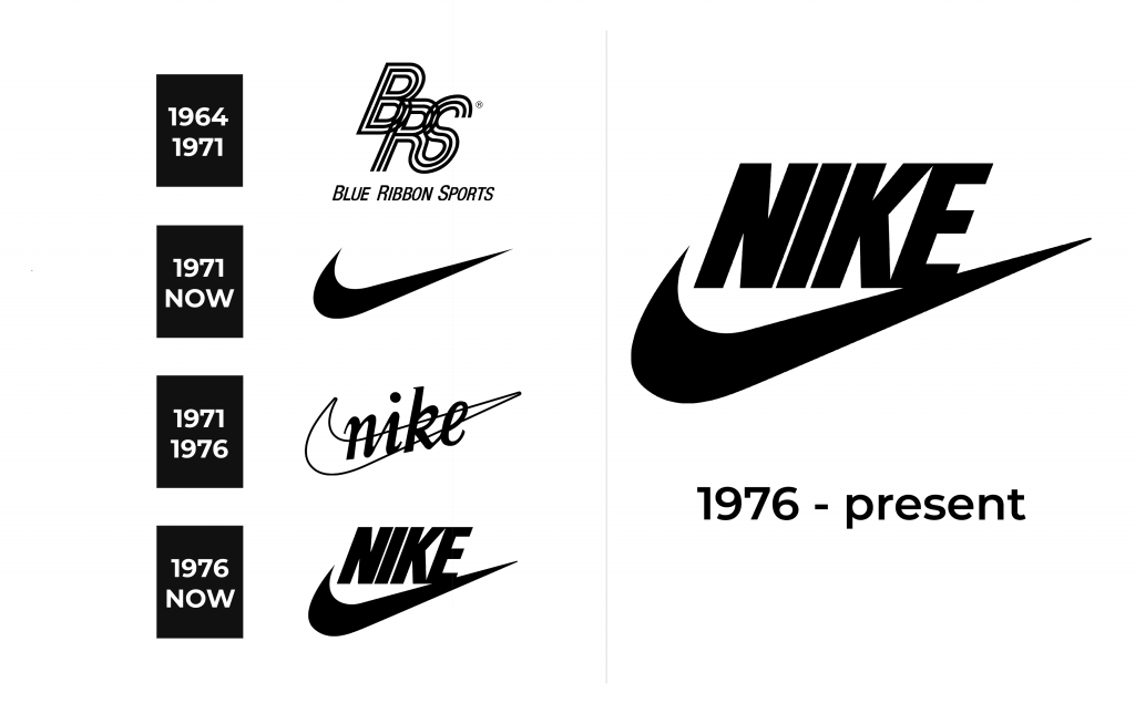
1964 – 1971
The initials of the company formed an intricate design with all the letters overlapping and being placed at different heights. The “R” and “S” were joined at the bottom. Each letter was drawn using three black lines with white space of the same width in between. The monogram was accompanied by the full name printed underneath. It featured all uppercase, italicized, sans-serif letters. The first letter in each word, though, was slightly higher than all the others. The black color added a classic, professional touch to the logo.
1971 – Today
Although the world first saw the famous check mark with pointy ends or the “Swoosh” symbol in 1971, it all started two years earlier. Back then, Phil Knight asked a graphic design student at Portland State University to draw an emblem for new sneakers. It did not meet his expectations, so Phil paid Carolyn Davidson just 35 dollars for it. The founders made up for this by presenting her with over half a million dollars in shares 10 years later. This was probably the best investment one could make, although such a simple design would be worth nothing if the founders did not make successful business decisions and great products. This emblem was first used on soccer boots.
1971 – 1976, 2022 – Today
There was another version, which was replaced by a new logo in 1976 but brought back in 2022. The check mark was done in white with a thin black outline. The “Nike” inscription featured a cursive typeface with all the letters being lowercase. It was placed on a slight diagonal, following the line of the symbol behind it.
1976 – Today
In 1976, the alternative version was redrawn. The changes were mainly done in the name, which was now placed above the symbol. The letters looked bold and powerful thanks to thick, straight lines and sharp terminals and ascenders. The whole emblem was done in black.
Font and Color
The first logo featured a classic black and simple, sans-serif, italicized font. Originally, the famous logo introduced in 1971 was done in a red and white color palette, which meant to reflect not only the brand’s passion for what it was doing but also the strength and energy of those who wear its shoes. It was later replaced by black, which gave it a timeless, yet powerful appearance. The other 1971 version with the brand’s name also had a white color for simplicity and accent on the name. The latter was printed using a modified Times New Roman Italic font. The emblem presented in 1978 was done in classic black and featured italicized Futura Extra Bold Condensed font.


