Coca-Cola Logo
Tags: beverage | caffeinated drink | USA
Coca-Cola is the most popular and widespread of the American soft drinks, sold across the world by the eponymous Coca Cola Corporation. The dark brown drink is notable for its high concentration of sugar and caffeine, although various other Cola varieties are also notable. The drink was created in 1886 by one J. Pemberton as a medicinally beneficial beverage, helpful against fatigue and headaches.
Meaning and History
The name of the drink, Coca-Cola, derives from the names of the two main ingredients used in the drink’s production originally. These were the coca, a South American plant that contains cocaine (used in the drink, as well), and kola nuts, the African plant similar to cocoa and coffee that contains caffeine. Cocaine and caffeine were the two integral parts of the recipe, although the latter isn’t used anymore.
What is Coca-Cola?
Coca-Cola is the most popular American soft drink. It’s a carbonated caffeinated sugar beverage sold in several varieties throughout the world. It’s considered one of the most successful brands of drink in the world overall.
1886 – 1887
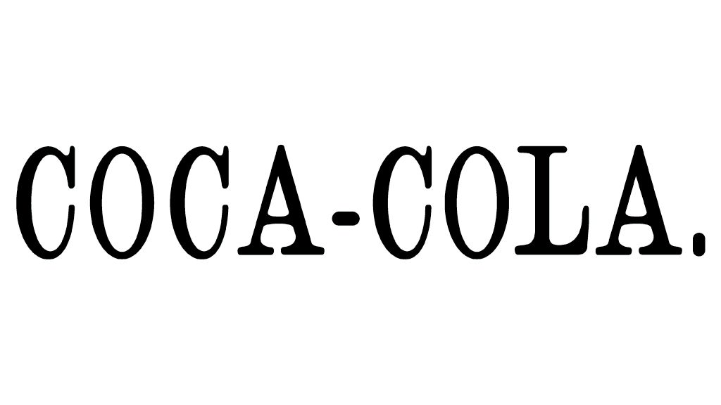
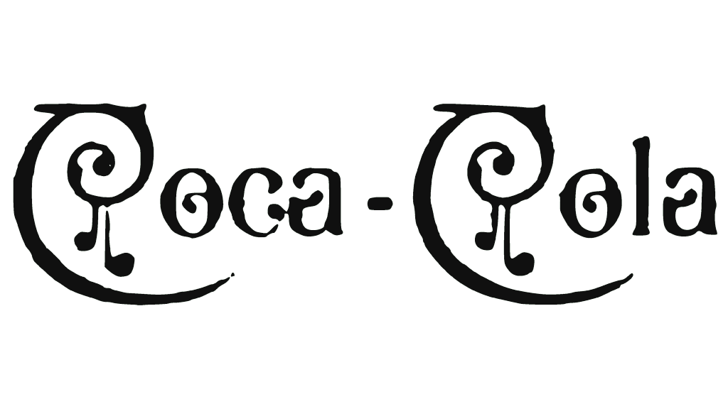
The first ever Cola logotype was a basic inscription of the brand’s name, written in a serif script that was commonly used for various purposes at the time. It consisted of call, capitalized letters with thin lines and sharp rips. In particular, the letters ‘C’ had fang-like tails, which were further modified in later logotypes.
1887 – 1890
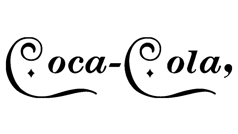
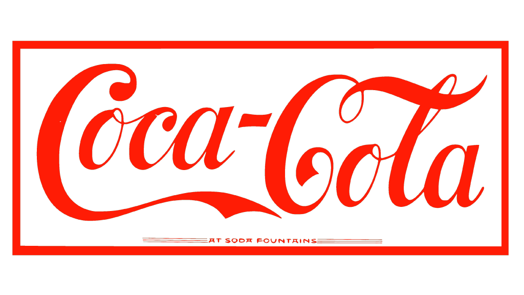
The next logotype saw the use of the first original Coca-Cola script. This one is very similar to the current style, but with plenty of unique features. It’s essentially a more grotesque, artistic variety with plenty of elements from the Victorian gothic typefaces (popular at the time).
It meant overly complex, twisting shapes. The letters overall had a handwritten resemblance, but with a many artistic additions, such as for the very first letter ‘C’. It was made particularly bold, and its tail was extended to the entire length of the word it belonged to.
1889 – 1892
An additional secondary logotype was introduced in 1889. It shared the same vaguely gothic elements, although the overall appearance became simpler and resembled a basic typographic sans-serif. It had rounded forms, and the first letters of each word were just two big twirls with elongated tails, like before.
1890 – 1891
The 1890 design was, by comparison, even more artistic. Loosely similar to the 1889 design, it had upright sans-serif letters with plenty of peculiar patterns all over the characters. In particular, the upper tips of the capital letters spiraled inwards and had what seems like note signs hanging down from them.
1891 – 1899
After a period of several experimental logotypes, Coca-Cola returned to the design very similar to the 1887 version (the second one). It’s almost identical to that attempt, except for several superficial alterations made to the word ‘Cola’.
1893 – 1901
The other alternative logotype arrived in 1893. It’s even become closer to the current design, although the changes to the previous variant are minimal. The letters became somewhat bolder, while the word ‘Cola’ was also rearranged. Its capital letter became bigger to fit the other characters in the line.
1899 – 1903
This one is another alternative design with minimal changes, in particular to the boldness of some letters and some small nuances in terms of their shape.
1903 – 1934
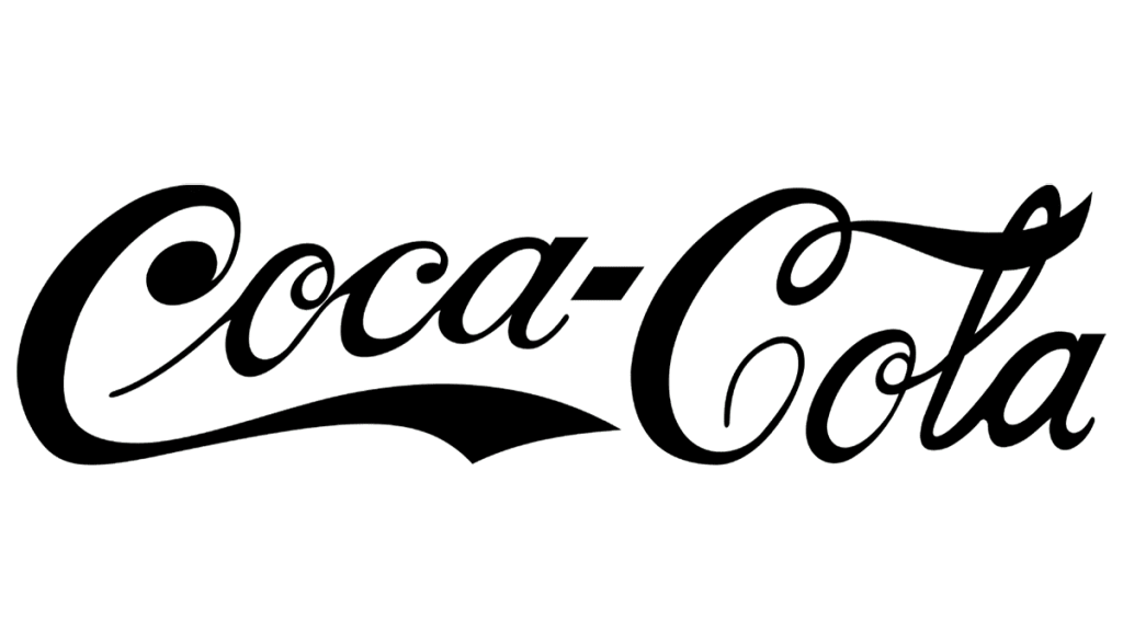
In 1903, Coca-Cola finally stabilized their logotype game and chose a single design for use in the coming decades. It came even closer to the current designs, in particular by enlarging the letters and making them bolder. The result was a much more condensed design than before.
1906 – 2012
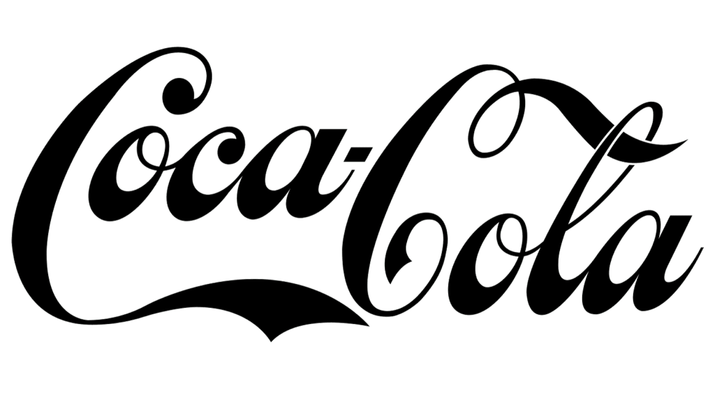
For a little over a century, the brand used this logo alongside other versions. It resembled the logo created back in 1891, mainly due to a more freely drawn first letter “C”, but was done in black and without a frame. Unlike most of the logos used by the company throughout history, the letters in this version had a thicker portion of the letters moved closer to the bottom rather than the side. Just like most logos created for the brand, this version looked elegant, stylish, and refined.
1934 – 1941
This next design is almost identical in appearance to the previous. The only major change is the choice of color. In 1934, Coca Cola finally adopted the bright red color as the one to represent their brand. The logotype – all black until that point – consequently became bright red in 1934.
1941 – today
The 1941 logotype saw a few more minor changes. That included several small rearrangements in terms of the form of the letters. The most visible change is the degree of boldness all these letters have – they became somewhat thinner. Moreover, a slight white outline now surrounded the letters, which is most visible in places where different letters meet.
1986 – 2009
The temporary alternative design in 1987 also didn’t have any particular differences compared to the previous variations. The letters became visible bolder again, making it very similar to the 1934 variant.
Font
The Coca-Cola iconic font derives from the 19th century artistic gothic scripts. They were pretty standards for brands back then, but now they are considered very retro. The Coca Cola Corporation intentionally stuck to this design to remind the customers that they are one of the oldest soft drink producers in America.
Color
Back in the day, Cola used black as the primary color in their logotypes. This later changed to red in the 30s – first for branding, and later for packaging. The color red was chosen to help differentiate barrels of Coca-Cola from alcohol back in the day, which helped during transportation.
