Bacardi is a renowned name for exceptional rum. It was developed by Don Facundo Bacardí Massó, a visionary entrepreneur, back in 1862. With a vision to create a distinct and refined rum, he set out on a journey that would forever change the spirits industry and spread this product worldwide.
Meaning and History
![]()
The history of Bacardi’s development and evolution is a testament to the brand’s commitment to quality and innovation. Over the years, Bacardi has grown from a small distillery in Santiago de Cuba to become a global phenomenon. Through strategic expansions, innovative production techniques, and a relentless pursuit of excellence, Bacardi has crafted a legacy that stands tall in the world of spirits.
The official logotype of Bacardi has witnessed subtle changes throughout its rich history. From delicate script fonts to bolder and more stylized typography, the Bacardi logo has adapted to reflect the brand’s identity and appeal to a changing consumer base. Exploring the Bacardi logo evolution allows us to appreciate the brand’s commitment to staying relevant while maintaining its timeless essence.
What is Bacardi?
Bacardi is a family-controlled producer of alcoholic beverages with a well-established reputation among enjoyers of spirits. Their most iconic product is an eponymous rum, but they also operate over 200 alcoholic brands. The manufacturing takes place in Cuba, and their headquarters are in Hamilton, Bermudas.
1862 – 1890
![]()
In its early beginnings, the emblem of the distillery bore a resemblance to a crimson stamp, delicately outlined in black. A monochromatic depiction of a bat found its place on the logo, symbolizing the brand’s unique identity. The selection of these creatures as a symbol stemmed from their presence within Bacardi’s premises, which had once been inhabited by them.
1890 – 1900
![]()
The subsequent logo exhibited a noticeable increase in attention to detail. The removal of the black frame allowed the fruit bat to assume a more lifelike form, capturing its essence with enhanced realism. The bat appeared plumper, adding a touch of joviality to its depiction. Positioned just below, the brand name “Bacardi” emerged in bold, yellow capital letters, cleverly aligned along the circumference of the circular composition.
1900 – 1931
![]()
In the year 1900, the decision was made to revisit the essence of the original logo concept, albeit with a few modifications. The dark frame surrounding the emblem was refined to possess a thinner profile, lending a touch of elegance to the overall design. The bat, while still embodying the familiar form, now exhibited subtle nuances that added depth and character. A noteworthy addition was the inclusion of the words “Marca de Fabrica” (meaning ‘Trademark’) in place of the brand name.
1931 – 1959
![]()
In the year 1931, a significant transformation took place, as Bacardi sought to breathe life into their animal mascot, rendering it with astonishing realism reminiscent of illustrations found within school textbooks. The accompanying text below remained unaltered, but they added the inscription “Ron Bacardi” (meaning ‘Bacardi Rum’) and placed it above the bat.
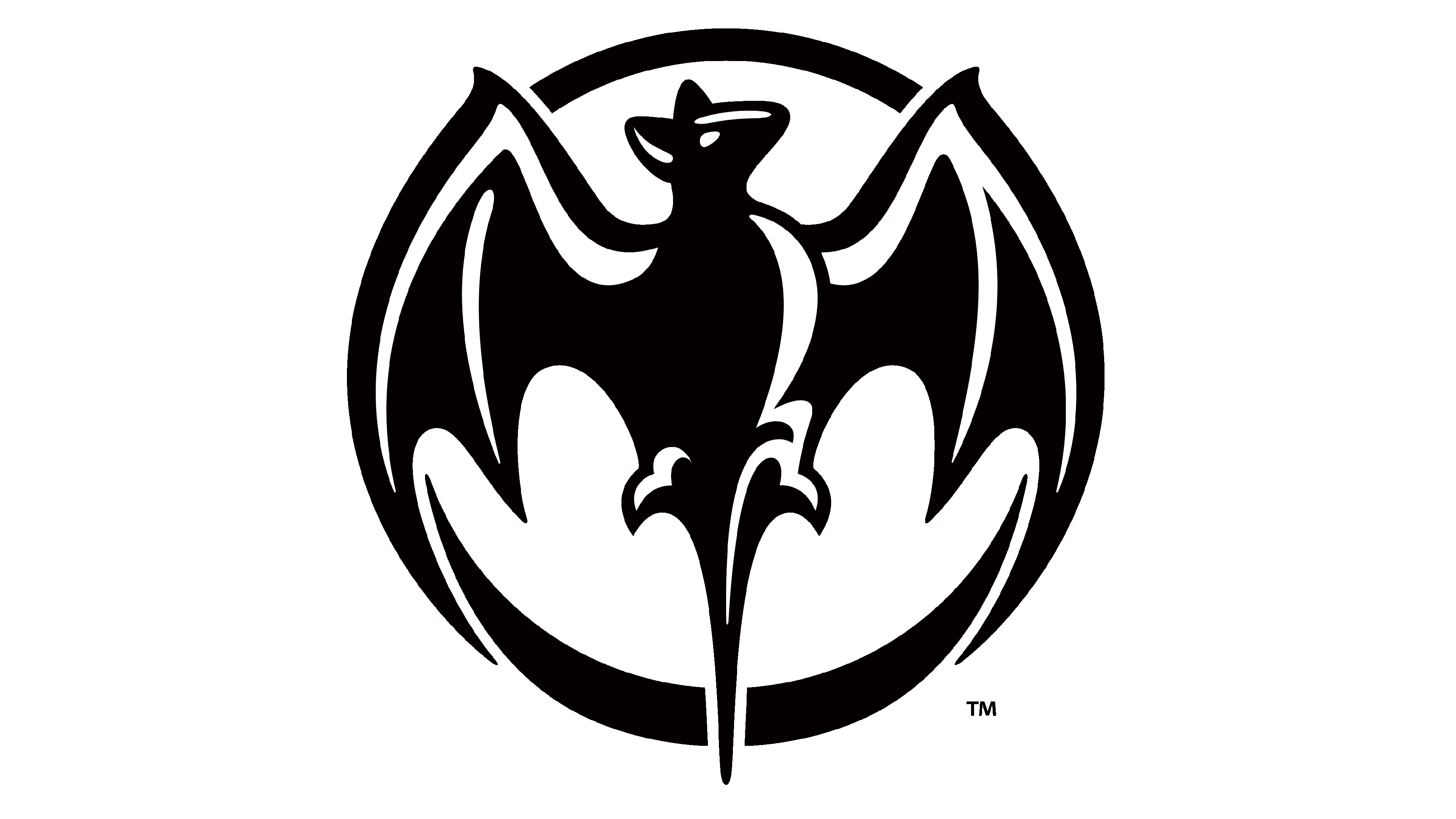
1959 – 2002
![]()
In 1959, Bacardi embarked on a path of simplification, resulting in a significant evolution of their logo. All written components were eliminated, making way for an expanded illustration that took center stage. The portrayal of the animal underwent a transformative shift, embracing a more minimalist and artistic approach
2002 – 2005
![]()
Throughout the 21st century, the core elements of Bacardi’s logo remained largely unchanged. However, a subtle modification was introduced in 2002. It was a slightly dark shade, delicately applied to the inner side of the golden ring that encircled the logo, infusing a touch of depth and dimension
2005 – 2010
![]()
In 2005 reinvention, Bacardi adopted a fresh approach to their logo, imbuing it with a sense of volume and depth. The logo’s surface came alive with varying brightness, creating an engaging visual experience. The bat, once more enlarged, took on a prominent role as its wings elegantly extended beyond the boundaries of the outer ring.
2010 – 2013
![]()
In 2010, the emblem was reworked again. The word “Bacardi” emerged in bold, black letters positioned directly below the bat emblem. This inclusion further solidified the brand’s identity within the logo, emphasizing its name with a confident and striking presence. The bat grew in size, particularly in the wing area.
2013 – today
![]()
In 2013, two significant changes reshaped the Bacardi logo. Firstly, the bottom text was enlarged, while concurrently, the emblem above was made smaller to create a visual balance. Additionally, the emblem itself changed its appearance.
The outer frame now featured a combination of white, black, and red, imparting a bold and striking presence. The bat received nuanced details, featured through shades of grey, adding depth and realism to its depiction. Furthermore, the words “Bacardi” and “Marca de Fabrica” returned.
Font
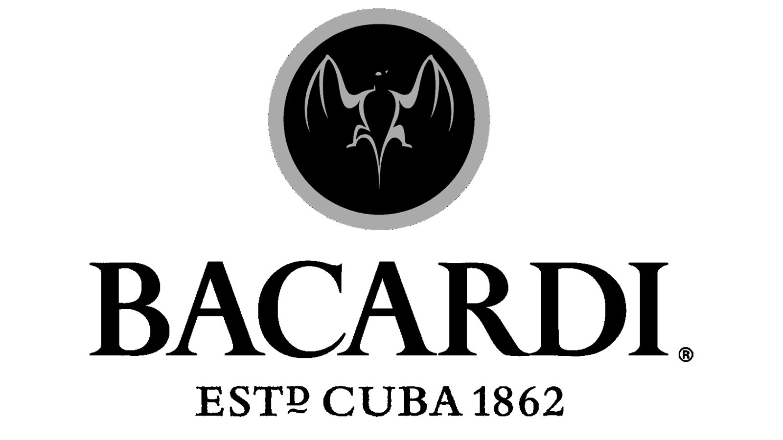
The nameplate is prominently displayed below the circular emblem. It was rendered in thick, title case characters with subtle curves that add some sophistication. Resembling the sleek Varvara Bold, this script was chosen to capture the Cuban heritage of the brand.
Color
The chromatic code of the logo has never been altered since 1862. It includes crimson red, accompanied by gray, black, and gold, which appeared in different periods.