Budweiser is an American brand of lager that’s been produced by Anheuser–Busch since 1876. It is a filtered lager, produced with 30% of rice plus hops and barley malt and sold in glass bottles and cans across the world. It is often mistaken as the European brand of Czech beer of the same name, and to avoid misconception, it can also be marketed as ‘Bud’.
Meaning and History
![]()
Budweiser was invented when its developer from America, Adolphus Busch, visited Europe in the 1870s to study the then-existing beer-making technologies and practices. He was particularly impressed by the success of pilsner beer, the main ingredient of which was the widely drunk Budweiser beer brewed in Budweis, modern Czech Republic. After the tour, Bush returned to the USA and started his own brand of lager, borrowing the Czech beer’s name.
What is Budweiser?
Budweiser, an American lager, has been produced by Anheuser-Busch since its inception in 1876. This filtered lager boasts a unique composition, featuring a blend of 30% rice, along with hops and barley malt. The product is sold worldwide, encased in both glass bottles and cans.
1876 – 1942
![]()
The inaugural logo reminded an instructional pamphlet, replete with numerous inscriptions and intricate elements that were visually captivating. However, the handcrafted text, while aesthetically pleasing, posed readability challenges.
The focal point was an elongated oval enclosed within a diamond, bearing three red letters “C”. Below, a rectangular business card showcases essential manufacturer information, adorned with a delicate floral motif.
1910 – 1945
![]()
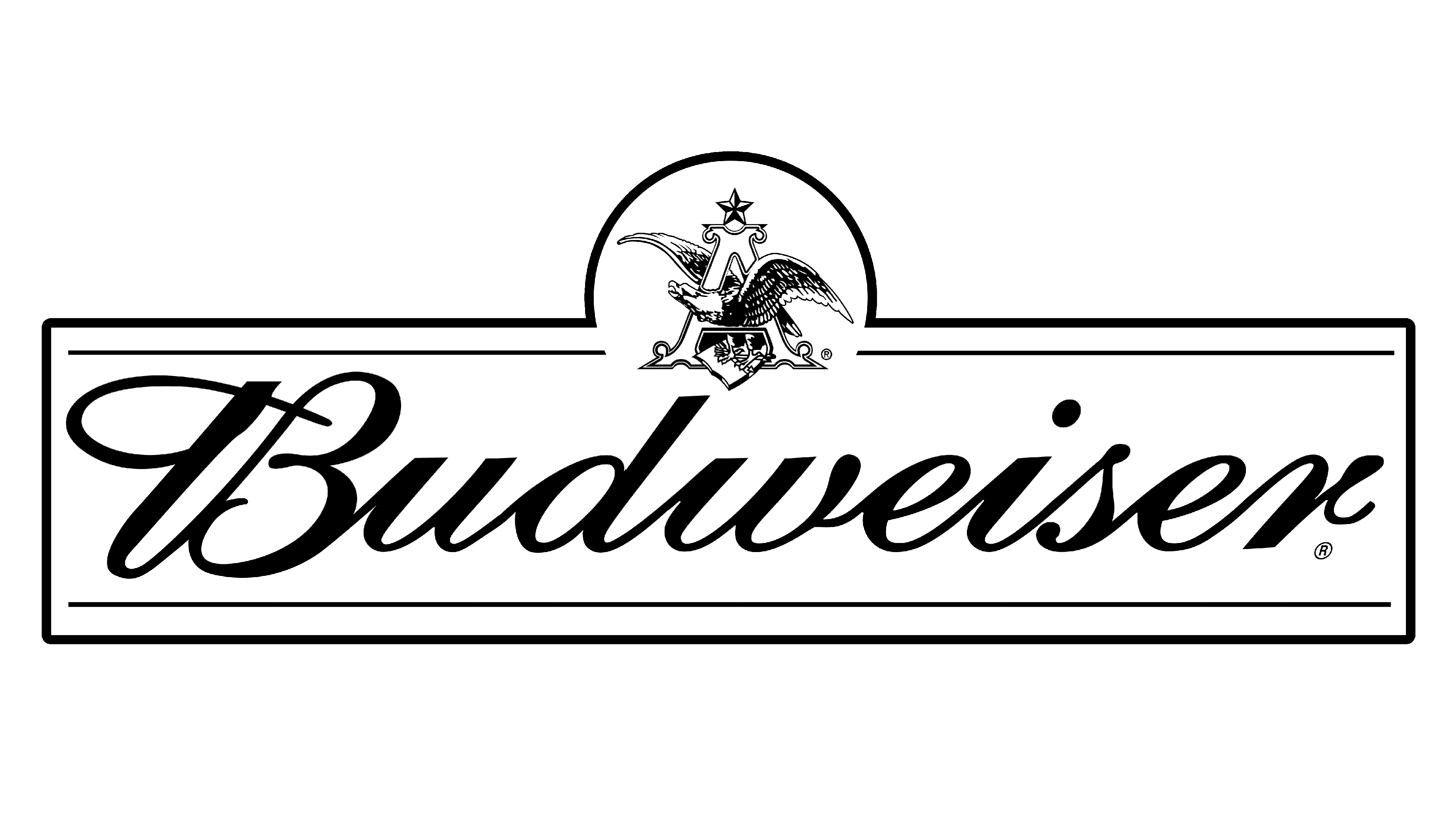
The following logotype presented a lot of product and manufacturer information. The italicized, handwritten text rested against a bright backdrop. Unlike the previous design, it didn’t have a frame, featuring only decorated corners at the bottom’s right and left. Prominent block letters of the words “Genuine” and “King of Beers,” balanced the text.
A graphical part was above, featuring a tape with pointed ends, a central circle, ears, leaves, wreaths, and the acronym “AB” for “Anheuser-Busch.” The backdrop adopted a vibrant red hue.
1945 – 1987
![]()
The brand designers then reshaped the rectangle, placing it vertically to reduce its similarity to a corporate card. Product and manufacturing info joined the text, written in five different scripts. The elements of the upper zone became more compact, though retained a familiar visual appearance. The corporate round emblem with ornaments and the “AB” abbreviation now commands clear attention.
1952 – 1957
![]()
In 1952, Budweiser introduced a triangle-shaped logo with rounded edges and a bold black outline. Within, the brand name and the motto “King of Beers” resided, accompanied by the Anheuser-Busch eagle within the letter “A.” The backdrop adopted a red hue with a white gradient.
1957 – 1961
![]()
For over a decade, the company employed rectangular emblems with a black frame. The 1957 version introduced two inverted triangles connected in a bowtie-like fashion. The name appeared over these triangles in a bold serif typeface, while the producer’s emblem was set at the top part of the logo.
1961 – 1963
![]()
The bowtie-inspired composition stayed in the 1961 rendition but omitted the “King of Beers” slogan and incorporated five ellipses into the white backdrop.
1963 – 1968
![]()
In 1963, the emblem underwent a complete transformation. All graphical elements, including the bowtie-like background, and emblem of AB, were removed, and only the rectangular emblem stayed on the logo. The word “Budweiser” inside it had each letter rendered in different color hues.
1968 – 1987
![]()
In 1968, the emblem reintroduced two inverted red triangles reminiscent of previous logos, while emphasizing the beer brand’s name. A slight alteration occurred in 1987, refining the geometric figure’s shape and italicizing the font.
1987 – 1994
![]()
This version streamlined the 1957 logo, eliminating unnecessary details for a minimalist look. It featured a red geometric figure composed of two connected triangles, with white lowercase text, subtly slanted. A thin black stripe, placed at a bevel, created a three-dimensional effect on the right.
1994 – 1999
![]()
The slope of the logo and the word “Budweiser” was reduced in the 1994 version, and the shadow disappeared. Letters were elongated, and the phrase “Biere Beer” was added. The geometric shape remained unchanged.
1996 – 1999
![]()
The 1996 emblem depicted a horizontally oriented, multi-structured figure. The brand name was written in white, with “Classic American Lager” beneath it. Above, a circular corporate sign featured ornamental elements and a talisman. The emblem included several multicolored lines and a 3D effect.
1999 – 2011
![]()
A bowtie-shaped emblem was adopted with italicized text extending beyond the geometric figure’s boundaries. A double thin line traces the edges, with a five-pointed crown above. The primary background color transitioned from red to black in the corners.
2011 – 2016
![]()
This iteration expanded the logo on the plane, introduced a pastel palette, and added an additional bordering line. A right-side shadow imbues the emblem with a three-dimensional quality.
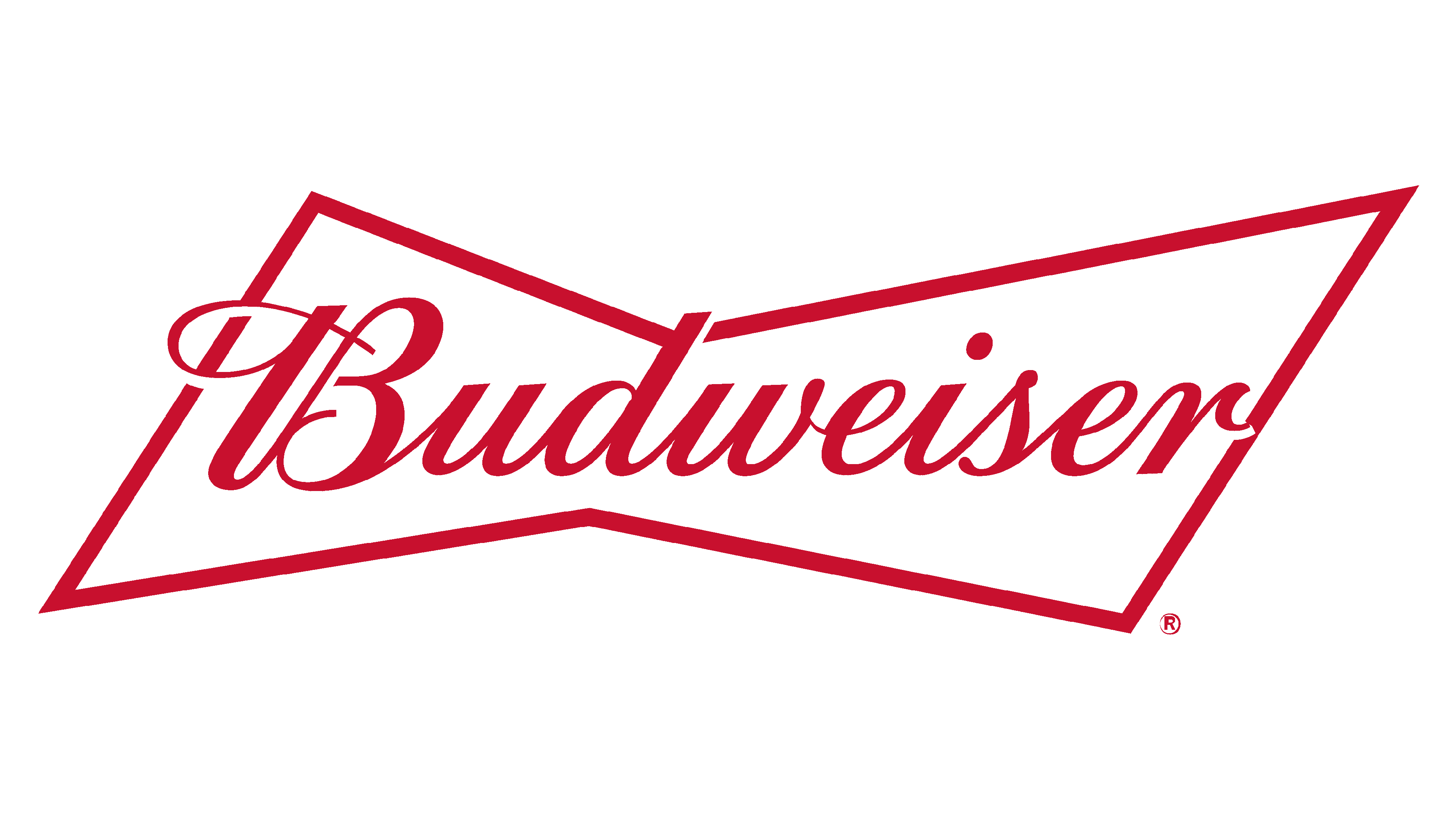
2016 – Today
![]()
The latter version features an oblique geometric bowtie shape and the word “Budweiser.”
Color
Throughout the brand’s history, its designers have used primarily black, white, and red as the main colors for the beer.
Font
The latter typeface features slim handwritten letterforms with numerous curly elements and decorative elements.