7Up, a popular carbonated beverage enjoyed by many around the world, was developed by Charles Leiper Grigg in the year 1929. Grigg, an accomplished beverage chemist, created 7Up as a refreshing alternative to the cola-dominated soft drink market. With its clear, lemon-lime flavor, 7Up quickly gained popularity for its crisp and tangy taste, setting it apart from other beverages of the time.
Meaning and History
![]()
Originally known as “Bib-Label Lithiated Lemon-Lime Soda,” the name was later changed to the now-familiar “7Up” in 1930.
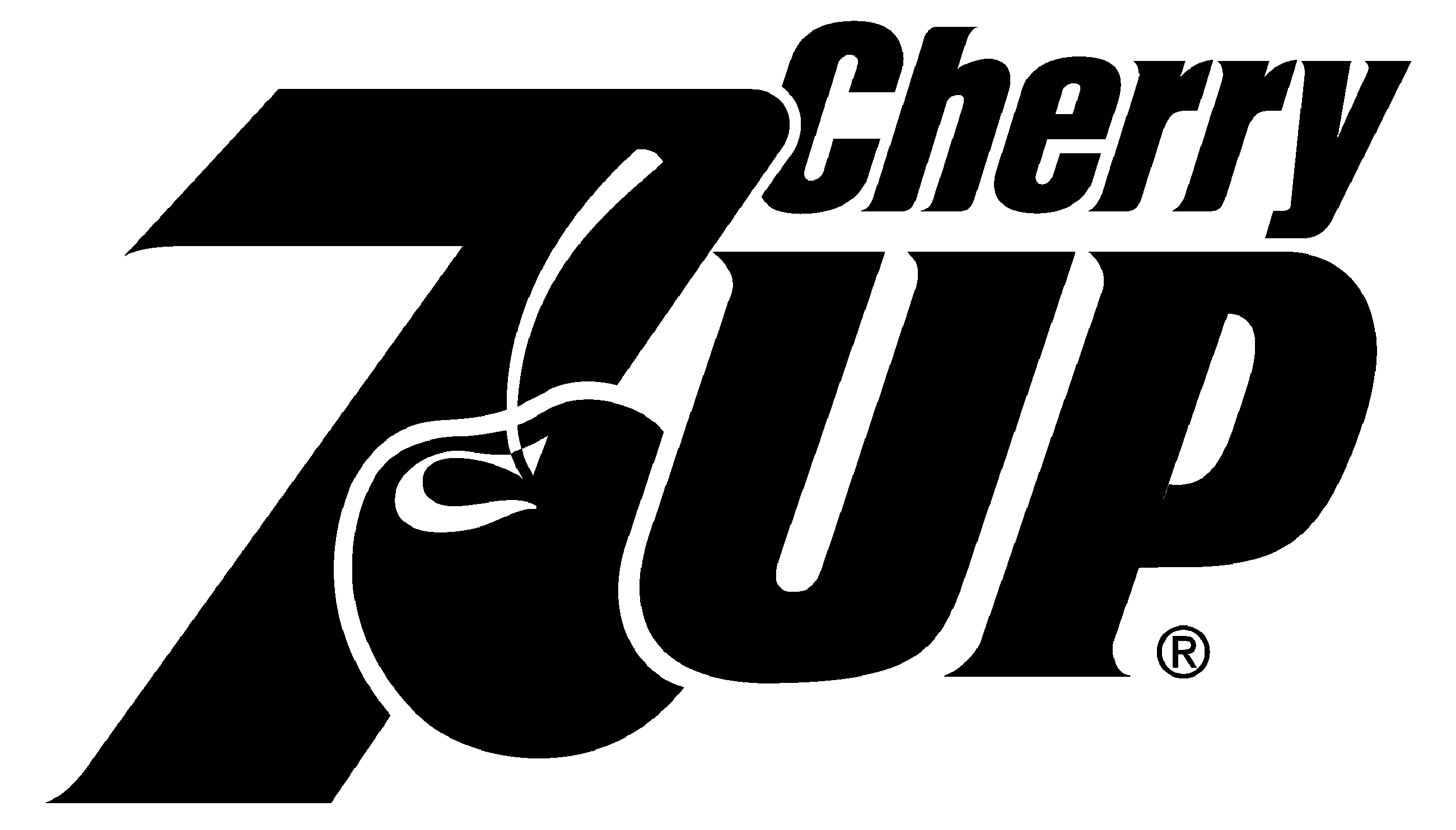
As time progressed, 7Up continued to evolve, introducing new flavors and variations to cater to a diverse consumer base. In the 1990s, the brand launched “Cherry 7Up” and “Diet Cherry 7Up,” offering a delightful twist to the original lemon-lime flavor. Additionally, the introduction of “7Up Plus” in the early 2000s aimed to capture the growing demand for carbonated fruit beverages, combining the refreshing taste of 7Up with real fruit juice.
Throughout its history, the 7Up brand changed its official logo, reflecting the evolving tastes and design trends of the times. From its early days featuring bold typography and vibrant colors to more recent iterations showcasing sleek, modern aesthetics, the 7Up logo has transformed while maintaining its distinct identity. In this article, we’re going to dig deeper into the 7Up logo’s evolution, exploring the various designs that have represented this beloved beverage over the years.
What is 7Up?
7Up is a brand of carbonated soft drink, originally lemon-flavored. Invented in 1929 and produced by Pepsi and Dr. Pepper, it has become a prominent name in the cola-dominated market.
1929
![]()
The initial rendition of 7UP’s logo decorated the aluminum bottle cap of the beverage. It showcased an inscription “Lithiated Lemon & Limes Soda” in an eye-catching geometric serif-free script. This lettering was artfully positioned on a solid green rectangle, accompanied by an array of bubbles in varying sizes, all adorned with an outline matching the vibrant green hue.
1929 – 1932
![]()
The brand’s pioneering logo after the renaming predominantly featured a black-and-white design. The creators invested considerable effort into meticulously crafting and illustrating this emblem.
The digit ‘7’ at the forefront was embellished with petite wings positioned near the top, giving the impression of a soaring motion. The word ‘up’ was incorporated as two small capitals, nestled on a subtle shelf-like structure located just behind and to the side of the primary element.
1930
![]()
The focal point of the 1930 logo was the towering digit “7,” whose elongated vertical bar exhibited an arrangement of bubbles towards its base. The digit was positioned within a badge that showcased a picturesque mountain landscape. Adjacent to the mountainscape, on the left-hand side, stood a human figure with arms outstretched skyward. The underlined lowercase “Up” found its place in the upper right corner of the badge, while the words “Lemon Soda” underlined the entire logo.
1930 – 1931
![]()
For just a few months at the beginning of the 1930s, the brand had been using another badge: a circular banner with thin lines dividing it into several parts: the upper one with the name of the product in a stylized shadowed font, the middle one with the description of the beverage, in the uppercase of a bold sans-serif typeface, and the bottom with the motto of the brand, written in a stable and elegant serif type.
1931 – 1939
![]()
In 1931, the 7UP logo transformed a simpler and more progressive design. The brand name, now rendered in a custom handwritten typeface, emerged with a subtle shadow effect. This distinct lettering was elegantly displayed against a clean white backdrop, enclosed within a square frame. Complementing the text, the emblem featured many outlined bubbles, gracefully adorning the lettering and adding a touch of whimsy to the overall composition. This refined rendition embraced a more contemporary aesthetic while retaining its playful charm.
1939
![]()
The year 1939 marked a significant refinement of its badge, characterized by precise and robust lines and contours. The white logotype found its new place on a sleek black badge with rounded corners.
Notably, the nine bubbles accompanying the logotype became solid white, shedding their previous outlines. This adjustment imparted a cleaner and more streamlined appearance to the logo, enhancing its visual impact while maintaining a sense of simplicity and elegance.
1939 – 1969
![]()
The subsequent emblem was the first truly colored version, featuring a vibrant and eye-catching design. Within this rendition, a prominent red square became the centerpiece, flanked by two slender black lines. The red space within the square was adorned with numerous white bubbles, symbolizing the presence of carbonated water.
The name, rendered in lowercase letterforms, remained in white with black shadows, exuding a bold and distinctive appearance. Notably, this iteration omitted any additional elements, such as wings or a shelf, allowing the logo to emphasize its core elements with a clean and straightforward aesthetic.
1966 – 1974
![]()
In 1966, 7UP unveiled a predecessor to its iconic logo, laying the foundation for the recognizable design we associate with the brand today. This iteration featured bold green lettering, crafted in a weighty geometric font without serifs. The digit “7” and the word “up” were visually separated by a solid red dot. The logo was presented on a transparent backdrop, allowing for versatility and adaptability across various applications.
1968 – 1974
![]()
In 1968, a decision was made to draw a new 7UP logo, resulting in a more simplified visual identity. This simplification involved retaining only a red square alongside the white lettering while eliminating all other elements previously present in the logo. The red square became a prominent feature, complemented by the white lettering that conveyed the brand name.
1975 – 1980
![]()
The 1975 redesign of the 7UP logo introduced a striking and ornate composition. The brand name was intricately crafted using solid green circles of varying sizes. Nestled between the digit and the letters, a small red badge featured the white inscription of “7UP,” positioned diagonally along the bottom line of the logo. The use of different shapes and colors within this iteration produced a distinctive and memorable logo that captured attention and reflected the brand’s identity.
1977 – 1978
![]()
The redesign has created a super sleek and sophisticated logo for the brand, executed in a timeless black-and-white color palette. There was just the name of the soda water written against a white background with no additional framing or graphics. It was all about the shapes of the characters and the elongated lines, making up a smooth sophisticated ornament.
1980 – 1987
![]()
In 1980, a notable adjustment was made to the lettering of the 7UP logo. The entire composition was slightly rotated counter-clockwise, while the letters were emboldened and converted from lowercase to uppercase. Between the digit and the letter ‘U,’ a small red circle was introduced with a white contour. This addition symbolized a bubble, adding a playful and effervescent touch to the logo.
1987 – 1995
![]()
In 1987, a significant alteration to the 7UP logo involved the removal of the name part from the square confines. The letters of the brand name were colored dark green, giving them a distinct appearance. Meanwhile, the bubble element retained its red hue. Additionally, a thin white outline was applied to every element within the logo. The dark green letters, complemented by the white outlines, contributed to a distinctive and visually appealing logo for 7UP.
1989 – 1995
![]()
In 1989, 7UP underwent another redesign that focused on simplifying and modernizing the logo. The badge was streamlined and straightened, shedding all outlines. A shift was made towards a lighter shade of green, infusing the logo with a fresh and inviting aesthetic. These updates resulted in a more contemporary look for the badge, aligning with the brand’s desire to resonate with a modern audience.
1995 – 2000
![]()
In 1995, a notable transformation occurred within the 7UP logo. The shade of green deepened, restoring a vibrant and richer hue to the brand’s visual identity. The logo was also subjected to vertical stretching, accompanied by a slight inclination to the right. This adjustment led to the vertical bar of the digit “7” becoming more pronounced, emboldened, and elongated.
2000 – 2010
![]()
The letters and the digit were rendered in a sleek silver shade, accentuated with shading to create a sense of depth. A thick white outline accompanied the silver elements, providing a clean and distinct separation. Additionally, a thin green line was added further away, contributing to the logo’s visual dynamics. The circular element evolved into a three-dimensional ball, imbuing it with a sense of volume and dimension. Furthermore, a vibrant yellow and green ribbon bearing the inscription ‘100% natural flavors’ was positioned below the logo.
2010 – 2015
![]()
The 2010 iteration of the 7UP logo bore a resemblance to the 1987 variant, albeit with notable refinements. The logo maintained a similar structure but with smoother and softer edges. The coloring changed, with the letters rendered in white instead of green. The outline surrounding the elements became green instead of white, creating a playful contrast. Additionally, the red circle between the letters transformed into a red ball, contributing to a more dynamic and lively visual representation.
2015 – 2024
![]()
The 2015 redesign of the 7UP logo brought about refinements to its contours and chromatic palette. The elements within the logo were meticulously fine-tuned, with a focus on clean lines and precise detailing. The chromatic palette took on a darker tone, while the bright red sphere, symbolizing a bubble, was given a glossy finish, adding a touch of vibrancy and visual allure. The dark-green outline surrounding the characters was refined and thinned, enhancing the overall sleekness and modernity of the logo.
2024 – Today
![]()
In 2024 the 7UP logo got back to basics. The design got flat and bright, with the white and red logotype of the brand written against a solid green background. The shapes of the characters remained the same, but now without any outlines, they look more laconic, which adds style and progressiveness to the composition.
Color
The primary colors used in the 7UP logo are red, green, and white. Together, these colors create a harmonious combination that conveys cheerfulness and a sense of well-being, reinforcing the brand’s appeal and connection to its consumers.
Font
The drink’s wordmark has uppercase sans-serif characters with smooth lines. All symbols are slightly italicized. Additionally, the digit is considerably bigger than the characters.