Jack Daniel’s is a renowned American whiskey brand developed by Jasper Newton “Jack” Daniel in the mid-19th century. Due to its smooth and distinctive taste, this brand is consumed worldwide as a component of cocktails or as a separate beverage.
Meaning and History
![]()
Founded in Lynchburg, Tennessee, the exact date of its inception remains a mystery, as the distillery’s early records were lost in a fire. Nevertheless, historians estimate that Jack Daniel’s distillery began its journey around 1866, making it one of the oldest and most iconic whiskey producers in the United States.
The history of Jack Daniel’s development and evolution is a fascinating tale of passion and perseverance. Jack Daniel, at a young age, was taken under the wing of a preacher and distiller, honing his skills in the art of whiskey-making. This knowledge laid the foundation for the establishment of his distillery. With a vision to create a distinctive and smooth whiskey, Jack introduced the charcoal mellowing process, known as the “Lincoln County Process,” which remains a hallmark of Jack Daniel’s to this day.
Over the years, Jack Daniel’s has undergone significant transformations. From surviving Prohibition to adapting to changing consumer preferences, the brand has consistently evolved while staying true to its heritage. The distinct taste, owing to the limestone water source and careful selection of quality grains, has contributed to its enduring popularity both within the United States and internationally.
One aspect of Jack Daniel’s that has seen several changes is its official logotype. The evolution of Jack Daniel’s logo mirrors the brand’s growth and adaptability. From its earliest designs featuring intricate calligraphy to more modern and minimalist representations, the logo has evolved while preserving its essence. This article delves into the captivating journey of Jack Daniel’s logo, showcasing how it has evolved, reflecting the brand’s enduring legacy and everlasting appeal.
What is Jack Daniels?
Jack Daniels is an internationally considered brand of whiskey from Lynchburg, Tennessee. It has conquered customer approval with its distinctive taste and manufacturing traditions, which help maintain its excellent quality throughout decades.
1950s – 1990s
![]()
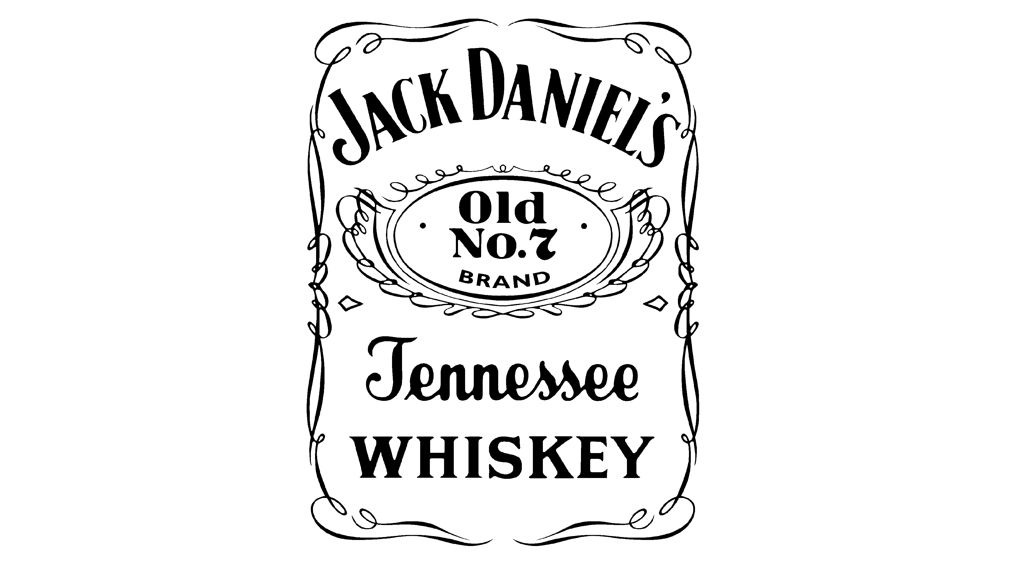
The earliest known emblem of Jack Daniels was a black rectangle with numerous ornaments and inscriptions. At its top, the designers wrote the name in a slightly circled all-caps inscription; the caption ‘Old Time’ showed up below it, also in uppercase serif-free letterforms.
At the center of the logo, an ellipse found its place with numerous curls and contours at its edges. Under it, the words ‘Quality’, ‘Tennesee’, ‘Sour Mash’, and ‘Whiskey’ were placed, with the latter written in massive letters with tiny serifs.
The distillery’s address and year of foundation were at the bottom. Additionally, the whole rectangle was outlined by a distinguished ornament with numerous curly elements.
1990s – 2011
![]()
Later, the logo was extended to contain more information. The indicators ’70cl’ and ‘40% vol’ were added below the word ‘Whiskey’. The additional modifications touched on the ellipse, which was made smaller, and the caption with the address, which was also decreased in size.
2011 – today
![]()
The latter iteration of the whiskey’s logotype features the official nameplate without the caption ‘Old Time’. The parts ’70 cl’ and ‘40% vol’ disappeared, as well as some parts of the bottom text. Now, it reads only the distillery name plus the caption ‘Distilled & Bottled by’ and the location.
Color
The bottles branded Jack Daniels are usually transparent, so customers can see the brown beverage, which harmonizes with the black label featuring the white elements of the logo.
Font
The logotype depicts numerous typography styles within an ornamented rectangular frame. The letterforms are generally capitalized and thick, with tiny serifs at the tips. Notably, the word ‘Tennessee’ has a calligraphic font with bold letters, connected.