Guinness is a renowned brand that has become synonymous with Irish beer and is recognized worldwide. Developed by Arthur Guinness, a visionary brewer, Guinness was first introduced in 1759 in Dublin, Ireland. With a rich history spanning over two centuries, the brand has become an iconic symbol of quality and tradition.
Meaning and History
![]()
The development and evolution of Guinness have been fascinating to witness. From its humble beginnings as a small brewery, Guinness grew steadily, thanks to Arthur Guinness’s commitment to excellence. The brand’s success can be attributed to its unique brewing process, which involves using roasted barley to create its distinctive flavor and dark color. Over the years, Guinness expanded its reach and gained popularity in various parts of the world, becoming a beloved beverage for beer enthusiasts everywhere.
Throughout its history, Guinness has witnessed significant milestones and adaptations. It has continuously embraced innovation, incorporating new brewing techniques and technologies to meet the changing demands of consumers.
The brand’s commitment to quality has remained unwavering, ensuring that each pint of Guinness is crafted with meticulous care and adherence to its original recipe. From introducing the iconic Guinness Draught to expanding its product line to include different variations and flavors, the brand has evolved to cater to diverse consumer preferences while staying true to its core values.
One aspect that has undergone noticeable changes throughout Guinness’s journey is its official logo. The Guinness logo has evolved, reflecting the brand’s growth and adaptation to contemporary design trends.
From the early days of a simple harp symbol, the logo gradually transformed, incorporating elements such as the iconic Arthur Guinness signature and the bold, distinctive lettering of the brand name. These changes not only refreshed the brand’s visual identity but also showcased Guinness’s ability to stay relevant in an ever-changing market.
What is Guinness?
Guinness is a marquee of Irish dark and light beer. Created in 1759 by Arthur Guinness in Dublin, the brand is considered worldwide as a symbol of quality and tradition.
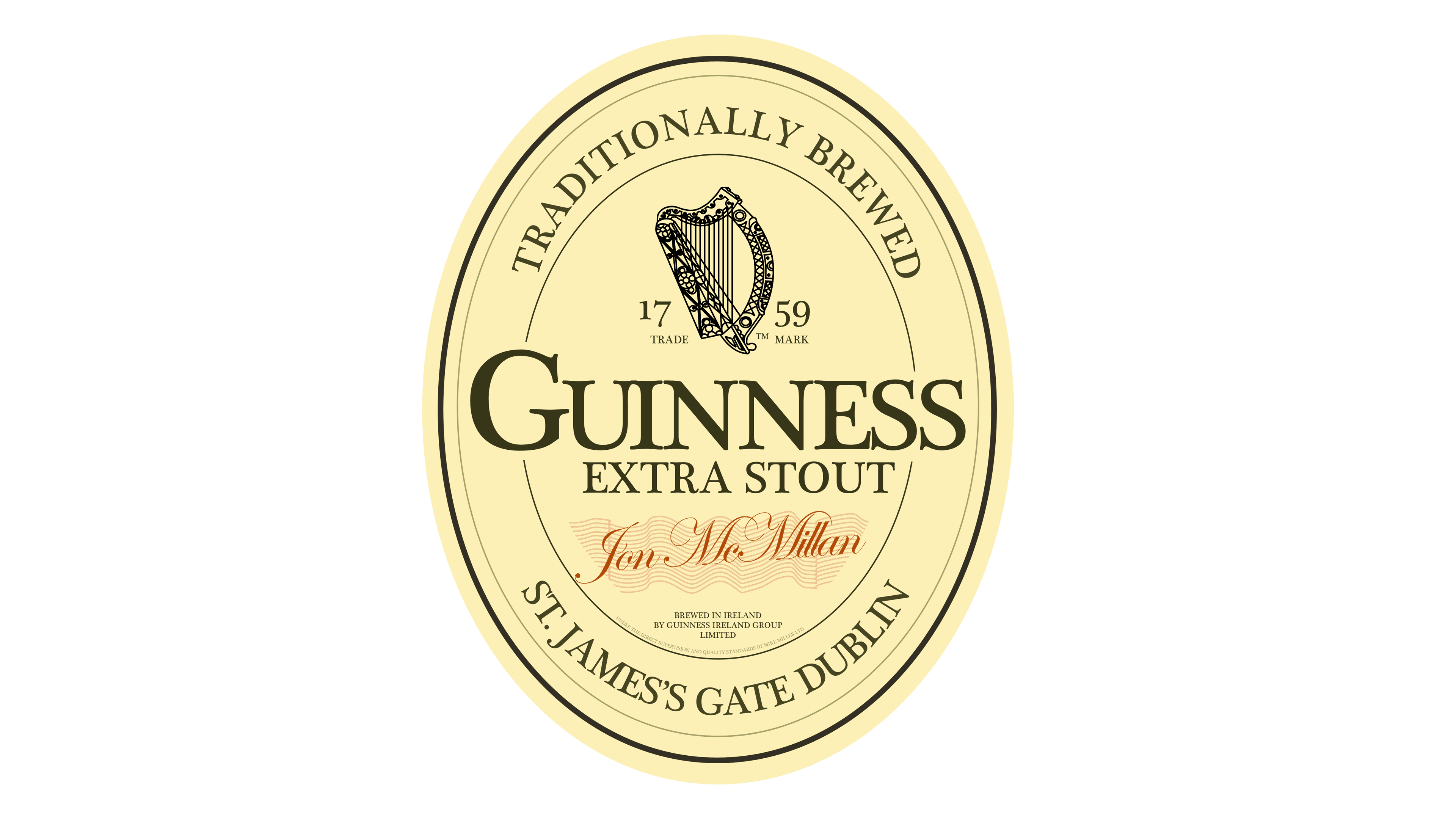
1862 – 1955
![]()
The initial Guinness logo, dating back to its early days, served as a label for its flagship product, the ‘Guinness Extra Stout’. It featured a vertical oval shape with an abundance of text at the top. The label also included the brewery’s address in Dublin. Nestled within the inner space, an iconic harp symbol, representing Ireland’s national heritage, adorned the design alongside several other elements.
1955 – 1968
![]()
In 1955, Guinness made a shift to focus solely on the harp. The renewed logo design showcased a monochrome palette, intricate details, and an overall sophisticated aesthetic.
1968 – 1997
![]()
The 1968 rendition of the harp logo adopted a minimalist approach, featuring a collection of simple metallic lines forming the outline of the musical instrument.
1997 – 2005
![]()
In 1997, Guinness adopted a new approach, incorporating the harp symbol alongside the brand name. The harp’s design was simplified to enhance its elegance: for example, the number of strings decreased. The brand name was displayed in tall, sharp font with serifs, which created a visually striking wordmark.
2005 – 2016
![]()
With the 2005 logo iteration, most elements remained consistent. However, notable changes included the ‘est. 1759’ inscription, split into two parts, placed on both sides of the harp. Additionally, they made slight modifications in the typography style, and a chromatic scheme, now featuring a black backdrop, white letterforms, and a golden harp.
2016 – today
![]()
In the latest logo version, Guinness opted to retain the main wordmark alongside the 3D-rendered harp. Its design received a noticeable sense of depth, while the lettering in the wordmark sported a contemporary thin serif appearance. The black background transformed into a square canvas. Additionally, the founding year inscription was atop the harp, completing the updated logo composition.
Font
The distinctive inscription used in the Guinness logo is crafted using the commercial typeface Agenda URW Light, skillfully designed by Phil Martin. While this typeface is not freely available, a suitable alternative script that captures a similar aesthetic is Resavska BG Sans Bold Font.
Color
Regarding the color palette, the signature colors of the Guinness brand are golden and black. By combining the carefully selected typeface and the golden-black color palette, the Guinness logo exudes a timeless appeal and a strong visual identity that has become synonymous with the esteemed beer brand.