Dr. Pepper Logo
Tags: carbonated beverage | multi-flavored | USA
Dr. Pepper is a worldwide-considered brand of carbonated drink that comes in 23 tastes, including cola, cherry, caramel, orange, pepper, and so on. Developed by an American pharmacist Charles Alderton, today, the brand has an international presence.
Meaning and History
![]()
The name “Dr. Pepper” carries a sense of authority and professionalism reminiscent of a respected medical figure. It conveys a touch of sophistication and expertise, alluding to the beverage’s unique blend of flavors that sets it apart from its competitors.
Dr. Pepper’s history dates back to the late 19th century. Created by pharmacist Charles Alderton, this carbonated beverage quickly captivated consumers with its secret recipe of carefully selected fruits, spices, and carbonation. It gained a loyal following, becoming a beloved brand known for its bold and refreshing flavor.
Over time, Dr. Pepper has been a part of prominent events that have shaped its legacy. The brand’s memorable advertising campaigns, like the iconic “I’m a Pepper” jingle resonated with audiences and celebrated individuality. Dr. Pepper’s sponsorships of sports events and teams have also established its presence in popular culture, forging a connection with fans and enthusiasts alike.
What is Dr Pepper?
Dr Pepper is a multi-flavored drink that first appeared in 1885 in the USA. There are 20+ tastes of this carbonated beverage, including pepper, orange, cherry, cola, caramel, and others.
1885 – 1906
![]()
In the late 19th century, Wade Morrison paved the way for large-scale production by acquiring the formula for Waco’s carbonated beverage, later known as Dr. Pepper. Within this era, an initial emblem emerged, featuring the registered name elegantly inscribed in a vintage font adorned with graceful swirls. Each letter, seamlessly connected in an unbroken chain, emanated a vibrant hue of crimson. Flowing from the final “r,” a sweeping and irregular curve gracefully arched to the left, creating ample space to showcase the motto “THE YEAR ROUND.”
1891 – 1906
![]()
As time progressed, the Dr. Pepper trademark underwent a metamorphosis, embracing a more intricate design. The emblem prominently displayed a robust anvil, leaving no doubt about the presence of iron. Positioned above it, an arched inscription proudly proclaimed the combination of “Wheat and Iron,” while a wreath of wheat encircled the central elements, elegantly tied at the bottom with a delicate ribbon—the title text, rendered in a bold capital font, showcased ornate serifs reminiscent of tiny dots.
1906 – 1911
![]()
In a tribute to its origins, the logo eventually returned to its 1885 design. The name was gracefully handcrafted, with interconnected letters forming a harmonious chain. A supplementary row emerged at the bottom, showcasing the phrase “Trade Mark” in printed characters, boasting a slender and segmented appearance.
1911 – 1923
![]()
Subsequent modifications aimed to simplify the lettering by eliminating spiral elements. The word “Drink” found its place in the upper right corner, while the term “TRADEMARK” made its debut at the bottom, divided into two sections by the elongated “pp.” The slogan transformed into “KING OF BEVERAGES,” with the official logo embracing a contrasting black and white palette.
1923 – 1926
![]()
The capital letters “D” and “P” displayed distinct resemblances, while the remaining inscriptions became more compact, streamlined, and intimately intertwined. The word “Drink” eventually made way for the new slogan, “Good for Life,” as it gracefully exited the logo’s design.
1926 – 1930
![]()
During this era, the Dr. Pepper logo prominently featured the original beverage’s price: 5 cents. The large and attention-grabbing numeral appeared beneath the wide, curved tail of the “r,” standing out boldly in white against a backdrop of deep black. The font changed, with bolder symbols replacing the previous weighty ones. The slogan and cent symbol slightly decreased in size, while the background embraced a rich jet-black hue.
1930 – 1941
![]()
In the subsequent update, the brand designers opted for a fresh typeface for the wordmark. This decision led to slightly heavier characters for the name, accompanied by a subtle increase in size for all elements.
1941 – 1950
![]()
As the logo continued its evolution, the central lettering gained enhanced precision. The background transformed into an orange brick wall, creating a distinctive visual impact. The superscript “TRADE MARK” vanished, and the word “DRINK” transitioned to uppercase. The brand’s new slogan, “GOOD FOR LIFE!,” adorned a striking horizontal strip in black. The primary text elements transformed, embracing a pristine white hue that elevated their prominence.
1950 – 1958
![]()
During the mid-1950s, a wordmark variation emerged, removing the dot following “Dr.” This alteration served two key purposes. Firstly, it allowed the manufacturer to navigate potential legal issues, as consumers believed that the abbreviation “Dr.” implied medicinal qualities in the beverage.
Secondly, the logo had got a more uncluttered visual presentation. The prominent “DR PEPPER” in red lettering remained direct and impactful, even with the addition of bold italics. While the dot was not eliminated, a subtle tribute to its memory surfaced in the form of small circles adorning the top of both “r” letters.
1958 – 1960
![]()
Enveloped within a pristine white oval, the brand name in the new logo commanded attention. The vibrant red letters, elegantly fashioned in a uniform serif typeface, exuded a timeless appeal. Just below, three numbers resided, each enclosed within a colorful circle. A deep red “10,” a delicate pink “2,” and a white “4” harmoniously adorned the logo.
Bubbles were spread across the design, mirroring the colors of the primary background. The logo’s placement on dark cans embellished with vertical stripes of yellow and red enhanced its visual impact, captivating the eye with its vibrant presence.
1960 – 1963
![]()
In addition to the bright logo, an inverted rendition of the emblem found its place. The transformation extended beyond the logo itself, with the main color of the can transitioning to a pristine white hue. Correspondingly, the “DR PEPPER” lettering embraced the same white hue. The numbers were removed as the company changed its promotional approach.
1963 – 1971
![]()
During the late 1960s, a noteworthy shift in the chromatic scheme took place, organized by the creative minds behind the brand. The once pristine oval became rich burgundy, while its frame was repainted sleek silver. The lettering retained its pristine-white appearance to stand out from the backdrop. The can’s colors were harmoniously aligned with the logotype’s color code.
1971 – 1984
![]()
In the early 70s, the brand’s logo had received a new look. The oval became flatter and changed color to light red—additionally, the new typography featured thick letters placed very close to each other.
1984 – 1990
![]()
In the 80s brand mark, Dr Pepper’s artists added a dark orange stripe to underscore the whole inscription. The ellipse disappeared. The underscoring stripe was divided by the legs of the two characters ‘P,’ which were converted to title case.
1990 – 1997
![]()
Every “P” and “e” within the renewed wordmark was transformed. Intra-letter extensions were introduced, seamlessly connecting the individual parts and rendering the symbols solid, free from any breaks.
1997 – 2005
![]()
The symbols in the next design became considerably sharper, and they cast shadows. The underscore, in its turn, was blurred. The designers drew it in a rough style and changed its color to orange. Typically, this logo showed up on a red backdrop.
2005 – 2015
![]()
The year 2005 saw another transformation of the brand’s logo. An ellipse had returned with uneven edges. It was surrounded by several strokes colored white, bright, and dark red. One of the strokes was implemented into the form of the first capital, ‘P.’ The name’s typeface included thick, sans-serif shapes with shadows. Additionally, they added the year of the brand’s establishment under the nameplate: “Est. 1885”.
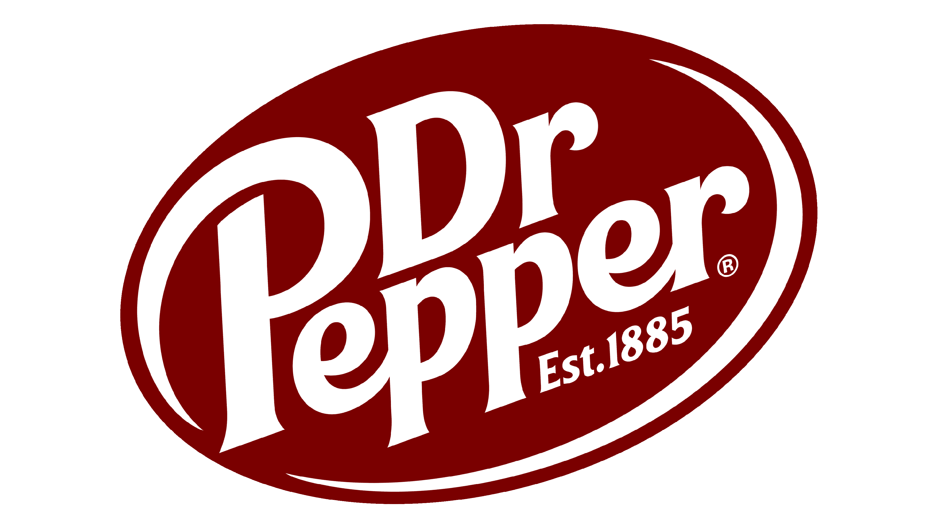
2015 – today
![]()
The latter logotype features the 2005 design without an oval and on a transparent backdrop.
Color
The chromatic choice of the Dr Pepper brand is represented by a deep maroon hue. This rich and distinguished hue is synonymous with Dr Pepper and is used consistently across its marketing initiatives.
Font
Special typography has been designed to represent the brand. It features thick, slightly italicized characters with small serifs. A distinctive feature of this style is the curls of the letters ‘P’, ‘e’, and ‘r’. Its author is Ervin Denissen.