Diet Coke, a well-known beverage, has undergone several rebranding efforts to stay relevant in an ever-changing market. It added new flavors such as Cherry, Vanilla, and Lime to appeal to a wider range of tastes. In addition to its taste and branding, Diet Coke has also been supported by numerous advertising campaigns featuring celebrities and influencers. One of the main attractions of this drink is its zero-calorie content, making it a guilt-free option for those watching their weight.
Meaning and History
Diet Coke, a popular soft drink under the Coca-Cola Company, has gained a loyal following since its introduction in 1982. Originally marketed as a sugar-free alternative to traditional Coke, Diet Coke quickly became a staple in the diet soda market. The origins of Diet Coke can be traced back to the 1960s when Coca-Cola introduced Tab, their first diet soda. Despite Tab’s success, Coca-Cola recognized the need for a new and improved diet beverage. In response, Diet Coke was created. With its distinctive design and rich history, the logo serves as a visual reminder of the brand’s dedication to providing consumers with a guilt-free refreshment option.
What is Diet Coke?
Diet Coke, also known as Coca-Cola Light in some countries, is a staple in the diet soda market. It has solidified its position as a leading diet soda brand through its innovative flavors and marketing strategies.
1982 – 1987
Diet Coke is known for its silver can adorned with a bold red logo since its introduction. The brand name is printed in two lines using a bold serif font. It is aligned to the right and underlined with a wavy line. This creates a feeling of movement and energy. The use of a smaller font for the “Diet” gives the logo a unique touch. It was designed by The Schechter Group.
1987 – 1994
The logo features an adjusted font. Italicized letters go better with the wavy line. The latter has been redrawn to be part of the inscription. The company made relatively minimal changes to the logo, though. This allowed the logo to look recognizable while being improved and better designed.
1994 – 1997
This logo marked the beginning of an iconic logo design. The “Diet” portion of the name is written using an elegant cursive font. It has been used in the logos ever since. The second portion of the name is printed using a serif font that has been featured in the original version. The logo still has a wavy line. It looks smoother and smaller as it is placed right under the top line.
1997 – 2002
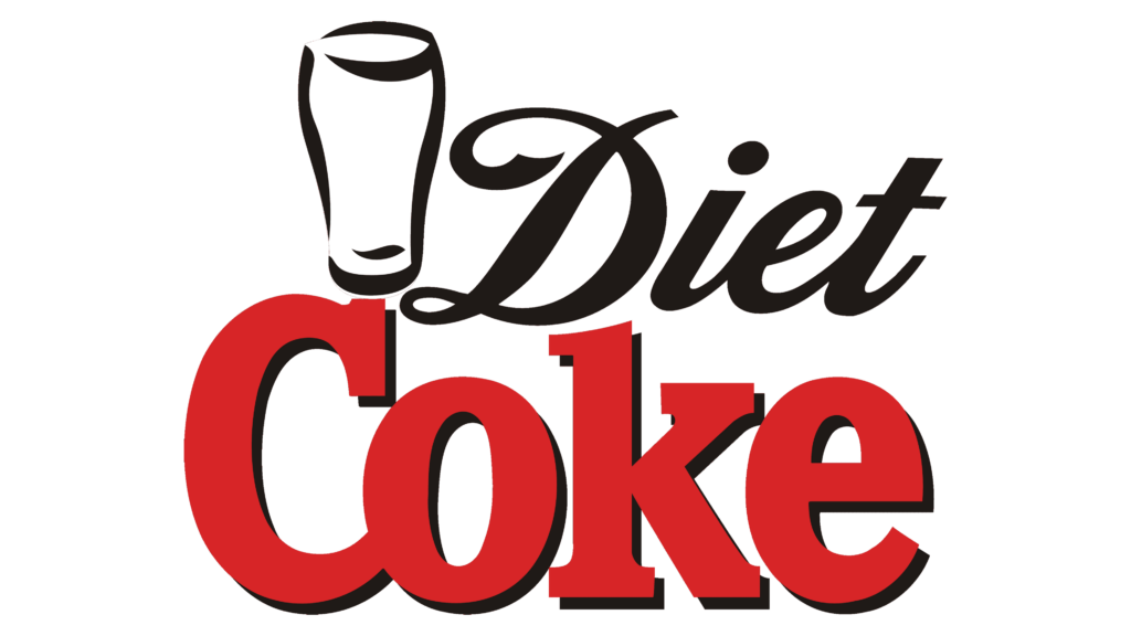
This is the only logo (so far) that features a glass silhouette in black. This design was developed by SBG Partners in early 1997. The top line is also printed in black. The color is also added as a shadow to the bottom line. This created a cohesive logo and added a sophisticated touch to an already powerful brand image.
2002 – 2007 (International), 2002 – 2011 (Asia), 2002 – 2015 (UK)
The logo’s new clean and minimalistic design looks very impressive. It further reinforces the product’s role in supporting a healthier lifestyle, appealing to consumers who are looking for a refreshing drink without the added calories. The designer kept the color palette the same but centered the top line, slightly overlapping the bottom one. Although this might look better, the brand image was partially lost.
2002 – 2007
For the US market, the designers simply removed the glass and made the “Diet” portion smaller. This version looks familiar. The use of black gives the logo a classy and almost grand appearance.
2007 – 2017
Designed by Turner Duckworth, this iconic logo features the words “Diet Coke” in a sleek, modern font with a distinctive red, black, and white color scheme. The company updated the font used for the “Coke” portion of the name. It features smoother lines and no longer has a black shadow. This font has been used for the regular Coke since 2002, so the update created a more cohesive beverage branding.
2015 – 2021 (UK)
The UK version of the logo features the same cursive font for the whole logo. The two words are printed in one line for the first time. The designer preserved the color palette, which not only separated the two words but also maintained a recognizable image.
2017 – 2022 (Australia)
A more elaborate design was created for the Australian market. First of all, it is worth noting the addition of a partially cut red circle as the base. The name was changed to “Coca-Cola” and printed in a white cursive font that was used by the brand earlier. The “Diet” portion is still printed in black and placed in a smaller font above the circle. The logo also included taglines “Light Taste” and “Sugar Free”, which are printed using a simple sans-serif typeface.
2017 – Today
The logo has undergone several updates over the years, but it has always maintained its recognizable design. The red color palette and a distinctive cursive typeface that was typically used for the word “Diet” made a large contribution towards this. Although there is no more wavy line, a monochrome color palette reminds of the original logo. It also gives it a clean and modern look.
2022 – Today (Australia)
The company continued to use a one-stroke logo for Australia. However, it brought back the red in the inscription and removed the red backdrop. The “Diet” portion is added at the bottom and features a very basic sans-serif typeface with fine strokes and a smaller font size.
Font and Color
The company has always used custom fonts for its logos. However, one can find fonts that can give a similar look. The original version uses a serif font similar to Directa Serif Bold or Rail Extra Bold font. The next logo used a font that resembled a modified Baker Signet. In 2007, the logo used a custom font called You for the “Coke” part. The iconic “Diet” portion of the logo as well as some other cursive parts of the logo in some versions is written using Loki Cola font.
The red color palette has always been strongly associated with the Coca-Cola brand. It is a powerful color that attracts attention. This color is also associated with activity, passion, and strength. In many cases, it was accented by black color. It is another strong color that adds a touch of sophistication and is considered to be a classic choice.


