Busch, a globally acclaimed beer brand, proudly holds the distinction of being the second most popular offering within the portfolio of the esteemed American company, Anheuser-Busch. This light lager beer undergoes a meticulous crafting process, harmonizing hops, malt, and rice. Its fermentation unfolds at low temperatures, courtesy of the yeast strain “Saccharomyces pastorianus,” which thrives at the bottom of the brewing vessel.
Meaning and History
The origins of the Busch beer brand trace back to the time of August Anheuser Busch Jr’s leadership. He was the grandson of Adolphus Busch and the great-grandson of Eberhard Anheuser—the founders of the company.
Since its inception in 1955, the Busch product line has steadily expanded to encompass four additional beverage varieties: Busch Light 4.1%, Busch Ice 5.9%, Busch NA non-alcoholic, and Dog Brew by Busch bone broth dog drink with vegetables.
What is Busch?
Busch is a marque of American light lager, produced by Anheuser-Busch since the 1950s. With hops, malt, and rice as the main ingredients in the manufacturing process, the beer undergoes fermentation in very low temperatures thanks to the yeast strain called “Saccharomyces pastorianus,” thriving at the bottom of the brewing vessels. It give the product exceptional taste and flavor.
1955 – 2013
The logo cleverly incorporates Adolph’s surname, creating an upward slant that symbolizes progress and growth. An energetic red underline and shadow accentuate the name, reflecting vitality, resilience, and an unwavering passion—the very attributes that propelled the company’s founder to extraordinary success.
The blue letters, outlined in white, symbolize the sky and the pristine snow-covered Bavarian mountains, invoking a sense of coolness and subtly alluding to mechanical cooling, a concept that Busch championed in his time.
In 1979, the beer brand officially adopts the name “Busch Beer.” However, it isn’t until later, under the leadership of Joao Nevis, that the logo undergoes a transformation.
2013 – 2017
During this era, the logo sports an unconventional font. The letters in “BUSCH” appear as though they are hand-crafted with deliberate imperfections: uneven, trembling edges, and disproportionate curves. The letter “U” is the most distinct, lacking the usual symmetry.
Below, the word “BEER” appears in capital letters, albeit scaled down and written in a simple sans-serif font. Both sections of the text are rendered in a muted black hue, with the letters in the top line featuring a thin dark beige outline.
2017 – today
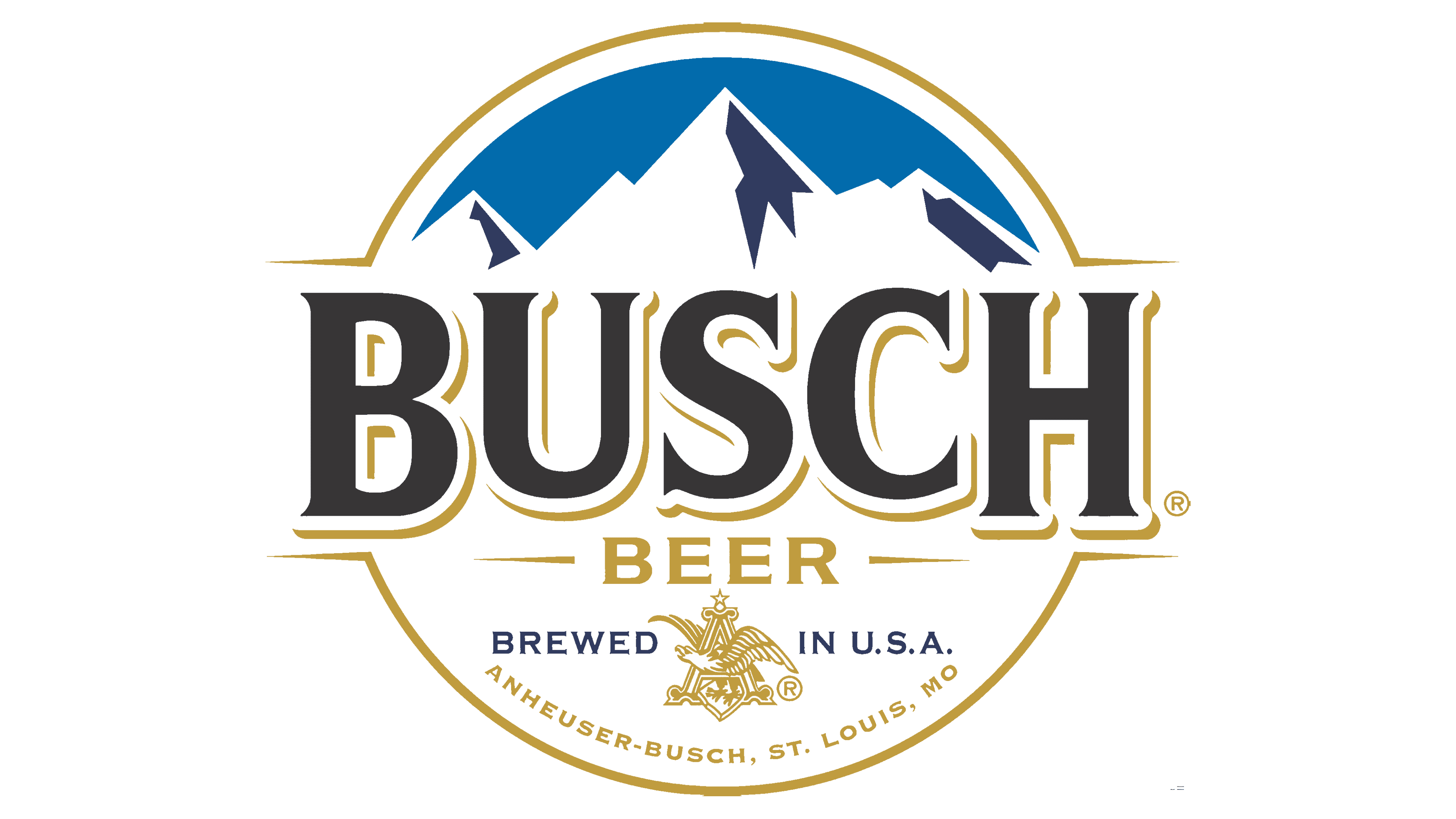
In 2017, a new logo design takes center stage. The emblem adopts a circular shape with subtle elements resembling two stripes extending in different directions, reminiscent of a champion’s belt. These lines symbolize the brand’s leadership and superiority in the market.
Accompanying the text, a visual symbol emerges in the form of snow-capped mountain peaks, paying homage to Bavaria, the Alps, and the original name, Busch Bavarian Beer. These mountains evoke the refreshing taste, pleasant aroma, and lightness of the beer.
The prominently featured letters spell “Busch” in a three-dimensional style. They appear in black with a white outline, replacing the previous red, and now boast a golden shadow. Below, the word “beer” shines in gold. The alignment and shadow adjustments emphasize stability and a rich 60-year history, rooted in preserving centuries-old brewing traditions and recipes.
The logo further underscores the brand’s commitment to tradition by incorporating distinctive elements and inscriptions typical of Anheuser-Busch. Notably, the eagle within the letter “A” (the company’s trademark) and the inclusion of “St. Louis” (the city where the Anheuser Brewery originated, with its first factory) pay homage to the brand’s historical roots.
Color
The Busch Beer logo primarily employs a color scheme centered around gold, complemented by shades of blue and white. Gold is utilized for lines, contours, and manufacturer-related inscriptions.
While variations of the brand’s beverages may feature different color schemes depending on location and release date, the overall palette consistently incorporates cool tones, including silver, blue, white, and cold red.
Font
The brand name is rendered in a classic serif-free style with all capitalized characters, contoured twice using white and yellow. The lines of the letters are bold.


