YouTube Logo
Tags: Google | video hosting
YouTube is one of the most popular sites in the world and has long been the leading online video platform. At the beginning of the year 2020, the platform’s audience reached 2 billion viewers. Users liked YouTube right from the start because it was possible to rate the video and leave a comment, the video was easier to download, and the access itself was faster. Its creation had a large influence on the lives of people across the globe. For the vast majority of users, this is simply an entertainment platform. Some, though, got world fame thanks to this site. YouTube is one of the few social projects that allows literally any user to earn money by creating content on the platform.
Meaning and History
![]()
Few people know Youtube.com was initially implemented as a dating site. It had a unique feature, the ability to upload one’s videos, which was meant to improve the dating experience. Its developers and creators, Chad Hurley, Steve Chen, and Jawed Karim, were colleagues in the PayPal payment system. On February 14, 2005, the guys registered the YouTube.com domain and began creating a website. The growth in the number of users was achieved through the viral marketing of a widget, which allowed the embedding of any YouTube video on other websites. The rapid growth attracted the attention of venture capital funds Sequoia Capital and Time Warner. The investments enabled the creators to open public access to the service, which makes November 22, 2005, the true birthday of YouTube. By July 2006, the site moved to 5th place in the ranking of the most popular sites in the US. Several months later, Google paid $1.6 billion in shares to acquire the company.
What is YouTube?
YouTube is a video hosting service that provides users with video storage, posting, and monetization services. YouTube is constantly evolving: functionality and user interface are improving, players and channel designs are being updated. YouTube’s only main competitor today is TikTok.
2005 – 2011
![]()
The new service had a name that could be split in half, which made it a great opportunity for an interesting logo design. The first part was plain and featured just a black inscription with the first letter being capitalized. The second half consisted of an inscription and a red background. The rectangular base with rounded corners had a highlight and a shadow, which gave it some volume. The white inscription also had a shadow that made it stand out even more. Both halves used the same sans-serif font, which closely resembles the well-known Helvetica.
2011 – 2013
![]()
Initially created for the Cosmic Panda experiment, the logo became an official version soon after. The designers played with the colors of the original one. They made the shadow cover the bottom half and transition into a lighter red in a gradient. The highlight at the top was removed, which made the base look flatter. Although the font has been kept the same, the lettering on the red background looks different. It is because the shadow has been changed. It is now under the letters instead of above them and black. The addition of a darker shadow created a link with the black half on the left.
2013 – 2015
![]()
The introduction of this logo coincided with an update of the Google logo. The first impression of a new version is that it is much lighter. The shade of red was changed for a brighter one. The shadow behind the letters was gone. Even the shadow on the bottom of the base was now barely noticeable. It was there just to avoid making the background look completely flat.
2015 – 2017
![]()
When YouTube began offering YouTube Premium (back then YouTube Red), it made some modifications to the logo as well. They were not major as the company simply removed the shadow on the red portion of its logo. Now, the base was one solid red color and looked flat.
2017 – Today
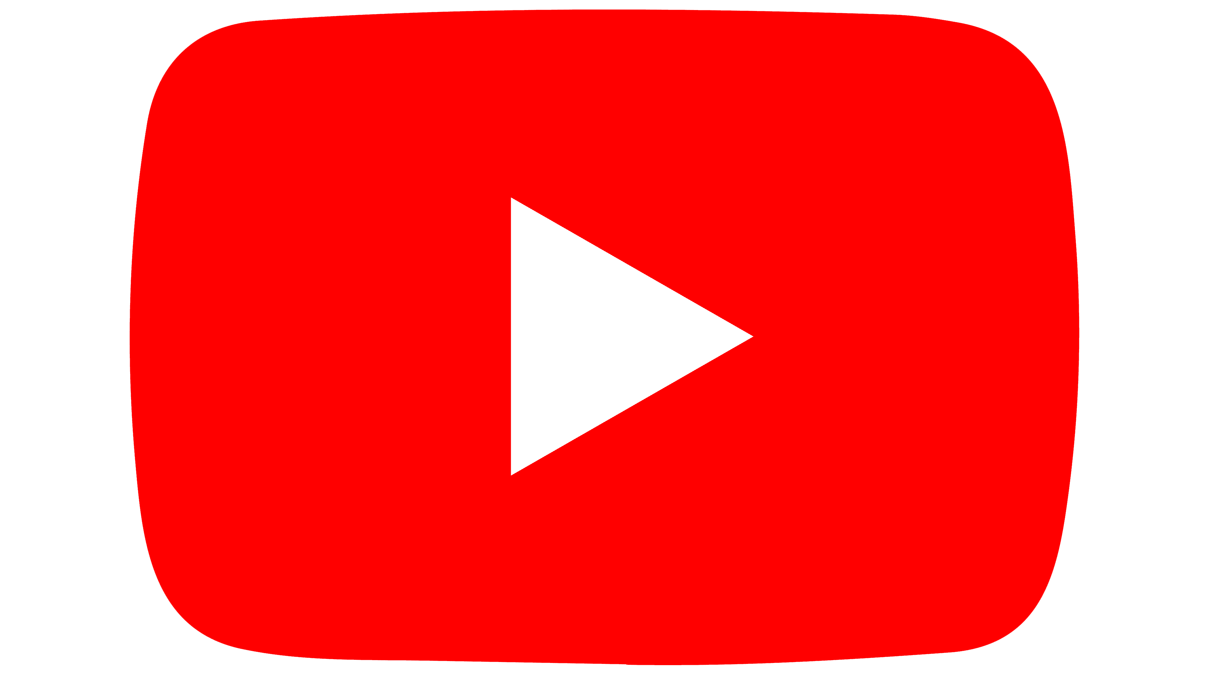
![]()
It looks like YouTube has designed quite a great logo as it did not go through a major change until 2017. This update took the logo apart and place a play button on the left, while the inscription was printed on a white background. The play button consisted of a red rectangle with rounded corners and a relatively small white triangle pointing to the right. To make the letters visible, they were all done in black and there was no more space between the two halves of the name. The font was kept the same.
Font and Color
The platform used the same color palette as a foundation. It was black and white along with red. The latter had changed shades but stayed close to the original. Despite the updates, the company also used the same font, which resembled Helvetica or Alternate Gothic, until 2017. The new logo featured a very similar font, but one that looked a bit more modern. It resembles Indecise Condensed Medium. It is distinguished by slanted terminals.