Amazon is an American corporation specializing in e-commerce, cloud computing, and artificial intelligence. It is widely known as a modern marketplace, where the offers of a corporation and sellers from the marketplace exist side by side. Automated warehouse system and many other innovative solutions played an important role in its success. The integrity of Amazon sellers is guaranteed by a thorough screening system for everyone who wants to start a business with this marketplace. The company leads the cloud computing market and, along with Apple, Google, Facebook, and Microsoft, is one of the Big Five technology corporations.
Meaning and History
The story of Amazon began with the desire of Jeff Bezos, who left a promising and highly-paid position, to start a business in a garage. Jeffrey was thinking about an online trading network that would have a huge variety of products, although, in the 90s, only a few had access to the internet. Jeff registered Amazon in 1994 and the following year launched the website. Growth began after a successful advertising campaign, as a result of which the store appeared on the main page of the Yahoo search engine. The company issued its own shares, after which profits rose to $66 million for the quarter. This attracted the attention of many investors. Amazon did not pay its shareholders anything for five years, reinvesting all the profits back into the company. It actively explored new markets. The use of new ideas allowed it to significantly outperform many competitors.
What is Amazon?
Amazon.com is the largest online store in the United States, which operates both as an independent company and as a marketplace. The online platform attracts visitors with affordable prices, high-quality goods, the absence of fakes, and prompt delivery of goods, even outside the US. Amazon is not only a giant online marketplace but also a global provider of cloud computing and artificial intelligence services.
1995 – 1997
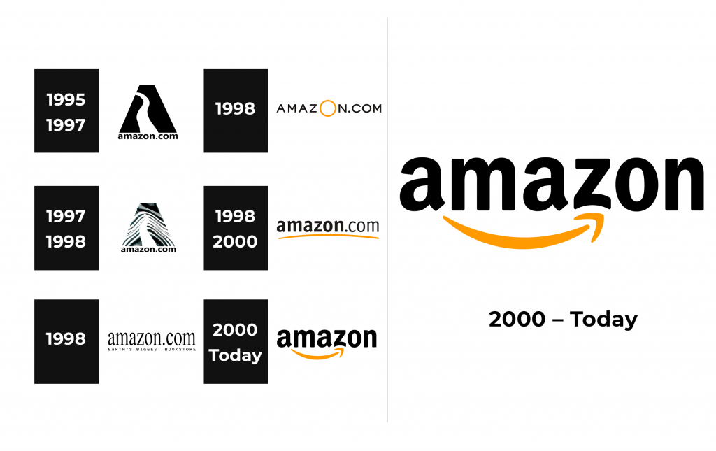
In search of a suitable name, Bezos opened the Oxford Dictionary. One of the first things that caught his attention was the word “Amazon”. The largest river was a great symbol for creating a huge online platform. One can see it as part of the logo the white river outline is running down the black rectangle with a cut top, creating the letter “A”. Right underneath, it says “amazon.com”. The inscription is done in black and uses all lowercase letters using sans-serif Tahoma font.
1997 – 1998
The emblem was changed to a more graphic one. The “A” is now shorter and has a wave or zebra pattern, which introduces other colors and represents other small rivers and creeks joining the larger Amazon river. It can be interpreted two ways: the platform is growing thanks to many other sellers joining it and it is the final shopping destination. The inscription underneath is kept unchanged.
1998
The company tested several logos this year. The initial was gone, while the “amazon.com” inscription was enlarged and done using a different serif font. Underneath, there was a slogan of the same length. “Earth’s biggest bookstore” was printed in smaller, capitalized sans-serif letters. Although Amazon started as a bookstore, this logo was limiting its potential.
1998
Another test version had only the domain name. it was printed in black and featured all capital letters of a black color. To add interest, the letter “O” was enlarged and looked like a large yellow circle.
1998 – 2000
Amazon finally found a logo that it liked. It was a base for the logo we know today. The domain name was done in two styles, with the first half being bold and the “.com” part being normal. Just like in previous versions, all the letters were lowercase and black. It was during this year, though, that an orange swish line was drawn underneath it. It gave a happy, energetic touch to the overall appearance.
2000 – Today
Two years later, a rather simple line was transformed into a “smile”, as many know it. It also resembles an arrow, which points from the first letter to “z”, which was curved slightly at the bottom to repeat the shape of the arrow. Many say it means that one can find everything they can think of on Amazon, from “A” to “Z”. In any case, the logo turned out successful and has been in use for over twenty years. In addition, the logo no longer looked like a domain name, and the “.com” part was removed.
Font and Color
The original logo featured Tahoma font, which was replaced by Gill Sans Heavy and later by Times New Roman. The 1998 logo that actually stayed with the company featured the Officina Sans typeface for the “amazon” part and Officina Sans Book for the “.com” half. In 2000, it was replaced by a similar typeface, Franklin Gothic Condensed. The black color was the main color of the brand. In 1998, the company introduce yellow in its color palette. Later, it was replaced by orange.


