Airbnb is an international marketplace where one can buy tickets for a train, plane, or bus, or reserve a room in a hotel. The service operates via a website, launched in 2008. Since its establishment, Airbnb has become a worldwide-considered solution for tourists.
Meaning and History
![]()
The company started its operations in 2008 thanks to Joe Gebbia and Brian Chesky. Since then, it has changed its brand identity and slogans multiple times. The company’s latter tagline reads ‘Belong Together’. The latter emblem is the 6th in their list, and it perfectly represents the values of connectivity, loyalty, and love.
What is Airbnb?
Airbnb is a service that lets tourists book a room in a hotel or buy transport tickets. With millions of users, the company’s zone of reference is the entire world.
2007 – 2008
![]()
In its early periods, Airbnb bore the name ‘AirBed&Breakfast’. It was also depicted in the company’s official wordmark – a two-level inscription where the part ‘AirBed&’ was in bright blue, while the portion ‘Breakfast’ was pink. The typography style was thick and sans-serif. They also put a tagline below – ‘idsa connecting ’07’.
2008 – 2009
![]()
Later, they changed the wordmark, making it a solid line of text and adding a bold white contour. The new tagline was ‘Forget Hotels’.
2009 – 2010
![]()
Upon the adoption of the new name, Airbnb, the company incorporated a new wordmark, which depicted the new inscription in the familiar typeface. The slogans were also removed.
2010 – 2013
![]()
The year 2010 saw another logo redesign. The modifications included a completely new typography style – a lowercase hand-drawn cursive. The name was set in an outline, which looked like a cloud. As for the coloring, the designers opted for a gradient of white and blue, whereas white shades were at the top.
2013 – 2014
![]()
In the next revision of the logo, the outline resembling a cloud was removed. Instead, gradient dark and light blue contours were used to match the shapes of the letters, and the letters themselves became colorless.
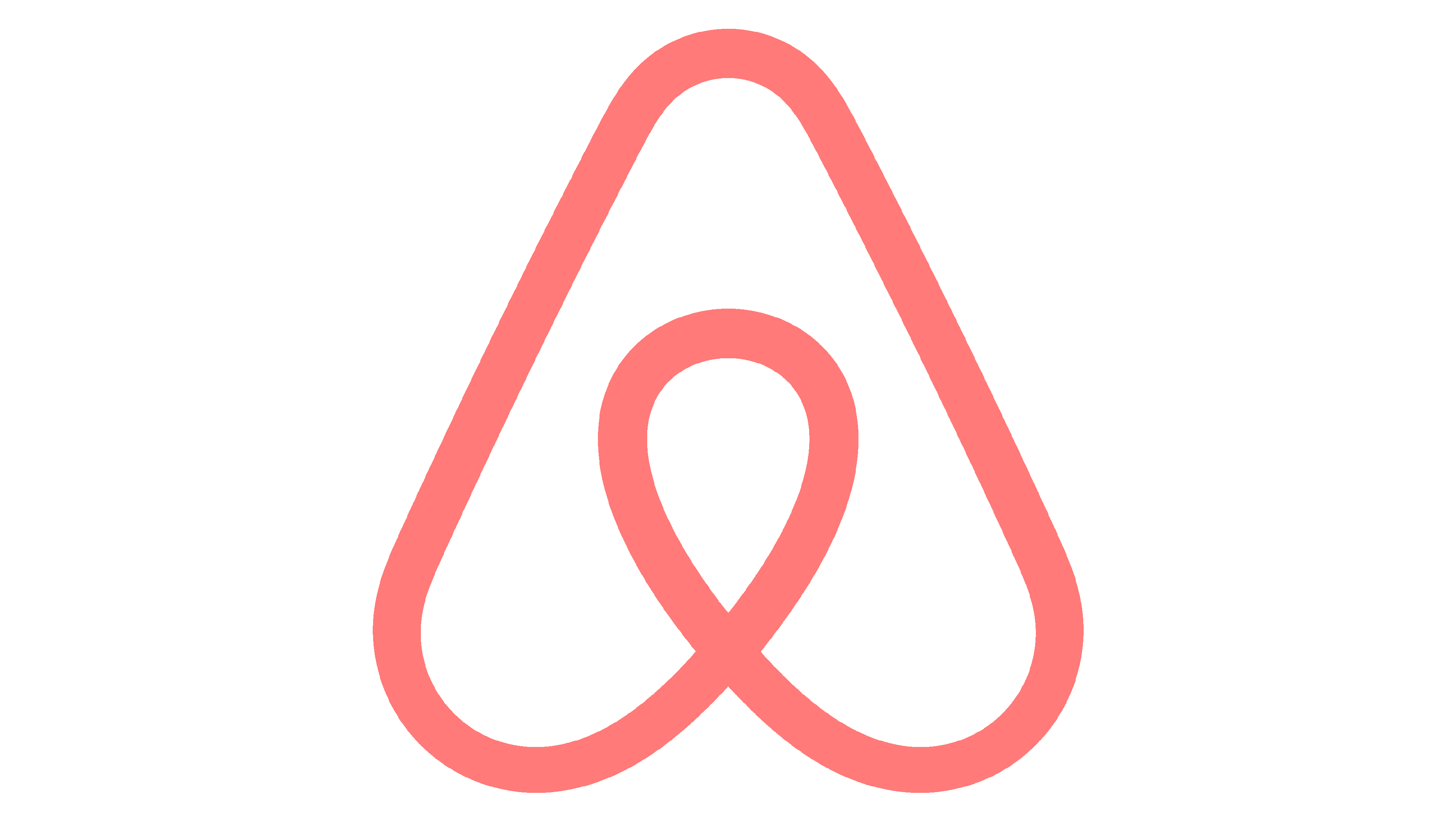
2014 – today
![]()
In 2014, the emblem was updated by the DesignStudio agency from London. The new icon is positioned to the left and accompanied by the name on the right or below. This iteration prominently features a stylized representation of the letter “A,” ingeniously composed of four distinct elements with significant connotations. These encompass people, places, love, and, Airbnb which unites all the former. Collectively, these elements coalesce to form a simple figure, known as “Belong Together.”
Font
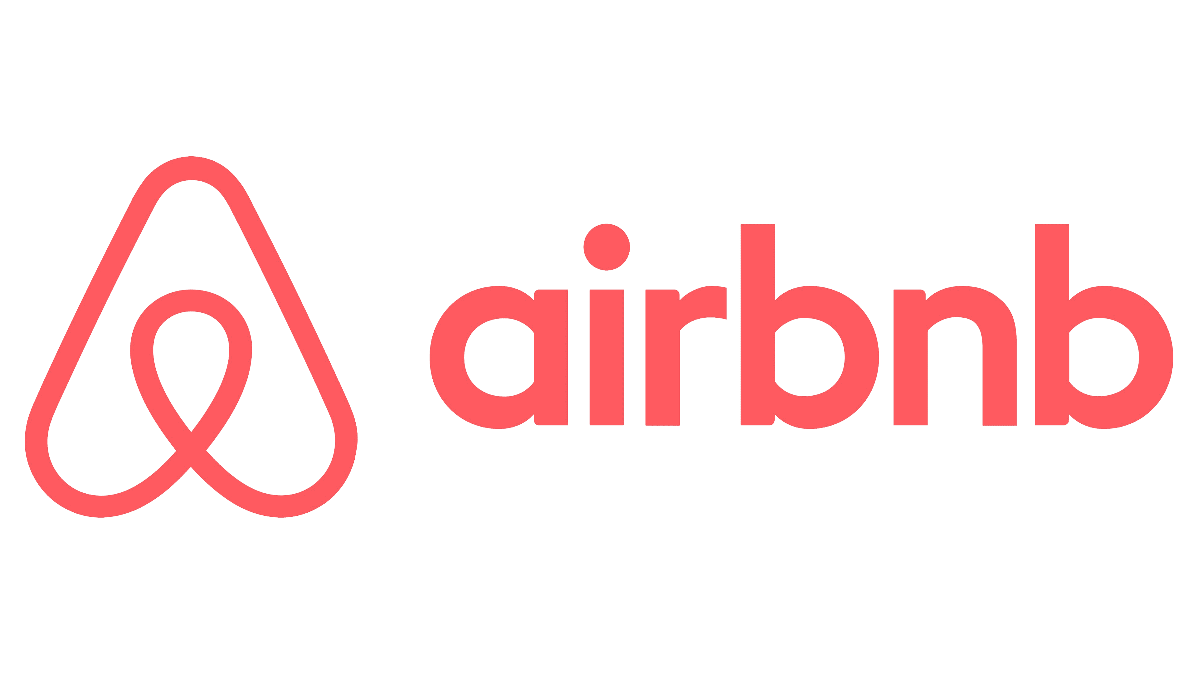
The initial Airbnb font exudes is bold and its letterforms are massive, imbuing a sense of lightness and dynamism. In contrast, the contemporary font is clean and legible. The latter emblem’s inscription has been streamlined, embracing a minimalistic, sans-serif style.
Color
The inaugural version included white and light blue hues, cultivating an ambiance of freshness and tranquility. In the present-day rendition, this color palette has evolved to include a pale red and white.