Yahoo! Mail is the name of an electronic mailing system, owned by Yahoo Corporation. The platform is used by over 200 million users, offered to send letters accompanied by photos and videos to one another. All mails are kept in a special mailbox interface, and they can be organized according to their mood: corporate records, spam, personal, et cetera. Yahoo! Mail also supports messages from the users registered on other email platforms. The service is available on web platforms, mobile phones, and personal computers.
Meaning and history
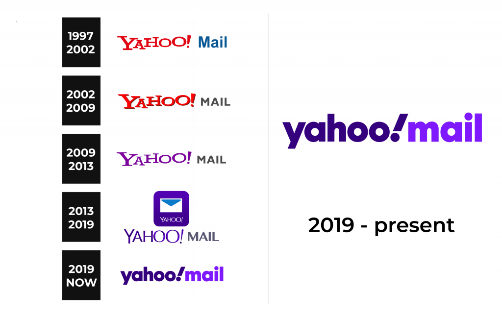
In 1997, Four11 Corporation created one of the first web letter services, named RocketMail. It had quite a similar functional with the modern email boxes. In the same year, Yahoo company bought Four11 with its products. RM engine and features were fully rebranded into the new web service, named Yahoo! Mail. It was drastically redesigned and equipped with the new wordmarks for several times throughout the following years.
What is Yahoo! Mail?
Yahoo! Mail is an American communication’s system, launched in 1997. This is an Internet mailbox, allowing people to write letters to each other. People can add photos, videos, and files to their electronic mails, as well as organize incoming letters in various thematic lists. YM supports receiving messages from the users registered on other email platforms. The service is used by nearly 225 million Internet users and multiple organizations worldwide.
1997 – 2002
The original Yahoo! Mail signboard was a signature with just the nameplate, written in two colors and two fonts. The maker’s name, ‘Yahoo’, was red, and it had a capitalized semibold typeface with prominent angular serifs. All letters had different proportions: the bars of ‘y’, ‘a’, and ‘h’ symbols had unequal length, while the following two ‘o’ letters were one larger than another and placed not at one line.
The blue ‘mail’ word had a grainy style with quite simple sans-serif letters, whereas the ‘m’ was uppercase.
2002 – 2009
The graphical style of the 2002 logotype wasn’t changed dramatically. It still used that ‘Yahoo’ inscription with ‘jumping’ letters, but it got a slight black contour covering all letters. The typeface for the now black ‘mail’ word was, however, redesigned and became fully uppercase. The diagonal bars of the ‘m’ letter were drawn shorter.
2009 – 2013
The only new feature in the fresh wordmark was the repainted violet ‘Yahoo’ word.
2013 – 2019
The 2013 brought a complete redesign to the name caption. The ‘Yahoo’ letters’ bars became equal, while the word itself was enlarged. The characters lost any serifs, and closed to a simpler slim style. Although the new font barely had many similar aspects with the previous styles, some features remained untouched: the second ‘o’ was wider than the first one, and the ‘!’ sign was tilted a bit.
The ‘mail’ word also received a new typeface with the ‘m’ letter’s diagonal bars elongated, and the rest of the letters slimmer than in the 2009 logo. The gaps became smaller as well.
2019 – today
The latter redesign shows the lowercase nameplate with small gaps.
Font
This nameplate features a bold lettering with the same typeface used in both words. The ‘a’ character has a vertical bar, distinguished by small cuts separating it from the rest of the symbol. The ‘!’ sign became even more tilted. All other symbols have a typical appearance.
Color
What’s of the color scheme, so the main mail identity consists of dark violet for the ‘yahoo!’ and brighter violet for ‘mail’ word. Why the violet? Well, it reflects vivid communication, based on creativity and knowledge. These features are suitable for such mail platform as Yahoo! Mail. The differentiation in the shades is made to make the logo more dynamic and playful.


