Initially, Yahoo was an online catalog of interesting websites, but gradually it grew to the size of the largest portal on the entire World Wide Web. It allows one to find a wide variety of information, organized by topic, as well as news, music, etc. Among other things, Yahoo! offers the use of e-mail and instant messaging tools. Today, one of the company’s priorities is to develop in the field of mobile applications and video hosting to the level of effective competition with recognized leaders.
Meaning and History
Yahoo! was founded in 1994 by Jerry Yang and David Filo. For entertainment purposes, they created a site that would serve as a guide on the web. None of them thought about how successful it would turn out to be. In less than a year, by the end of 1994, more than a million unique visitors were visiting the site per month. Their number was constantly growing. In 1999, the company’s market value reached $100 billion. At that time, it became the most valuable IT corporation. According to legends, Yahoo is the university nickname of David Filo. According to rumors, this was the name given to residents of the southern United States, where the talented student was from. The second says that it is short for “Yet Another Hierarchical Officious Oracle”.
What is Yahoo?
Yahoo! is one of the largest American companies that includes a search engine, internet portal, and email service. Search engine Yahoo! ranks second in popularity in the world, and the email service is one of the oldest and most popular on the internet.
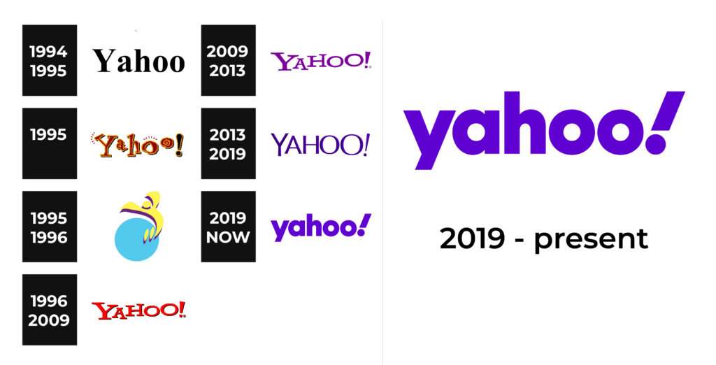
1994 – 1995
The first logo looks sophisticated and timeless thanks to its minimalistic and serious design. It consists only of a wordmark that is done in a classic color palette – black with a white backdrop. For the font, the designers chose no less elegant font with bracketed serifs. The inscription had the first letter capitalized, adding to a traditional look that spoke of the reliability of the service.
1995
The logo now featured a crimson color for the inscription with yellow and black being used for outline and shadow. A unique feature of this logo was the font choice. Although it still had serifs, all the characters seemed to be handwritten. Moreover, they were all of a different size and placed quite randomly, inspiring creativity. They also added an exclamation mark, which became closely associated with Yahoo and its services and products. This logo surely brought more attention to the company. Its bright and bold color palette as well as funky and playful font choice made the platform feel more approachable and user-friendly, encouraging one to try it.
1995 – 1996
It was not long before the last logo was replaced by yet another version. It was even brighter in color and preserved that fun and exciting feel. In the background, one can see a blue circle, which symbolizes our planet and the global reach of the platform. In front of it, there is a yellow jumping figure with a purple shadow. It shows the excitement and joy that Yahoo brings to the world. Finally, the platform name is added at the bottom. It features a sophisticated purple color and all uppercase characters. Although the wordmark is not aligned in one straight line and has characters of slightly different sizes, it looks much cleaner and more professional than the earlier test version.
1996 – 2009
The illustration behind the inscription was removed. The designers left only the inscription, but it did not look boring on its own. It was mainly thanks to the bright red color that many remember so well. The wordmark had a light shadow, which added volume and even more interest to the logo. Despite being a relatively young company, Yahoo did a great job creating a memorable visual identity.
2009 – 2013
No major changes were made this year. In fact, it seems that the inscription was left unchanged. The only noticeable change is the color, which was replaced by a calmer and more sophisticated purple.
2013 – 2019
The logo still consisted of the name but it was now featuring a more cohesive inscription with the characters being relatively the same size and placed on the same line. The inscription now had a three-dimensional look with a black shadow side and a blue or rather dark periwinkle color on the lighted side. There were no serifs, which further created a difference between this and previous versions. The logo presented the company from a more serious and trustworthy side.
2019 – Today
The company introduced yet another look for its logo. It preserved the dark periwinkle color, removing the black and three-dimensional appearance. The font was still sans-serif but it looked completely different. Another major change this time was the fact that the name was printed using only lowercase characters. Such an approach has been used by many companies.
Font and Color
The serif, bold font introduced in 1995 is known as Yahoo by J.F.Y.Daniel Gauthier. It was used in several different versions until 2013 when it was replaced by a simpler, cleaner typeface without serifs and with concave cuts. The latest logo features a font similar to Greycliff CF Heavy font.
Although initially the company went a safe route and chose black for its logo, it was soon replaced by maroon. Another logo featured bright yellow, sky blue, and purple. For over ten years, the company’s logo was done in bold and powerful red. However, in 2009, the company brought back the purple, which gradually turned into blue with a purple tint or periwinkle. This color gave the logo a solid and strong look.


