Xiaomi Logo
Tags: China | household appliances | phones | tablets
Xiaomi was registered on April 6, 2010. Its headquarters are located in Beijing, and a key role in the creation of the company belongs to Lei Jun, who previously worked at Kingstone from 1992 to 2000, where, in the best traditions of such stories, he went from a simple engineer to the CEO of the company.
Meaning and History
For a very long time, Xiaomi’s corporate logo was a stylized inscription “Mi”.
In 2020, there was a rebranding and the company introduced a new logo. There was a kind of cross in the center of the logo, and a multicolored dot between the crossbars. The image was published in Weibo by the head of the company Lei Jun, he called the logo “colorful”.
Xiaomi came up with this logo specifically for the celebration of a major date – the company’s decade (April 6, 2020). And there were really more colors on it than on the previous logo. However, it is not yet clear whether the logo will remain further, or whether it was introduced only for a year to mark an important milestone in its history.
What is a curious fact about Xiaomi?
The company started from scratch, but now its revenue is $ 20 billion, and Lei Jun, according to Forbes magazine, ranks 23rd in the top- richest people in the world. The company employs about 8000 people. They are mainly from mainland China, Malaysia, India and Singapore.
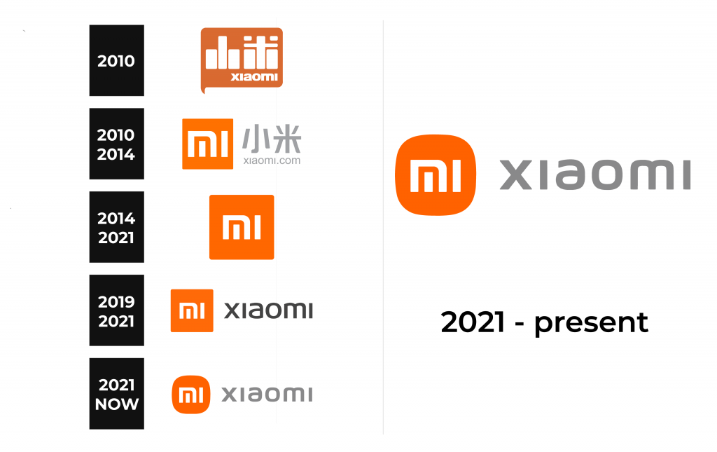
2010
2021 – 2014
2014 – 2021
2019 – 2021
2021 – now
In 2021, Xiaomi introduced an updated logo that will now reflect the company’s perfect flexibility, relentlessness and will to move forward. A short video was dedicated to this rebranding during the second spring presentation of new Xiaomi products.
The logo was designed by renowned designer, Musashino University of the Arts professor and head of Nippon Design Center (NDC) Kenya Hara. The designer chose a superellipse — a square with rounded corners – as the basis. The typography of “Mi” also underwent minor changes. .
The logo is made in the design concept “Alive”. It interprets Xiaomi’s philosophy, giving the brand a visual image full of life: it is a living connection between people and technology. The corporate color remaines orange to convey the vivacity and youth of Xiaomi. Black and silver are used as additional colors to accommodate applications of the high-end product line. The new logo is not just a redesign of the form. Thanks to a softer and rounded contour, the logo became more aesthetic.
Font and Color
At the moment, the main color of the Xiaomi logo is orange. This color conveys the vivacity and youth of the brand. Black and silver colors complement it. They emphasize the belonging of Xiaomi products to high-end products.


