Airtel, officially known as Bharti Airtel Limited, is an influential telecommunications giant from India, established in 1995 under the leadership of Sunil Bharti Mittal. This remarkable company has a strong presence in Asia and Africa and offers a wide range of services, including mobile and fixed telephony, broadband Internet access, digital television and enterprise solutions.
Meaning and history
The company’s name epitomizes its commitment to providing state-of-the-art communications solutions to customers around the world, transcending borders and facilitating limitless communication.
Founded in 1995 by visionary Indian entrepreneur Sunil Bharti Mittal, Airtel began as a single telecommunications operation in Delhi, India and quickly expanded its footprint across the country. In the early 2000s, Airtel spearheaded a revolutionary shift in India’s mobile communications landscape by democratizing mobile phones and making them affordable to a wider population.
Through strategic acquisitions and robust network expansion, Airtel has become one of the largest telecommunications service providers in India, gaining global recognition after expanding into markets across Asia and Africa. With a culture of innovation, customer satisfaction and technological advancement, Airtel has consistently led the telecommunications industry.
The secret to Airtel’s growth and success lies in its ability to adapt to changing market dynamics and technological advances. The company constantly invests in expanding its network infrastructure, expanding its service offering and introducing cutting-edge products that meet the ever-changing needs of customers.
Airtel’s reliability and quality have built a significant and loyal customer base, cementing its position as a pioneer in the telecommunications sector. In addition, the company’s responsibility and corporate citizenship have reinforced its positive image, reinforcing its status as a responsible industry leader.
What is Airtel?
Airtel, an Indian telecommunications corporation founded in 1995, has established itself in the industry as a well-known provider of services ranging from fixed-line telephony to mobile phones, satellite, digital TV, IPTV and Internet TV. With a strong presence in almost 20 countries in Asia and Africa, Airtel has strengthened its position as a key player in the global telecommunications market.
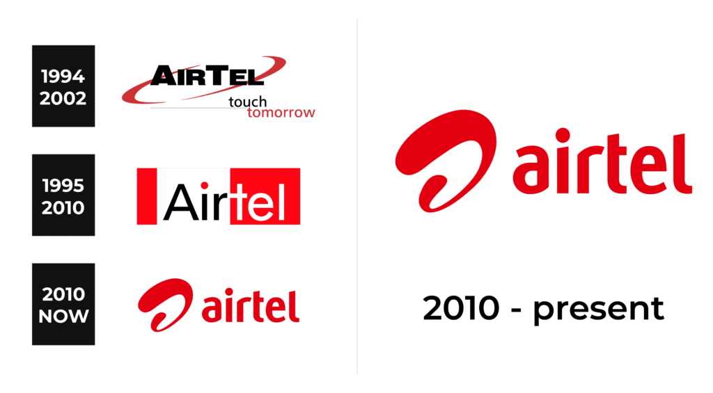
1994 – 2002
During this period, the Airtel logo was a charming red ellipse enclosing the word “AirTel”, exuding a sense of dynamism, leadership, strength and energy. The company name was elegantly styled using a typeface like Bureau Grot Wide Black or a similar typeface, exuding a bold and authoritative feel.
A slogan appeared under the wordmark in two lines. The second line has been set back slightly to the right and is painted in a bright red hue that harmoniously complements the color of the surrounding ellipse.
1995 – 2010
In the 1995 logo, the wordmark was accompanied by two red rectangles. The narrow one was placed to the left of the initial letter “A”, and the wider one became the background for the part of the “bodies”, painted in snow-white color. The word “Air” found its place between the two rectangles, with all the glyphs rendered in classic black except for the dot above the “I”, which had an eye-catching red tint.
Some people also remember the alternate old logo with a black text sign enclosed in a red ellipse. Until 2010, a different emblem was used, with thinner letters inside white and red squares. The dot above the “i” was cleverly placed in an unconventional manner, symbolizing the brand’s commitment to innovation.
2010 – present
As the company expanded globally, a new branding strategy was needed and a rebranding began in India in 2010 with a new logo designed by London-headquartered The Brand Union. The heart of this logo is a stylized “a”, affectionately known as the Airtel wave. The name was chosen after a six-month online competition.
Font
The Airtel name lettering displays an exceptionally distinctive typeface that artfully complements the logo, resulting in an aesthetically appealing visual harmony. Some of the glyphs appear to be creatively carved, as seen in the “a” and “r”.
Color
Red takes center stage in the logo, symbolizing passion, energy and dynamism, according to the company’s explanation. In earlier versions, bright red and white coexisted alongside black and dark red, creating a more complex color palette.


