Apple Inc is a company that revolutionized the market for PCs and mobile devices. It became a pioneer in many branches of the computer industry. Fifty years later, there’s no denying that it has profoundly impacted technology and how and where we use these devices. Apple is not only a huge and recognized brand, but also a lifestyle of product owners. Its logo is a representation of an amazing reputation, incredible aesthetics in gadget design, and unique innovations.
Meaning and History
Apple Inc. was born from Stephen G. Wozniak’s dream of building his own computer. His concept of a microcomputer was rejected by Hewlett-Packard. So, he founded his own in April 1976 with Steve Jobs, who sold his minivan and offered his garage to make it possible, and Ronald Wayne, who sold his share for less than $1, 000 less than two weeks later. Professional management and substantial funding later came from Regis McKenna, a prominent public relations professional, and Mike Markkula, a wealthy Intel veteran. Astonishingly, by 1980, the business made over $100 million in profit and had more than a thousand employees. However, Apple soon faced competition from the IBM Corporation. Due to poor sales performance, CEO John Scully exiled Jobs from the business in 1985. Wozniak left Apple the same year. Fortunately, Apple released an affordable laser printer that was used with Aldus Corporation’s PageMaker program and developed another in-demand program. This became a beginning of a golden era for Apple. A series of ups and downs are an undeniable part of this outstanding brand.
What is Apple?
American corporation Apple Inc. develops, produces, and sells PCs, mobile devices, and music players along with related software, services, solutions, and third-party digital content and apps. It sells its products worldwide through online and retail stores.
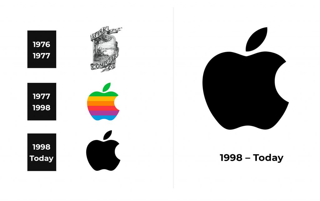
1976 – 1977
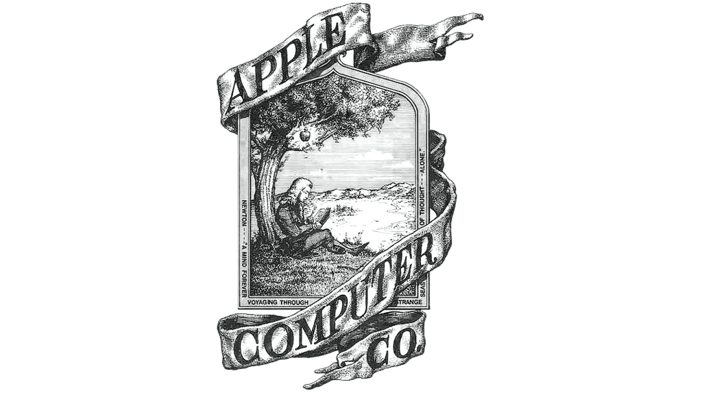
On the emblem created by Ronald Wayne, Isaac Newton, who not even realizing that a fateful apple is about to fall on him, is portrayed under a tree. It is a very detailed and realistic pencil drawing. A quote from William Wordsworth’s poem is written around the border. A ribbon wrapping the image holds the “Apple Computer Co.” inscription done using capital letters with serifs. The emblem is printed in black and white.
1977 – 1998
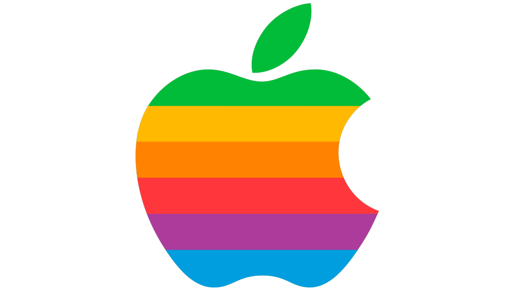
Although the “Newton logo” was very unique, detailed, and had meaning behind it, it was decided to redesign it. Rob Janov came up with an iconic “Apple” image, which was meant to attract the attention of buyers and present Apple as a trustworthy brand. He drew an apple that had been bitten on the right side. Although there are multiple versions as to why it’s not drawn whole, the one told by the designer seems to be the most truthful. He simply felt like it resemble a tomato and the bite left no doubts about what fruit it is. It took the artist only a week to visualize what will become a recognized brand image. Jobs had an idea to add six multicolored, horizontal stripes that started with light green at the top and followed a rainbow pattern to make it less plain.
1998 – Today
The colorful stripes were no longer appropriate and were replaced by solid black. Actually, the artist originally proposed a monochrome version in 1977. However, it took the founders some time to realize that it would be the best choice for their brand. So far, this is the longest the brand went without changing its symbol. Although, there were alternative versions for some of its products, such as light blue and a silver apple.
Font and Color
The original emblem had a black-and-white color palette. Rainbow colors are seen in the 1977 version. At the time, they were appropriate as the company was introducing colored screens. Then, it went for the classic, powerful choice – a solid black. This color proved to be a perfect choice for many outstanding brands and can always withstand the test of time. Only the original had inscriptions. The quote on the border was done using a basic, sans-serif font, while the name was printed using a more exquisite, serif font.
