xHamster, a popular 18+ content platform, is managed by Hammy Media Ltd. The entity was conceived by Alex Hawkins. Rooted in Cyprus, the platform caters to a global audience with its vast range of content.
Meaning and history
Founded in 2007 by Alex Hawkins, xHamster has since grown into a leading content provider. Its prominence is rooted in features like user-generated content and an in-built social network. Presently, it retains its strong global standing, serving millions of users from its Cyprus base.
One of the interesting features of XHamster that sets it apart from other porn sites is the ability to book a private video chat with one of the models. During the pandemic, it was this service that made the platform incredibly popular, and the number of visits grew to over 30 million per day.
What is xHamster?
xHamster is an content platform, renowned for user-generated content and social networking features, operated by Hammy Media Ltd. based in Cyprus.
2007 – 2016
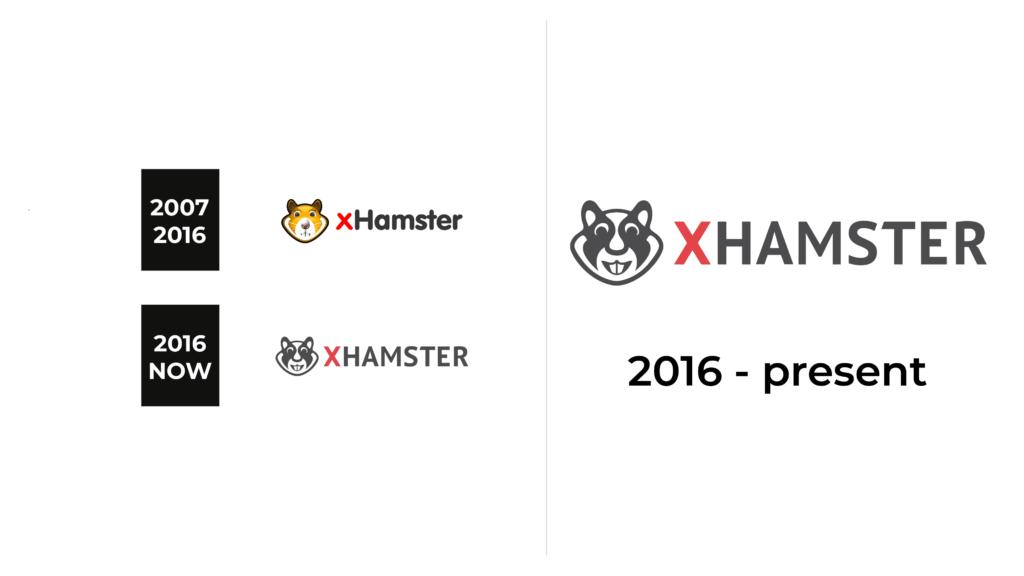
The first logo was created for xHamster in 2007 and stayed untouched for a bit less than ten years. It was a bold wordmark in red and gray, set in a rounded sans-serif typeface and placed on the right from a graphical emblem, depicting a funny cartoonish hamster. The red “X” in the lettering was set in the lowercase, while the gray “Hamster” — in the title case, with the “H” capitalized. As for the emblem, it was drawn in a yellow and brown color palette.
2016 – now
The redesign of 2016 has simplified and at the same time strengthened the xHamster logo. The emblem with the animal’s head was redrawn in a more minimalistic style; with only gray and white colors, while the inscription got rewritten in the uppercase of a geometric sans-serif typeface, with the first letter set in red, and all others — in gray.
Font and color
The bold uppercase lettering from the current logo of the XHamster platform is written in a modern sans-serif typeface with the left part of the T-bar cut diagonally, and the right one — straight. The closest font to the one, used here is PT Sans Pro Bold, or Calima Bold.
In terms of color, the XHamster logo is quite modest, using gray as the main shade, but adding a drop of the passion of power with the deep-red “X”.


