Big Idea, an American animation company founded in 1993 by Phil Vischer and Mike Nawrocki, is famed for creating ‘VeggieTales,’ a series blending Christian themes with child-friendly storytelling. Known for its humorous, computer-animated tales featuring characters like Bob the Tomato and Larry the Cucumber, the series gained widespread popularity for its engaging approach to teaching moral and biblical values.
Meaning and History
![]()
Founded in 1993 by Phil Vischer and Mike Nawrocki, the company quickly made a mark with its unique computer-animated, direct-to-video series. ‘VeggieTales’ became popular for its blend of humor, catchy songs, and moral lessons, appealing to a wide audience. The characters, like Bob the Tomato and Larry the Cucumber, became iconic, teaching biblical values and ethics through both biblical and original stories.
However, the company’s ambitious expansion into feature films led to financial challenges, exacerbated by a costly lawsuit, resulting in bankruptcy and a change in ownership. Despite these setbacks, ‘VeggieTales’ continued under new management, maintaining its status as a beloved children’s series, though with some changes. Big Idea’s contribution to children’s media, particularly in Christian entertainment, is significant, paving the way for similar content. The company’s story reflects the impact of values-driven storytelling in children’s entertainment.
What is Big Idea?
Big Idea is an American animation studio, renowned for its ‘VeggieTales’ series, which combines Christian themes with engaging children’s entertainment.
1989 – 1993
![]()
Initially, a minimalist line drawing depicts a stylized symbol, a nod to GRAFx Studios, the company’s original name. A monochromatic scheme highlights the simplicity of early graphic designs, with a lightning bolt for a touch of energy.
1993 – 1994
![]()
The brand name ‘BIG IDEA PRODUCTIONS’ then comes into play, spelled out in bold, block capitals in a rectangular frame. A heavy, solid typeface conveys stability and a notable presence, continuing the minimalist monochrome theme.
1995 – 1996
![]()
Next, the design brings in animated figures of a cucumber and a tomato, indicating a shift toward storytelling. These characters, vibrant against the ‘BIG IDEA’ text, start to personify the brand’s playful character.
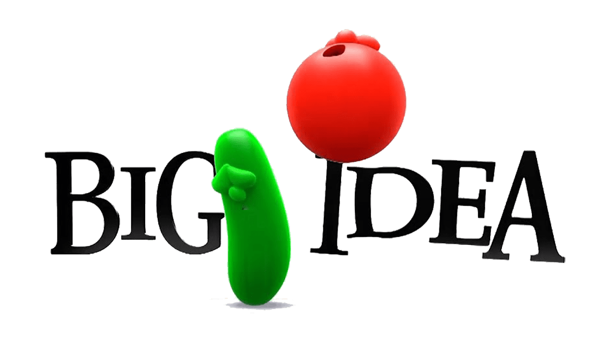
1997 – 2006
![]()
The logo further evolves into a more refined aesthetic, maintaining whimsy at its heart. ‘BIG IDEA’ lettering becomes more polished. Each character is slightly flattened for a unified brand image.
1999 – today
![]()
Continuity in design is maintained as the figures grow more central in the brand logo, their bright colors set against a dark background for added prominence.
2016 – 2020
![]()
Subsequently, the characters receive a two-dimensional update, offering a modern and engaging look. The ‘BIG IDEA’ text takes center stage in the visual identity.
2020 – today
![]()
The new logo is further simplified, emphasizing the symbols that have become synonymous with the brand. The text ‘BIG IDEA’ is designed in an elegant, modern style, embellished with subtle highlighting of the lower ends of some letters.
Color
The brand has usually been avoiding major graphic elements throughout its history. Name caption, whose color depends on the backdrop and plays a dominant role in the brand’s identity. Its third logotype has introduced the brand’s cartoon characters, a cucumber, and a tomato, colored green and red, respectively.
Font

The typeface in the Big Idea logo chronicles a shift from stark functionality to playful engagement. It begins with the straightforward, no-frills font of the GRAFx Studios emblem, showcasing the utilitarian design trends of the late 1980s. As the brand matures into ‘BIG IDEA PRODUCTIONS,’ the letters take on a hefty, block-like appearance, communicating a sense of established presence. The transition to a more rounded, accessible font coincides with the brand’s pivot towards storytelling, reflecting a move from corporate to creative.