BBC Logo
Tags: British | news agency | TV
The BBC carries out both television and radio broadcasting in Britain and other countries of the world. The company operates several television channels in Great Britain. The BBC News Division is the world’s largest news broadcaster and publishes around 120 hours of radio and television production every day, as well as online news. With its excellent reputation, influence, variety of communication forms, and privileges, the position of the BBC makes it possible to attract talents, update forms of broadcasting, and produce quality content.
Meaning and History
One of the most famous media corporations in the world was founded in 1922 by a group of entrepreneurs as a private company. The first radio program was done on November 14 of that year. Just five years later, the company was granted a royal charter and nationalized by the government, although it remained independent in its editorial policy and enjoyed extensive self-government. International broadcasting began in 1932. Television programs were also launched in 1932, initially by Baird’s company, which later became BBC One as in the mid-sixties, the BBC opened a new channel. Unfortunately, with the beginning of the war, the broadcast had to be stopped until it was over. In 1967, BBC was the first to show TV programs in color in Europe. In 2003, the company started satellite broadcasting. The company’s 100th anniversary was celebrated in 2022.
What is BBC?
The main motto of the company is “to inform, educate and entertain”. Besides entertaining films and TV series, popular science programs make up a significant portion of the BBC content. Over the years, the company expanded its broadcasting to almost all regions of the world and added television and the internet to radio broadcasting.
1958 – 1963
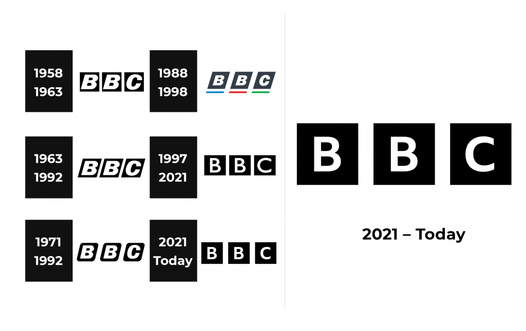
It is interesting that until 1953 the company did without a logo. Since broadcasts were now done internationally, the company needed a good logo that would be easily remembered and instantly recognized. It was designed by Abram Games. The initials of the corporation were placed on square bases. The white letters contrasted well against the black background. They are bold and italicized and almost fill the squares.
1963 – 1992
The logo looks almost the same. The only difference is that the square base was replaced by parallelograms. This shape repeated the angle of italicized letters and created a more even frame around each one.
1971 – 1992
Once again, there were minimal modifications. They consisted of rounding the corners of the black bases. This way, they repeated the rounded shape of the letters. In addition, the square bases were spaced further apart, giving it a bolder appearance and making the corporation look strong and confident. Abram Games was the creative designer again.
1988 – 1998
This logo is a lot different than any other version. It brought back the square corners and added some color. The squares are not pitch black anymore. Instead, it is a dark gray color. In addition, the letters got smaller and used a different font. The most noticeable change is a colored line under each square. The colors start with blue, followed by red, and then green.
1997 – 2021
Martin Lambie-Nairn designed a logo that looked a lot more like the original one with a square, black base behind the letters and no other elements. The spacing between the blocks was made smaller again. However, he changed the font to Gill Sans, which made the letters look thinner. For the first time, they were no longer italicized and there was more space around them. As a result, the BBC logo looked more sophisticated while reminding about the corporation’s roots.
2021 – Today
A custom-designed font was introduced in 2021. It was called BBC Reith Sans Bold and had a lot in common with the font seen in the previous logo. This logo featured smaller initials compared to other versions. However, the lettering was not italicized and the designers kept the black squares, which made the logo resemble the previous version.
Font and Color
The original logo used an italicized Univers Extra Black Oblique font. It was used in several logo versions, until 1992. The 1988 version used Helvetic Neue Black Oblique font, which looked very similar to the original one. In 1997, it was replaced by Gill Sans font, while the most recent one used a custom font called BBC Reith Sans Bold designed by BBC Creative Wolff Olins. With an exception of one logo, BBC has always used a black-and-white color palette, which gave the logos a timeless, classic look. The logo presented in 1988 was the only exception. It not only used dark gray instead of black but also had colored lines.
