Wingstop is a franchise network, spreading chicken wings across more than 1,400 establishments. It offers a variety of welcoming dining establishments, including restaurants, bars, and sports bars, all designed in the aesthetic of the 30s/40s. The customers can find a large menu of chicken wings with 10 flavors, including Louisiana Rub, Mild, Hickory Smoked BBQ, Lemon Pepper, Garlic Parmesan, Hawaiian, and Teriyaki.
Meaning and History
![]()
The Wingstop brand is relatively young. Its establishment dates back to 1994, marking it as one of the freshest faces in the food service industry. Founded by visionary entrepreneur Antonio Swad in Garland, Texas, this franchise has navigated numerous challenges to attain global popularity and widespread recognition. Today, its thematic logo resonates worldwide, echoing a fusion of rock and aviation aesthetics, blending raw energy, a thirst for exhilaration, and a passion for freedom.
But why this particular design for an emblem and establishments in the culinary realm? The answer is as straightforward as it is fitting: it embodies the very essence of Wingstop. Inspired by the pre-jet aviation style of the 1930s and 1940s, the brand exudes this vintage allure across its visual elements. Embracing a restrained, masculine, and austere decor, it also serves a practical marketing purpose – harmoniously uniting two seemingly contrasting realms: aviation and culinary excellence.
What is Wingstop?
Wingstop is a Texas-based network of fast-food restaurants and bars, that controls about 1,400 locations country-wide. Its menu revolves around fried chicken wings in different flavors, served with additional beverages and snacks.
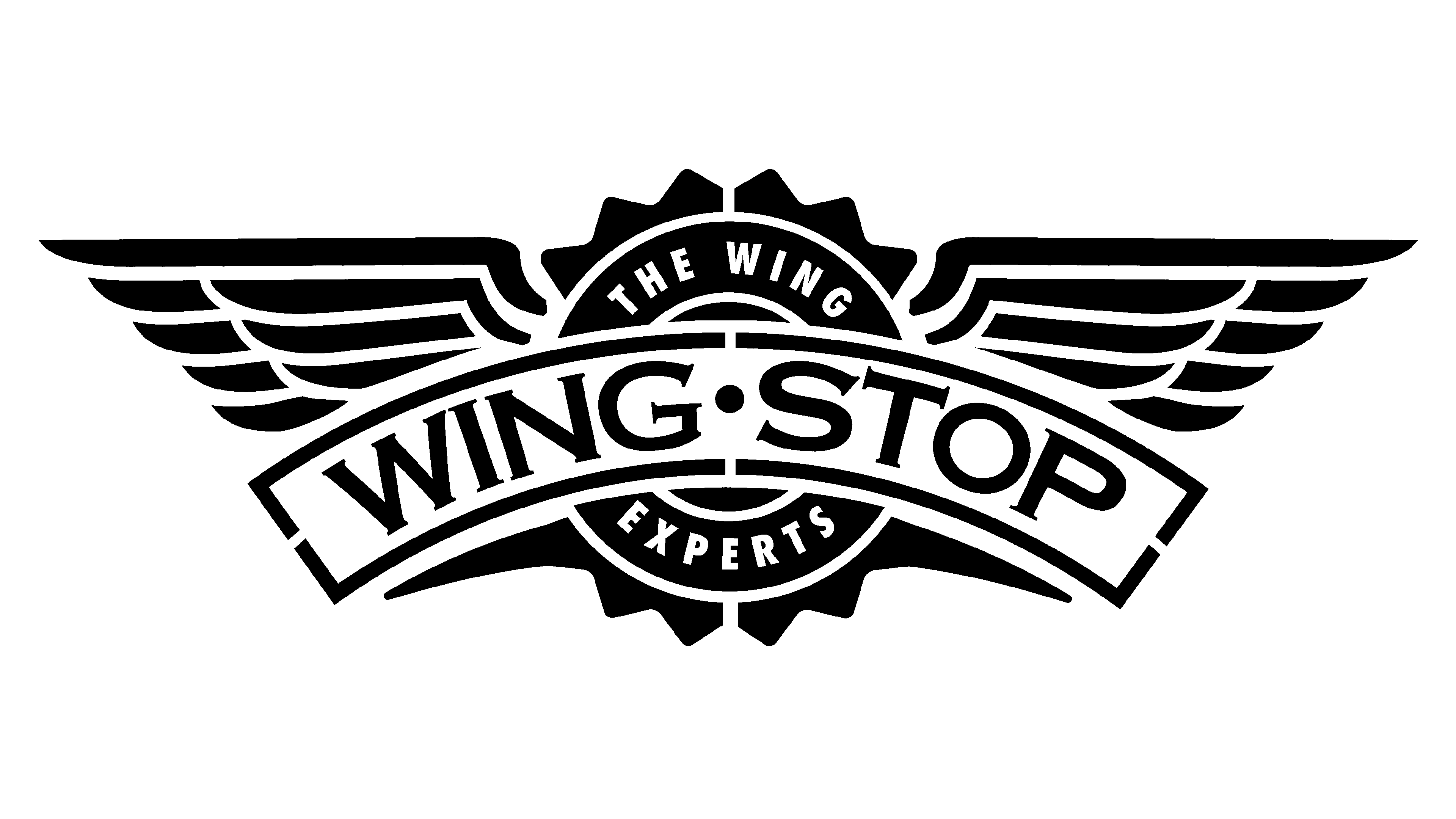
1994 – 2014
![]()
At the heart of the original logo lies the imagery of expansive wings, sporting a timeless design. The feathers serve as the foundational element. In the emblem’s center, a circle with the inscription ‘The Wing Experts’ finds its prominent position, covered by a large arched ribbon featuring the name in a thick uppercase typeface with small serifs. Each letter has a contour, giving a 3D effect. The aforementioned circle has to contours and multiple spikes at the edges, making it look rather like a bottle cap.
2014 – today
![]()
In the 2014 redesign, subtle enhancements were made to the wing and central seal contours, infusing them with a bolder, more contemporary aesthetic. Yet, the most significant transformation lay in the logo’s color palette, as the once dark green hue transitioned into a lighter, more vibrant shade.
This lively transformation rendered the logo notably friendlier and more engaging. The lettering style underwent a slight modification as well, shedding its shadow lines, and further modernizing the composition while maintaining its timeless appeal. Additionally, the feathers have become segmented by small gaps.
Font

The uppercase lettering adorning the arched ribbon in the Wingstop logo boasts an elegant typeface characterized by substantial bars and delicate triangular serifs gracing their endpoints. The closest font matches to this distinctive style are likely Copperplate SH Bold or Copper Penny CAS SC, albeit with a slight extension of the characters.
Color
Regarding the color palette within the Wingstop visual identity, it revolves around a vibrant shade of green, balanced by white. It’s a perfect color choice that reflects a wide spectrum of things from success and growth to freshness and quality of food served in the restaurants.