Burger King mainly sells grilled hamburgers, several types of chicken sandwiches, French fries, including those with spices, snacks (nuggets, wings, chicken fries, etc.), breakfast items, and carbonated drinks. It also offers desserts such as milkshakes, ice cream, muffins, donuts, brownies, and apple pies. Burger King is now part of Restaurant Brands International Inc. (RBI) a Canadian-American international fast-food holding company
Meaning and History
Keith Cramer and Matthew Burns open the Insta-Burger fast in Florida in 1953 after being inspired by McDonald’s. It became the origin of the future half-century competition. Almost immediately after its opening, the restaurant began to have financial difficulties and did not last even a year. In 1954, two franchisees, David Egerton and James McLamore, purchased it and rebranded it as Burger King. Three years later, Burger King introduced its flagship product, the Whopper, the classic burger. The huge burger was loved by the customers. 8 years after the launch of the franchise, the company managed to open almost 300 establishments with the brand logo in the USA.
What is Burger King?
Burger King is the second largest fast food chain after McDonald’s not only in the US but also beyond its borders. The brand is open about its commitment to first-class ingredients, signature recipes, and family dining.
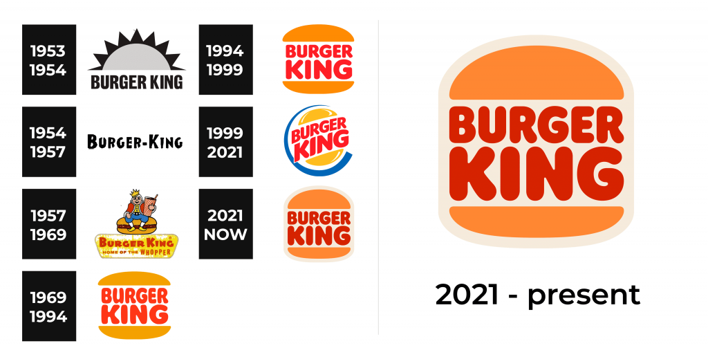
1953 – 1954
Originally, the emblem was done in black and white with “Burger King” written in bold, sans-serif typeface under a semicircular sun. It was simple, but the bold, sans-serif lettering and all uppercase letters create an image of a solid establishment.
1954 – 1957
After the network was bought out, the new owners left only the “Burger King” portion of the emblem, removing the sun. This version ran for three years.
1957 – 1969
The royal figure did not appear on the logo immediately. It was added in 1957 and then completely disappeared. The burger served as a throne for the monarch with the brand name underneath and “Home of the Whopper” placed on a yellow shape below. It was a funny and positive image.
1969 – 1994
This emblem gave birth to a logo design idea that Is still used today. The mascot character was replaced with an emblem that featured the brand’s name sandwiched between two halves of a bun. In advertising, this logo was used along with the slogan: Do it your way. The chain emphasized that even though McDonald’s has fast service, people cannot change the menu to their liking in Burger King.
1994 – 1999
The updated logo looked very similar but featured a more conservative font. The buns have also changed their look. A darker shade and a thicker upper half of the bun looked much more appetizing.
1999 – 2021
In 1999, Sterling Brands’ design agency added a blue semi-circular line to the classic minimalist logo that framed a bun. The but was now a bright yellow with glowing edges, while the brand name was written in dark red bold. The logo looked fun and friendly.
2021 – Today
In 2021, top management decided to return to the early version of the logo, removing the blue line and glowing edges on the bun. “We don’t have blue food,” ex-CMO Burger King Fernando Machado commented on the logo change. “Besides, the buns don’t shine.” This logo version was designed by Jones Knowles Ritchie.
Font and Color
Burger King has always used a bold, sans-serif font with all uppercase letters. In some cases, the strokes were solid and straight, while in others they looked a bit wonky and were combined with rounded ends. Although there were periods when the brand had more colorful logos, it typically had red and beige/yellow as the main colors with white as a neutral color. The red was used as a bold, powerful color that attracted attention, while the other two served as a good base.
