The McDonald’s brand is associated with world fame, leadership in the fast food spere, and feelings of pleasure and joy. Every year the company is actively developing, growing its capital and network of restaurants, and competing with other well-known brands, such as Burger King, Subway, Kentucky Fried Chicken, and Pizza Hut. Although the chain is often blamed for unhealthy food and widespread obesity, the latest McDonald’s programs have calorie counts and allow for a fairly healthy menu.
Meaning and History
Dick and Mac McDonald established their own small restaurant, primarily aimed at drivers. In 1948, eight years later, they changed their focus to hamburgers. Since burgers already existed, they developed a production method. It allowed for increasing the speed of service, making the dishes cheaper and serving more people, which ultimately led to commercial success. Real success came in 1952 after the publication of an article in the American Restaurant Magazine with the first requests to open establishments under their brand following by. A year later, they met Ray Kroc, their mixer supplier who became their franchisee in 1955. Encouraged by the income he received, he bought the entire McDonald’s chain in 1960 for $2.7 million. McDonald’s remains the most developed fast food chain in the world to this day.
What is McDonald’s?
McDonald’s is one of the world’s largest chains of fast food restaurants that operate on a franchising system. It is hard to believe that the founders of the greatest corporation were simple assemblers of Hollywood scenery.
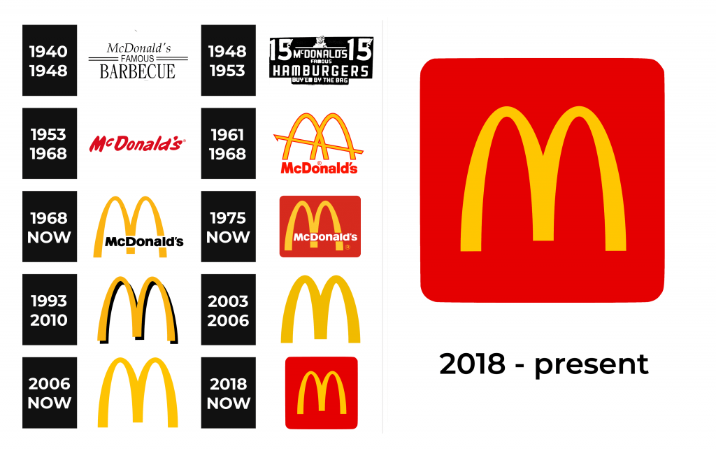
1940 – 1948
The first McDonald’s logo was very minimalistic, yet stylish and with a professional touch. It stated “McDonald’s” in serif, italicized font. The second line had “Famous” printed in all uppercase letters and featured a basic, sans-serif typeface. For accent, it had two parallel lines going horizontally on the right and left of it. The bottom line grabs the most attention as it has “Barbecue” printed in a bold, serif font with all letters capitalized and is much larger than the other inscriptions.
1948 – 1953
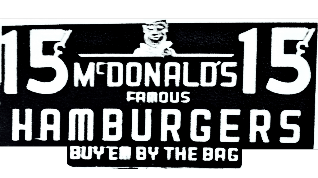
The new logo looks more like a billboard. The goal was to allow customers to quickly identify that they could get hamburgers and fast food here. Thus, besides the name, there was its specialty (hamburgers) and a flashing chef to indicate that the customers will be served as fast as possible printed in white on a black background. It also specifies the price per dish – 15 cents.
1953 – 1968
This is another simple logo, but not as elegant as the original. It introduced the red color, which was used for the name. The inscription has very smooth curves and uneven thickness of strokes.
1961 – 1968
A logo created by Jim Schindler featured a diagonal line crossing the arches, which the food chain was recognized for. A red outline appears around all the elements. It goes well with the name, which is also written in red right underneath the emblem. The latter is done using a new, yet basic, sans-serif font that had thick, bold strokes.
1968 – Today
The fast food chain went global, so Ray Kroc wanted to design a logo that would appeal to all corners of the planet. His idea was simple: get rid of two arches and connect them to form the letter “M”. Now, the name of the restaurant crosses the rounded letter “M”. This logo became the basis for all the other logos.
1975 – Today
Just like the previous two, this logo had Jim Schindler as the designer. Although the basics were the same, it had a completely different feel thanks to a red background in the form of a rectangle with rounded corners. The black was swapped for white.
1993 – 2010
The yellow “M” acquired some volume thanks to a dark shadow behind it. There were no other elements, but it was recognizable even like that. Initially, this emblem was designed for McKids but became the brand’s logo in 1995 with the introduction of new packaging.
2003 – 2006
The shadow was replaced by thicker lines of the “M” itself. It was done using Helvetica Neue 75 Bold font, and presented to the public along with the advertisement campaign known as “I’m lovin’ it”. Just like some other logos, it was still being used in one way or another even after the main logo was updated.
2006 – Today
Dalton Maag made the arches look thinner, similar to what they were like back in 1968. It was just the familiar “M” without any outlines, shadows, and other elements.
2018 – Today
A red background was brought back in 2018. Since it was just the initial, the background was in the form of a square with rounded corners.
Font and Color
The original logo featured three different fonts. Thanks to serifs and italicized letters, it had a classic touch. The next version used a very basic, bold font. The logo introduced in 1968 as well as the one created in 1975 features a modified version of the Helvetica Neue Black and stayed with the company until 2006 with a few modifications. It was not until 1953 that the black and white color palette was replaced by a dark red. Then, a yellow was introduced in 1961. It became the main color in 1993. The bold red was brought back in 2018. Overall, a sunny yellow and red dominated the color palette. These logos are full of energy, happiness, love, and strength.
