Founded by Dan W. Evins on September 19, 1969, in Lebanon, Tennessee, Cracker Barrel has established itself as an iconic American restaurant and retail chain, renowned for its seamless fusion of high-quality offerings at affordable prices.
Meaning and History
![]()
Known as Cracker Barrel Old Country Store, this chain uniquely intertwines restaurants with retail stores, offering a diverse array of goods spanning souvenirs, toys, apparel, and beauty products. The innovative concept, conceived by Dan Evins, a Shell Oil sales representative, initially envisioned restaurants and stores within gas stations, strategically positioned along highways.
The inaugural Cracker Barrel store in Lebanon, Tennessee, laid the groundwork for an expansive chain, boasting nearly 650 restaurant-stores across 44 states, predominantly in the Northeast and South regions of the United States. The chain maintains uniformity across its stores in terms of design and menu offerings, while its retail component regularly refreshes its assortment, highlighting popular holidays and seasonal sales, often accentuated by vibrant store decorations.
What is Cracker Barrel?
Cracker Barrel Old Country Store seamlessly integrates dining establishments offering home-style country dishes with retail outlets featuring an array of home goods, souvenirs, and cosmetics. Its broad appeal and distinctive combination of hospitality and retail experiences have firmly established it as a quintessential American culinary and shopping destination.
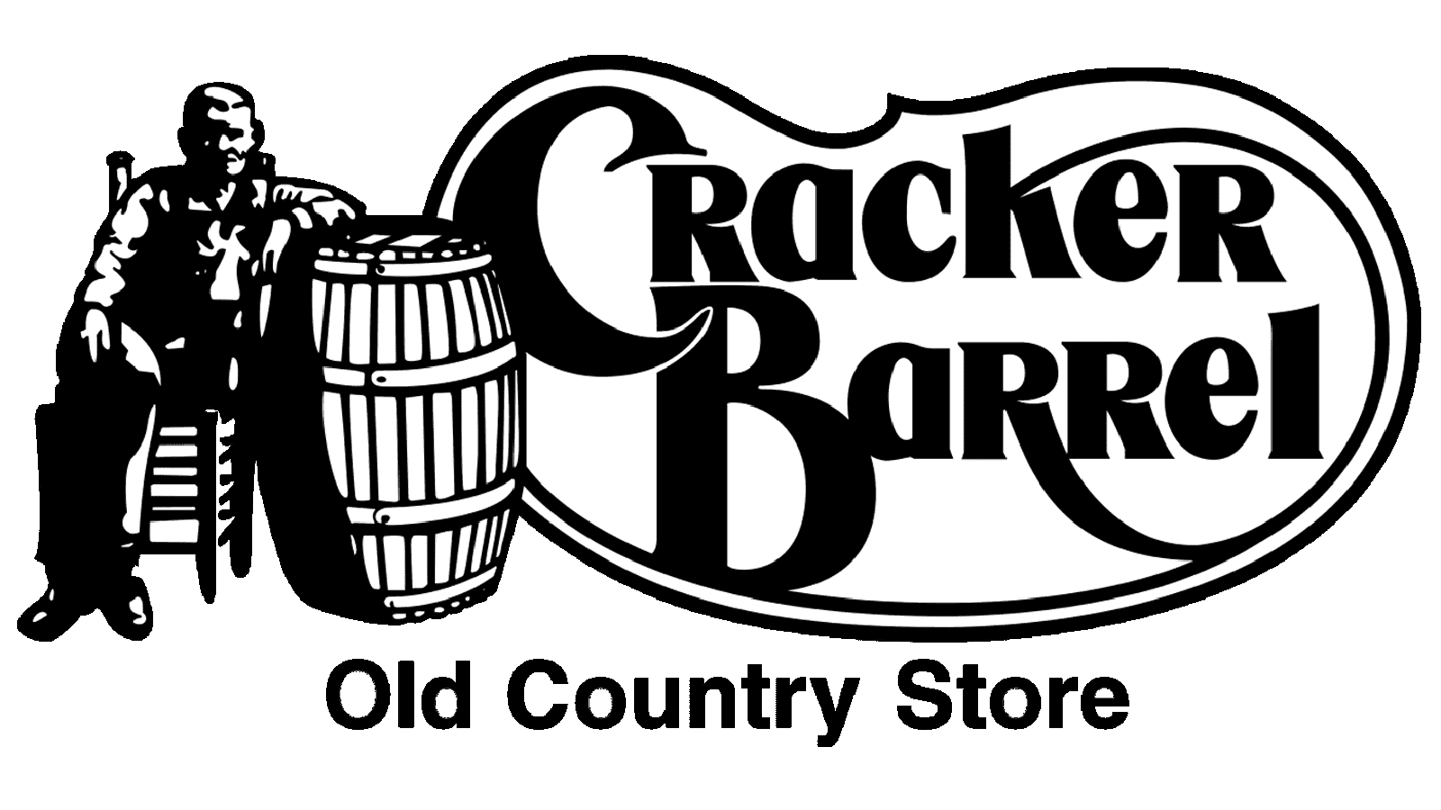
1969 – 1977
![]()
The original logo featured a stylized inscription in a designer wishbone-style typeface, evoking an old Western saloon ambiance. The “Old Country Store” line adopted a more modest yet stylized uppercase font.
1977 – 2006
![]()
This era defined the visual identity with an image of a man by a sizable wooden barrel, accompanied by a smooth yellow banner housing warm brown lettering. The tagline employed a classic Helvetica font, while the primary wordmark showcased a unique designer typeface.
2006 – 2015
![]()
A redesign aimed to intensify colors and slightly modernize graphical elements and lettering, reflecting the brand’s evolution towards a more contemporary appearance.
2015 – today
![]()
The latest iteration introduced a more concise typeface for the wordmark and refined contours within the interior frame, enhancing a flatter yellow background. The tagline underwent a stylistic shift, becoming capitalized and narrowed.
Font
The primary Cracker Barrel lettering employs a custom font reminiscent of Goldenbook Black or Qeskile Voyage Medium, modified for a distinct brand identity. The tagline utilizes a simplified uppercase sans-serif akin to Bison Bold or Uniform Pro Extra Condensed Bold. A warm color palette anchored in yellow and brown has remained a constant since the 1970s, fostering a welcoming and homely ambiance.