Wendy’s is the iconic American hamburger company. The new network had several features. First, Dave developed a system for preparing burgers, in which the roasting did not begin until the order was placed. Secondly, all hamburgers were square. “At Wendy’s, we don’t cut corners,” Dave said in the ad. Finally, one of Wendy’s key advantages was the ability to buy a meal without even leaving one’s car. Of course, the massive experience gained while working for the famous Colonel Sanders helped the founder a lot. His endless innovations made Wendy’s one of America’s most beloved chains.
Meaning and History
![]()
On November 15, 1969, Dave Thomas opened his own fast-food restaurant in Ohio. It was named after one of his daughters with the nickname Wendy. In 1976, the five hundredth restaurant was opened, and two years later – the thousandth. By 1980, two thousand establishments were already operating under the Wendy’s brand. In the 1990s, the chain began to actively spread around the world with new locations opening in Mexico, New Zealand, Turkey, Indonesia, Greece, and Guatemala. In April 2009, the company merged with the Arby’s brand, and since then the new Wendy’s/Arby’s, Inc. is the third largest chain of fast food restaurants in the world.
What is Wendy’s?
This is an American fast-food chain specializing in burgers. Thomas, the founder, decided to create something unique to set his restaurant apart from the others. The square shape of hamburgers became that detail that attracted people to Wendy’s.
1969 – 1971
![]()
The name was printed in large letters of a red color with block serifs. The first letter was capitalized and stood straight while the others created a curve. Underneath, there was a black, decorative element that underlined the name and was connected to a round frame holding a drawing of a cute redheaded girl. It is supposed to be a portrait of a girl the restaurant was named after. The “Old Fashioned Hamburgers” inscription at the bottom suggested that even though Wendy’s hamburgers do not look standard, they still have that yummy, homemade taste everyone loves. The lettering on the top line reminded of an Old English style typeface, while the second line had a more reserved and bold look with large, block serifs.
1971 – 1975
![]()
A couple of years later, the logo was updated by adding a “Quality is Our Recipe” inscription. It was done in small, black, basic lettering and placed around the inner perimeter of the round frame, curving above the adorable girl’s head.
1972 – 1976
![]()
This logo has the same idea as the original, but with a few details modified. First of all, the inscription at the bottom of the emblem was placed higher and aligned to the left instead of being centered. The decorative element was also slightly redrawn and no longer touched the portrait. As for the portrait, it looked slightly different as the girl now had her hair match the color of the word “Wendy’s”, her face was white instead of beige, and the shirt was also redrawn. She looked more like a character from cartoons.
1976 – 1983
![]()
In 1978, the designers added a bright background to the previous logo. It was a yellow square with a thin red border. Everything above “Old Fashioned Hamburgers”, which was now centered again, was placed on an additional red base with corners curved in. This meant that the word “Wendy’s” would blend with the background, so they made it white to match the portrait next to it. The skin color of the face was brought back to make the girl look more realistic and create a more inviting and friendly impression.
1983 – 2013
![]()
The logo got updated again and featured more red now. The most prominent change this time was the positioning of the portrait centered at the very top. The logo now had a more squarish shape rather than elongated. It is interesting to note that the company decided to bring back the white color when drawing the face of the girl. Given the bright color palette, it might have been too much otherwise.
2007 – 2013
![]()
For the first time in history, the company decided to do away with the “Old Fashioned Hamburgers” portion of the logo. It simply cut off the bottom of the previous logo and made the red a bit darker. This logo was used for some period alongside the other version.
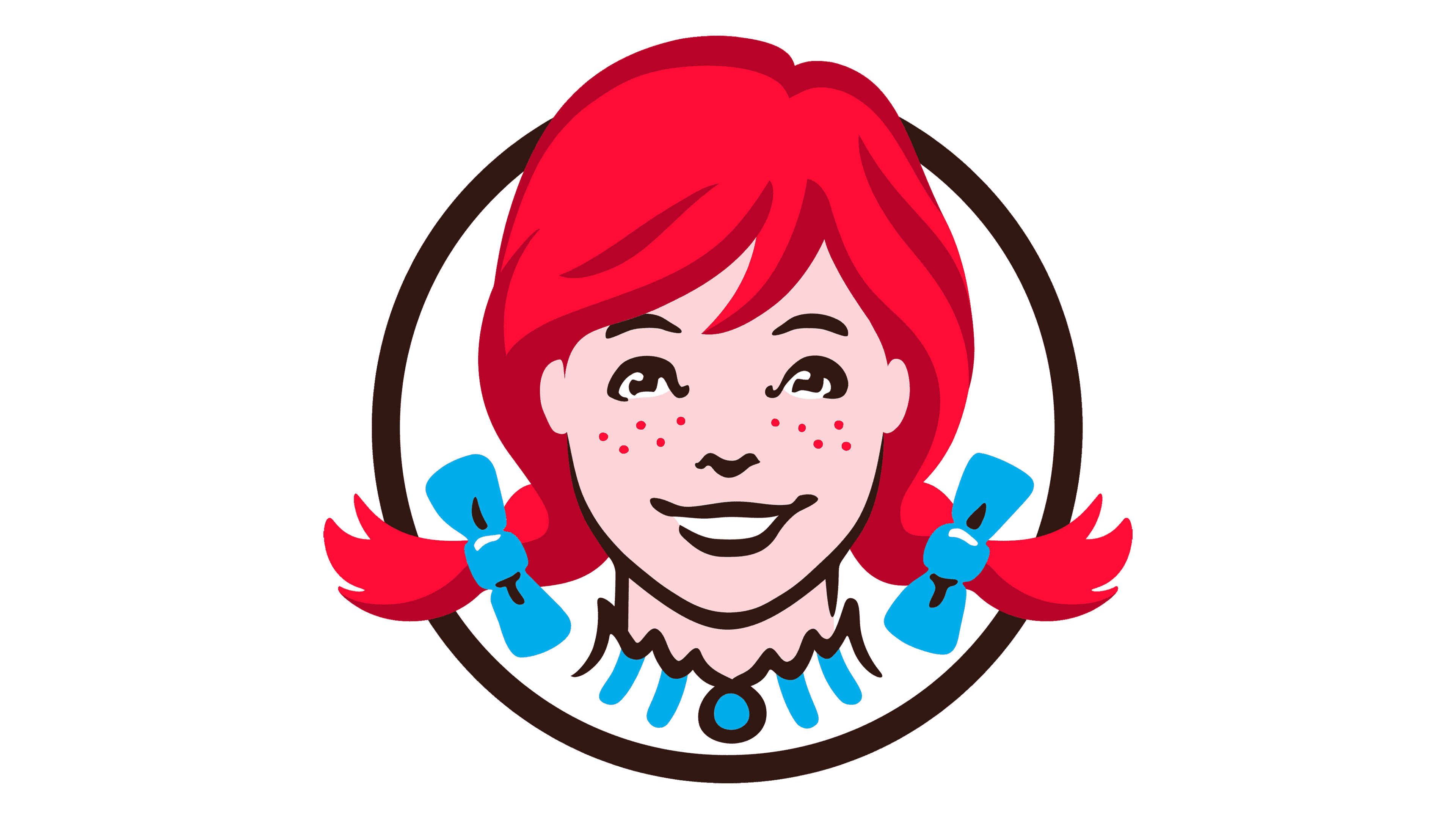
2013 – Today
![]()
As the previous logo showed, there was no need to specify what one could buy at Wendy’s. An award-winning design studio Tesser created a new look for the company while preserving the recognizable brand image. The logo introduced in 2012 featured a new handwritten style font with thick strokes and rounded ends. There was no background, although they kept the girl’s portrait above the name. The redhead was also completely redrawn with a cute look, a friendly smile, and charming freckles. The frame around the portrait was made bolder and smaller. The new design turned out stylish, recognizable, and welcoming.
Font and Color
The “Wendy’s” portion of the name featured an old-fashioned, bold font with large, black serifs. Underneath, the top line was done using a font very similar to VVDS_Bimbo Serif Main by Vintage Voyage Design Supply, while the “Hamburgers” part was printed using a font that looked like Playbill Pro Regular by Linotype. Dom Diagonal Bold is a font that is very similar to a handwritten logo introduced in 2012.