The company was founded in July 1937 by entrepreneur Vernon Rudolph. Enlisting the support of relatives, he bought a shop in Paducah, Kentucky, offering donuts prepared according to a unique recipe by a French chef.
Young Vernon Rudolph, who started selling donuts in 1937 could not have imagined that in a few decades Krispy Kreme would win the love of sweet tooths from all over the world: today, the opening of each new coffee shop traditionally gathers kilometer-long queues.
What is an interesting fact about Krispy Kreme?
Traditionally, on the opening day of a new Krispy Kreme shop, the first customer receives a year’s supply of donuts as a gift, and there are, of course, many who want to have such a privilege. A peculiar record was set by Robert Perugini from Indiana, who lived in a tent opposite the entrance to the new Krispy Kreme coffee shop for 17 days, despite the rain and the bewilderment of passers-by. His persistence brought the desired results: a free dozen doughnuts weekly for a year.
Meaning and History
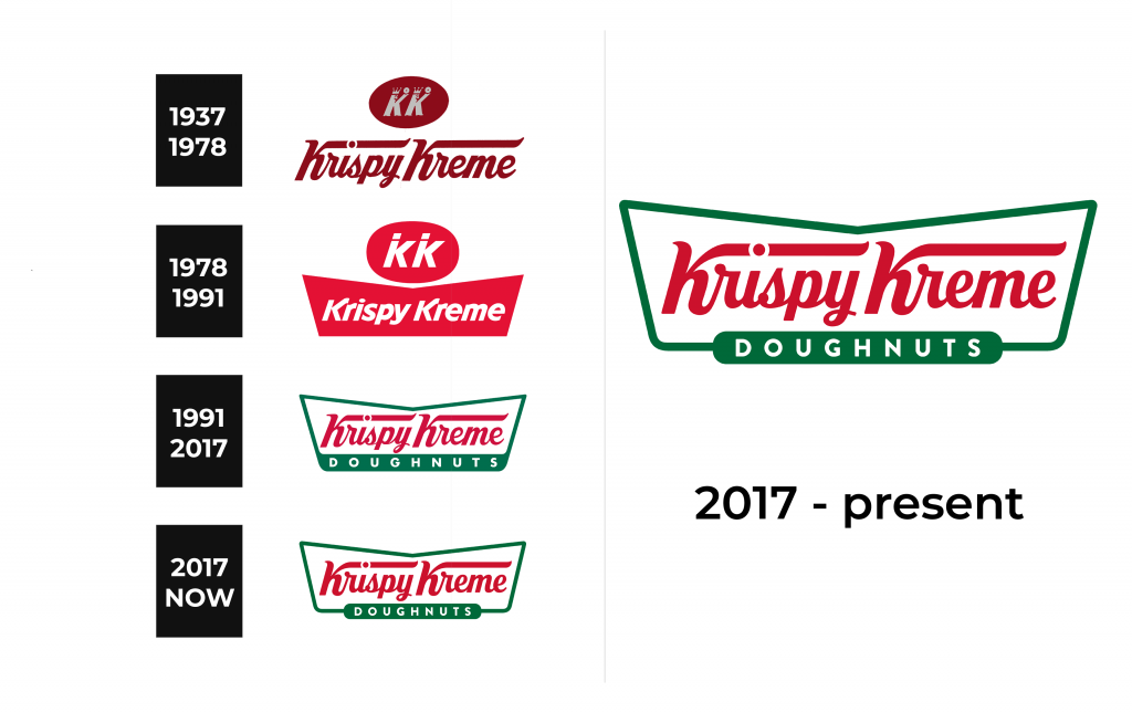
The Krispy Kreme logo is the brand name written in red letters, enclosed in a green frame. Everything is on a white background.
There is one marketing feature of the company that is directly related to the logo. Since its foundation, Krispy Kreme has been focusing on the freshness of baking. The company’s couriers not only deliver donuts to grocery stores, but also pick up products that have lost their freshness. At the same time, only in 1992 the logo on the signs was supplemented with a neon inscription “Hot — now”. Attracting passersby, the inscription lit up when the next batch of fresh donuts was ready. Over time, the idea of signaling about fresh pastries turned into a “donut theater”: several times a day, the windows of Krispy Kreme coffee shops open, showing the audience the whole process of making donuts. Krispy Kreme met the new era of smartphones with an application that informs customers about the appearance of hot donuts in the neighborhood.
1937 – 1978
1978 – 1991
1991 – 2017
2017 – now
Font and Color
The main colors of the Krispy logo are green, red and white. Green is one of the main two. This color is not chosen by chance. The brand chose the green color of the logo as an indicator of freshness, high quality and naturalness of products. The green logo is a constant companion of all products, to which it is important to convey a sense of freshness. This is a sign of super-fresh produce.
The red color excites the appetite. It is associated with hot, freshly cooked, appetizing-smelling. This color encourages buying.
White is just a background that does not cause unpleasant associations.


