Gatorade Logo

Tags: football team | PepsiCo | USA

Gatorade is a sports drink with a balanced content of water, salt and sugar, which has been produced in the USA by PepsiCo since 2001. The main purpose of this product is to restore fluid in the body after grueling workouts.

The drink was invented back in 1965. The prerequisite for its appearance was the observations of the assistant football coach of the University of Florida team. He began to notice that the team’s players increasingly began to get into a hospital bed due to dehydration. Studies have shown that during the period of profuse sweating, football players lost not only fluid, but also important elements for the body, such as potassium and sodium. These adverse processes led athletes to a decrease in energy and endurance levels. The drink allows you to fill in the missing elements.

What is an amazing fact about Gatorade?
By 2015, UF (University of Florida) received about $250 million in royalties for the Gatorade brand. In the recent few years, the university has been earning $20 million a year due to such deductions for the specified brand. The market share of the drink with the Gatorade logo is approximately 67%.

Meaning and History

Gatorade Logo history

The logo of the famous drink is the first letter “G” of its name. Only the first letter was left by PepsiCo. At one time, the corporation hoped to get rid of the license fee obligations in favor of UF by changing the inscription on the logo from Gatorade to G, but to no avail: ultimately, the company pays not for the letters, but for the product.

The Gatorade drink is available in a 500 ml plastic bottle. A reusable sports nipple is located on it, which closes tightly for the convenience of receiving liquid. Emblems of teams that consume this sports drink can be placed on the label in addition to the logo. Gatorade has different flavors, and each of them has its own color. The classic Gatorade coloring has a green color with the application of the manufacturer’s mark “G”.

1965 – 1970

Gatorade Logo 1965

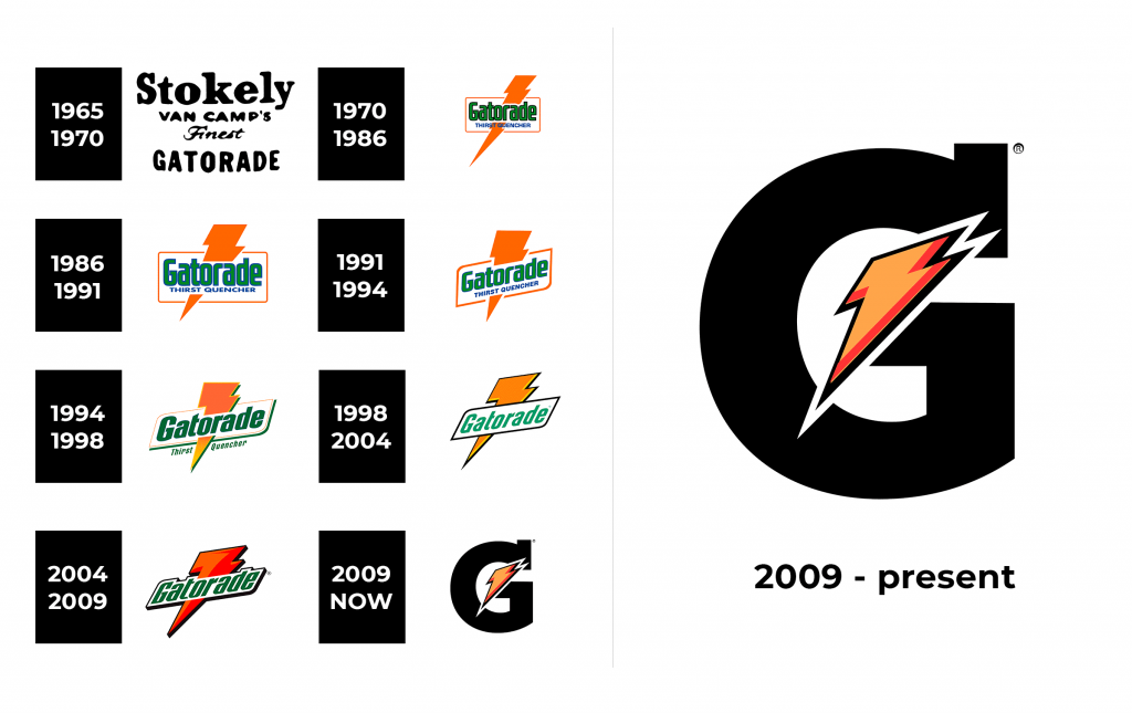
The Gatorade logo in this design features a white background that highlights the bold, black, playful script of “Stokely Van Camp’s Finest Gatorade,” with each letter crafted in a rounded, hand-drawn style that exudes a vintage charm. The stacked arrangement of the text, with “Gatorade” standing prominently at the bottom in larger letters, creates a sense of hierarchy and focus.

1970 – 1986

Gatorade Logo 1970

The Gatorade logo showcases a vibrant orange lightning bolt slicing through a white rectangular frame, with “Gatorade” written in a bold, green, sans-serif font that conveys strength and energy. Below, the phrase “THIRST QUENCHER” appears in smaller, blue letters, adding a functional tagline that complements the dynamic design.

1986 – 1991

Gatorade Logo 1986

The Gatorade logo features a bold orange lightning bolt cutting diagonally across a white rectangular frame, with “Gatorade” boldly scripted in a green font accented by a blue outline, exuding a vibrant and energetic feel. Below, the phrase “THIRST QUENCHER” is written in blue, adding a cool, refreshing contrast that enhances the design’s dynamic appeal.

1991 – 1994

Gatorade Logo 1991

The 1991 Gatorade logo features a prominent orange lightning bolt slashing through a white rectangular frame with an orange outline, symbolizing energy and intensity. The word “Gatorade” is rendered in a bold, green font with a subtle blue shadow, while “THIRST QUENCHER” below is in a smaller blue typeface, creating a balanced and vibrant contrast.

1994 – 1998

Gatorade Logo 1994

The 1994 Gatorade logo showcases a dynamic orange lightning bolt piercing through a white, angled rectangular frame with a green outline, symbolizing a surge of energy and power. The word “Gatorade” is boldly displayed in a green font with a blue shadow, while “Thirst Quencher” below it flows in a matching green hue, creating a cohesive and refreshing look.

1998 – 2004

Gatorade Logo 1998

The 1998 Gatorade logo features a sleek, orange lightning bolt with a gradient effect slicing through a white, angular frame, evoking a sense of speed and hydration. The word “Gatorade” is prominently displayed in a bold, green font with a slight black outline, giving it a grounded yet energetic look against the white background.

2004 – 2009

Gatorade Logo 2004

The Gatorade logo displays a fiery orange-to-red gradient lightning bolt, jagged and bold, cutting diagonally through a white, angular frame with a black outline, evoking a sense of explosive energy. The word “Gatorade” is written in a thick, green font with a subtle black shadow, adding depth and a grounded feel against thewhite background.

2009 – now

Gatorade Logo

The Gatorade logo features a bold, black capital “G” with a vibrant orange-to-red gradient lightning bolt integrated into its design, creating a striking and energetic focal point. The lightning bolt, with its sharp, angular lines, cuts through the center of the “G,” symbolizing power and speed, while the minimalist white background enhances its modern and sleek appearance.

Font and Color

The main color of the logo Gatorade is white. This is the color of the letter “G”, which is depicted on a contrasting background: blue, green or orange. The white color was chosen for a contrasting combination with different background colors. This color does not cause any unpleasant associations or sensations. The white color evokes a feeling of calm, trust and purity.