Doritos, the brand synonymous with bold and zesty flavored tortilla chips and snacks, has left an indelible mark on snacking since its 1964 inception, thanks to marketing executive Arch West at Frito-Lay. Recognized for its intense flavors, it diversified its product range with beloved options like Cool Ranch, Nacho Cheese, BBQ, Lemon, and more.
Meaning and History
![]()
Doritos, born as a plain tortilla chip, underwent a significant transformation in the 1970s with the introduction of Nacho Cheese flavor, solidifying its place as a pantry essential and choice for gatherings.
Doritos’ branding evolved with its flavor offerings. Its iconic triangular chip shape is instantly recognizable, featuring dynamic graphics targeting young audiences, emphasizing excitement and boldness. Continuous innovation has propelled Doritos to prominence in the snacks industry.
What is Doritos?
Doritos is a renowned brand of flavored tortilla chips with various flavors, from spicy pepper to cheese and lemon. Emerging in the mid-’60s, it has gained global popularity.
1964 – 1968
![]()
Doritos’ initial regional debut features burgundy lettering within alternating orange and yellow vertical rectangles, creating an illusion of movement.
1968 – 1973
![]()
Orange rectangles are swapped with yellow, maintaining the original typeface.
1973 – 1979
![]()
The lettering turned chocolate-colored, while rectangle colors neared gold, with slight asymmetry and “BRAND” underneath the “s.”
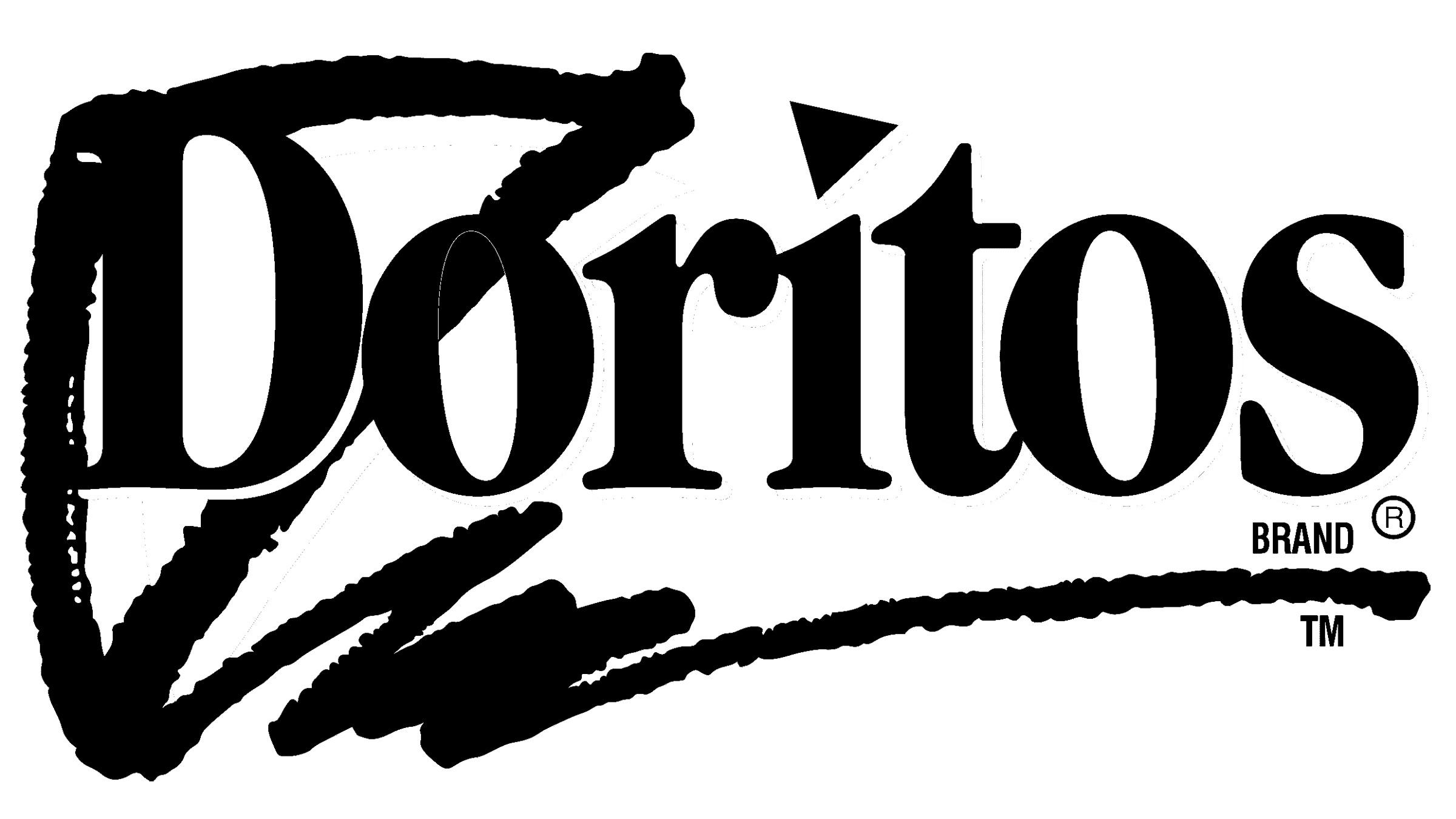
1979 – 1985
![]()
Increased rectangle angles, unaligned with letters, reduced letter spacing, while colors became subdued.
1985 – 1994
![]()
An expanded black lettering with a thin white outline replaced “BRAND.” Vibrant colors replaced the base, and the number of rectangles reduced to five.
1994 – 1999
![]()
The “BRAND” returned under the “s,” outlines became yellow, a triangular background behind “D” and “o” emerged, and chaotic stripes added emphasis.
1999 – 2000
![]()
The logo shows a bitten-off black rectangle, slanted white lettering with shortened serifs, and “CORN CHIPS” instead of “BRAND” in bright yellow.
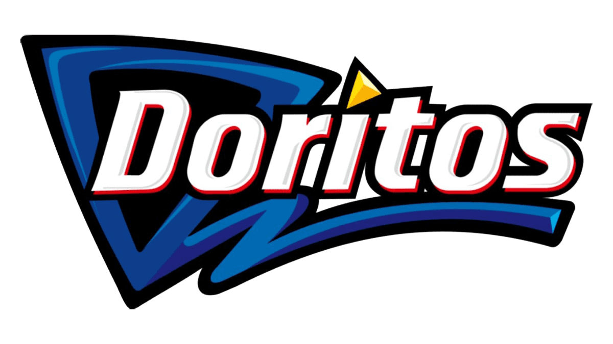
2000 – 2005
![]()
The uneven base is replaced by a black triangle framed by three stripes, emphasizing asymmetry.
2005 – 2013
![]()
An unconventional logo featuring a streamlined sans-serif font and a fiery cardiogram-shaped line.
2013 – today
![]()
The iconic triangle returned with a red-orange frame punctuating the “o” letters. The jagged outline featured needle-like protrusions, both in black. The letters are entirely white with dark borders, red and black stripes.
2019
![]()
In 2019, a Generation Z-focused logo was introduced, featuring a black “LOGO GOES HERE” inscription slanted to the left across a red triangle with an empty center.
Font
Serif fonts were used in Doritos’ early history, transitioning to a streamlined, sans-serif style with bold and uniform strokes. The dot over the “i” became a triangle, and the “t” was shortened to follow its shape.
Color
The current logo uses contrasting colors, with white lettering, a black outline, delicate red lines, and a fiery gradient in the background triangle. These vibrant colors symbolize Doritos’ core ingredients – peppers and corn.