Warner Bros. Entertainment Inc., established in 1923 by the Warner brothers, is a major American entertainment company known for its contributions to film, television, and music. Initially a small film studio, Warner Bros. gained prominence with the release of ‘The Jazz Singer’ in 1927, the first feature-length movie with synchronized sound, which revolutionized the film industry.
Meaning and History
![]()
During the 20th century, Warner Bros. produced a series of classic films and introduced iconic characters, particularly through its Looney Tunes and Merrie Melodies series. The studio’s expansive portfolio includes timeless movies like ‘Casablanca’ and ‘The Maltese Falcon,’ as well as modern blockbusters from the Harry Potter and DC Extended Universe franchises. This era solidified its status as a major force in American entertainment, blending artistic innovation with commercial success.
Warner Bros. has experienced various union agreements and management changes, including joining with Time Inc. to form Time Warner in 1989, later becoming part of AT&T’s WarnerMedia, and finally merging with Discovery, Inc. in 2021 to create Warner Bros. Discovery. Despite these transitions, the company remains a global entertainment leader, with a rich legacy in film and storytelling that spans over a century.
What is Warner Bros?
Warner Bros is a transnational entertainment corporation, the world’s leader in production of films, cartoon shows, and series, some of which include Harry Potter, Looney Tunes, The Lord of the Rings, etc. They’re also engaged in video game production, merchandise industry, theme parks, and others.
1923 – 1925
![]()
The earliest Warner Bros logo is a simple yet classic design. It features the words ‘Warner Bros’ in a distinctive, bold serif font that curves slightly upwards, giving a sense of grandeur.
This title is underscored by the phrase ‘Classics of the Screen’ in a smaller, less prominent font. The entire logo is unadorned with any additional imagery, suggesting a straightforward and unembellished approach to their early cinematic endeavors.
1925 – 1929
![]()
In this period, Warner Bros introduced their iconic shield logo, a design that has endured in various forms over the years. This early rendition features a shield with a black-and-white gradient, lending depth and dimension.
The letters ‘W’ and ‘B’ are prominently displayed in a bold, blocky typeface that is strong and immediately recognizable. Above the shield, a small banner carries the abbreviation ‘WB,’ and below it, a compact depiction of the Warner Bros studio building adds a touch of detail and association with the physical production of films.
1929 – 1937
![]()
The shield becomes more streamlined and stylized in this version. The letters ‘WB’ inside the shield are now more stylized, with the ‘W’ and ‘B’ connected by a single line, suggesting unity and cohesion. The shield is topped with a stylized banner that reads ‘Warner Bros Pictures Inc.,’ indicating the company’s growing emphasis on its status as a film production house.
1934 – 1937
![]()
This logo maintains the shield motif but simplifies it further. The shield is now a flat design with no gradient, making it more adaptable and easier to reproduce across various media. The ‘WB’ remains central within the shield, but the font is less bold, giving it a more elegant and modern appearance.
1937 – 1953
![]()
This iteration returns to a more three-dimensional look with the shield casting a slight shadow, suggesting solidity and establishment in the industry. The ‘WB’ inside the shield is more prominent, and the whole logo is encased with a darker border, emphasizing the brand’s name and its legacy.
1948 – 1967
![]()
The logo for this period simplifies the design again, returning to a flat shield with a thick outline. The ‘WB’ is very prominent, with the serifs on the ‘W’ stretching to the edges of the shield, conveying a sense of stability and reach.
1953 – 2019
![]()
In this version, the shield is presented in a single color without a border, and the ‘WB’ fills almost the entire space within the shield. This minimalist approach reflects a modern aesthetic of the 1950s and ’60s, focusing on clean lines and clarity.
1967 – 1970
![]()
Warner Bros experimented with a departure from the shield motif, opting for a stylized ‘W’ that resembles an abstract, ribbon-like form. This design suggests innovation and a break from tradition, aligning with the creative and experimental spirit of the late 1960s.
1970 – 1972
![]()
This short-lived logo reintroduces the shield but pairs it with a bold, angular ‘WB’ that fills the shield entirely. The edges of the letters touch the shield’s perimeter, suggesting a breaking of boundaries and a dynamic, forward-moving energy.
1972 – 1990
![]()
Perhaps one of the most recognizable iterations, this logo features the ‘WB’ in a stylized, rounded font encased within a shield that appears almost as a film reel or record, symbolizing the company’s involvement in both film and music industries. The continuity of the ‘W’ and ‘B’ suggests a seamless production process.
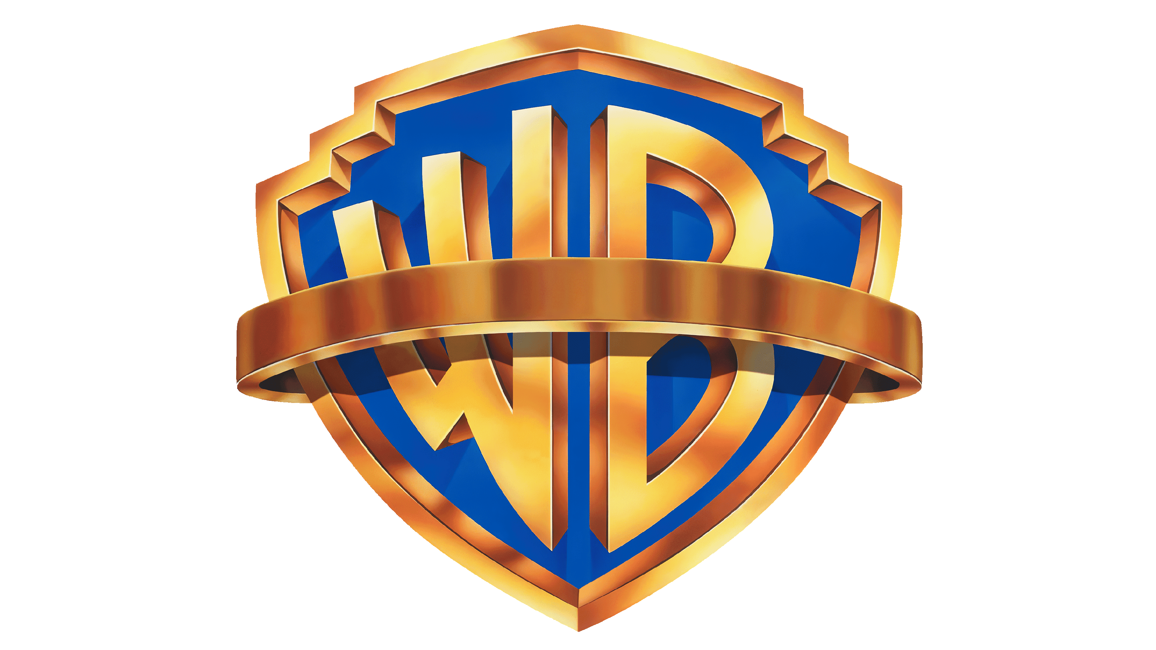
1993 – 2022
![]()
In this logo, the shield takes on a metallic sheen, suggesting a modern, high-tech era. The ‘WB’ maintains its presence within the shield but with a softer, more refined typeface that lends an air of sophistication.
2019 – today
![]()
The 2019 logo simplifies the shield motif to its essence, with the ‘WB’ inside a solid, flat shield. The design is clean and versatile, signalling a brand that is both respectful of its legacy and adaptable to the future.
2023 – today
![]()
The latter logo features the iconic ‘WB’ monogram, with both letters interlocked within a solid blue shield outlined with a thin yellow border. The overall design is clean, with no additional embellishments, emphasizing simplicity and contemporary aesthetic while maintaining the historical essence of the brand’s identity.
Color

The letters are bold and rendered in a bright white color, providing a strong contrast against the blue background, which aids in its visibility and recognition.
Font
Below the shield, the full name ‘Warner Bros.’ is written in a sans-serif, uppercase font, colored in a matching blue hue, which creates a cohesive and balanced look.