Vivo is a global high-tech company that occupies a leading position in the creation of innovative products and services in the field of mobile communications. It appeared in 2009 as a subsidiary of BBK. Vivo currently owns and operates R&D centers in the USA (San Diego) and China (Dongguan, Shenzhen, Nanjing, Beijing and Hangzhou). Their activities are focused not only on the development of next-generation smartphones, but also on advanced consumer technologies, including 5G, artificial intelligence, mobile photography.
What is a curious fact about Vivo?
The number of Vivo users is more than two hundred million people. Vivo smartphones are represented in 18 countries, the company’s retail stores are open in more than 1,000 cities around the world.
Meaning and History
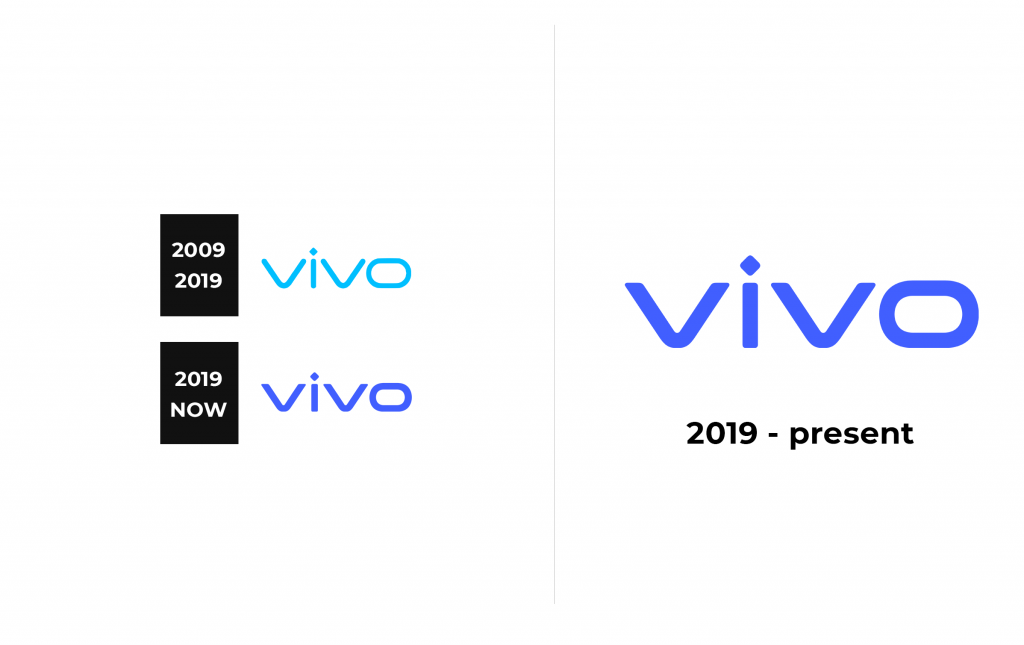
The first Vivo products had the logo of the parent company. A little later, the logo was replaced with the name Vivo.
2009 – 2019
2019 – now
In 2019, Vivo updated the visual image of the brand to emphasize its commitment to innovation aimed at a global audience. The new visual style included the brand’s logo and color, as well as exclusive fonts in Chinese and English.
To develop a new logo, Vivo engaged the famous Danish designer Bo Linneman to collaborate. The updated logo is characterized by simplified lines and pointed corners, reflecting the spirit of creativity inherent in the company. The new logo color – Vivo Blue – has a richer shade of blue.
Font and Logo
The main color of the logo is blue. Studies have shown that this color is better perceived by the human eye and is optimally read on digital media.
In 2019, the company also introduced its own VivoType font for English with 6 typefaces and 2 character widths, as well as VivoType font for Chinese with 2 typefaces, to ensure smooth adaptation of fonts in different regions. The new VivoType fonts for English and Chinese are designed by Bo Linneman and Chinese calligrapher Qiu Yin.


