Along with Telemundo, Univision is one of the Spanish-language television networks that broadcast in the United States to serve the needs of that country’s increasingly large Hispanic community. Its mobile app allows users to watch all programs on their smartphone or tablet, both live and on demand. The content includes 24-hour news, live broadcasts, competitions, reality shows, series, and soap operas. A staple of prime time, attracting millions of viewers, is the famous Mexican series.
Meaning and History
![]()
The Spanish International Communications Corporation was established in 1961 by Rene Anselmo. SICC’s marketing efforts have been handled by the Spanish International Network (SIN), which was established for this goal. As the first full-fledged national Spanish-language television channel, Univision was formed in the US based on regional television and radio stations, primarily Spanish radio in Texas. By 1982, over 90% of the Spanish TV channels had content from SIN. Since more than 20% of the company was foreign-owned, the company had to sell a group of TV stations to Hallmark Cards Inc. It was now known as Univision Network. Due to financial hardships, the network was sold back and successfully brought to life. In fact, it became a publicly traded company in 1996.
What is Univision?
Television, radio, and the internet are all areas of focus for Univision, a multifaceted Spanish-language media conglomerate. In the United States, it is the most favorite Spanish-language television network. It is the fifth-largest network in the country.
1962 – 1970
![]()
The logos of the company reflect its history and roots. Originally, it was known as the “Spanish International Network”. The inscription is done using a rather basic sans-serif font. To add some uniqueness to the logo, the name is printed in two lines and aligned to the right. All the characters are quite tall and closely spaced together, which balances out the rather long inscription and gives it some height. Meanwhile, the black color gave the logo a professional and even sophisticated look.
1970 – 1987
![]()
This version is more graphical and bolder. The company decided to use an abbreviated name to appeal to a wider population. They used block letters that created an almost symmetrical monogram. The letters “S” and “N” were formed from a solid square block with white diagonal lines to turn it into a letter. The only difference between these two is that the “S” has two rounded corners to create the “S” shape. Besides making the name more international, the company was also able to present itself as a strong and trustworthy network.
1986 – 1987
![]()
The name change prompted the network to design a logo that would reflect it. The logo consists of an emblem and the new name. The first is formed by a black circle with a fingerprint pattern in the lower part and multiple thin alternating black and white lines that create a square border around it. It has a feeling of depth but also has a lot of symbolism behind it. As for the name, it is printed using tall, sans-serif letters that are closely spaced together. This reminds of the original logo, but in this case, the strokes are thinner and draw smooth curves. To connect the two parts, the designers gave the “O” a round shape, which contrasted the rather skinny other characters and referenced the black circle above.
1987
![]()
For a short period of time, the logo featured both names. The top line had “Univision” printed using bold font without serifs and all caps. The bottom line had a much smaller font size to make both lines the same length and only the first letters were capitalized. The black circle was now white and placed on a black background. Horizontal lines in front of it made it appear as if it was a night sky with the moon peeking through the window blinds. It could symbolize that the network allows people to take a glimpse at the world beyond their homes.
1987 – 1989
![]()
The second line was soon removed and the logo was slightly redesigned. First of all, the moon drawing was placed above the name and the black color turned into a muted purple to give it a lighter shade. Meanwhile, the inscription was swapped for a golden version and appeared to have volume thanks to highlights and shadows. Both purple and golden are considered royal colors, which makes the company appear highly esteemed.
1989
![]()
The company took its logo design to a whole new level. The logo consists only of a “Univision” inscription, but the way it is done gives it a lot of personality and it would be hard to forget it. The letter “I” is printed in the center, while the beginning and the end of the word go off into the horizon on both sides. This triangular shape allowed to show the three-dimensional look of each character. The fronts of the letters are golden and already have some volume. The designers enhanced it by adding translucent thin and deep sides with horizontal lines that added even more interest and showed the shiny, metallic finish. It seems that this design was a bit too much given that it was not used for too long.
1990 – 2012
![]()
This version looks nothing like the logos seen earlier. The vibrant, multicolor shield-like shape that is formed from three quarter-circles and a square reflects the colorful culture of the Spanish community. It is significantly larger than the name printed below. The latter is done in black and uses a font that very closely resembles the original font but has slightly wider characters. The designers surely did a great job presenting the history of the network in a memorable and eye-catching manner.
2012 – 2019
![]()
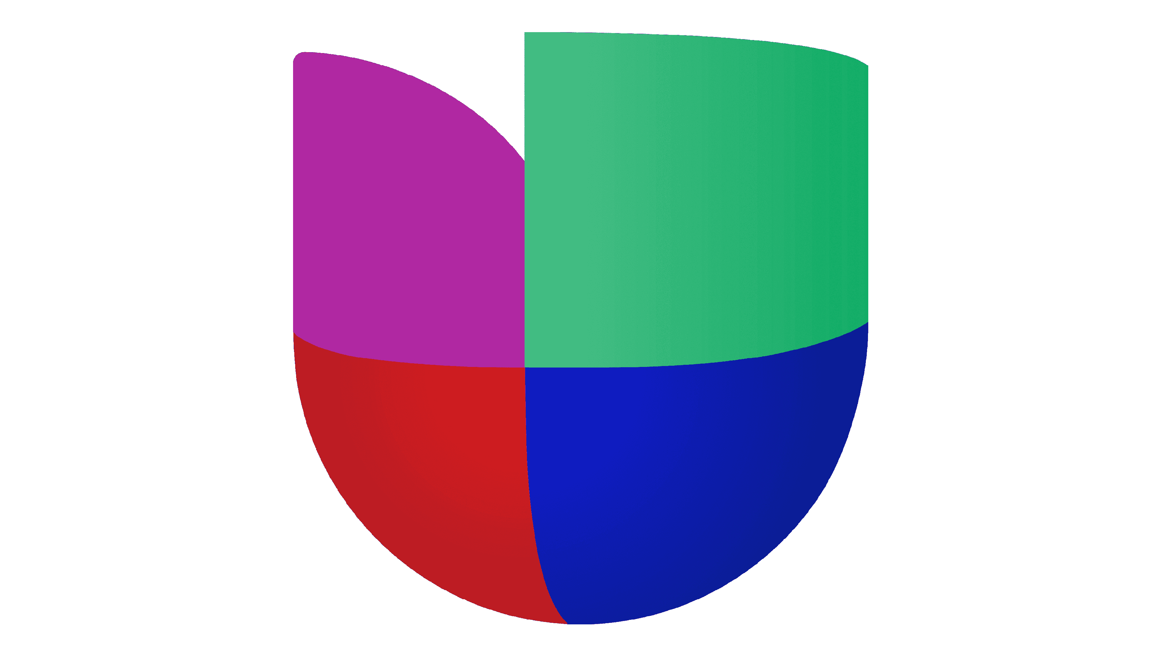
At the beginning of the new century, it was decided to give the logo a more modern look. The shield shape acquired a three-dimensional appearance and slightly changed the color shades. The designers went even a step further and added an illusion that the purple element was either reflecting other shapes or had them inside. The inscription has also undergone a transformation. It was now a dark gray color and the letters were no longer tall. To make it more in line with the emblem above, some of the letters had a “U” shape.
2019 – Today
![]()
A more modern version was presented not long after the previous update. The shield shape was flat again, but a bit of shadow was added at the bottom to give it a little depth. Like in the previous version, all the colorful parts were joined with no white spacing in between. However, the color shades were adjusted once more, but not drastically. As for the inscription, it remained untouched.
Font and Color
The earliest logo features a minimalistic sans-serif font that was also used in the 1990 logo. Starting from 1970 and for the next 17 years, the company used a block, geometric font that looked daring and impressive. A fine, sans-serif font that looked elegant and had a vintage style replaced it for a short period. Soon, the company presented a bolder version but still with some art-deco, vintage notes. There was also an experiment with a three-dimensional font. Since 2012, the logo of the network has featured a font similar to Posterama 1984 Bold. It has arches to go with other logo elements and looks quite modern thanks to its rather minimalistic look.
Until 1987, the company went with a classic, professional color palette where black served as the main color and white was a neutral background. For a few years, it experimented with adding a golden, which surely created a sophisticated look, but was not the right match for the network. It was in 1990, that the company finally found its colors. These were powerful red, trustworthy blue, welcoming green, and royal purple. They reflected the vibrant Spanish culture as well as diversity in the media presented on the network. It also brought back the black, which was later replaced by a dark gray.