Twitch Interactive, a division of Amazon.com, is the owner of the Twitch streaming service. The website is focused on computer games, including live gaming feeds as well as e-sports competitions. You may watch videos on Twitch both in real-time and at your convenience. In addition, Twitch provides information about events and news about new products. It has a community of real video game enthusiasts.
Meaning and History
![]()
In 2007, four buddies (Justin Kahn, Michael Seibel, Kyle Vogt, and Emmett Shear) created the website Justin.TV. On it, Justin Kan streamed his life 24/7 for nine months. This act inspired many people to start streaming and the website began to gain popularity. In 2011, Twitch was created to reduce the load on its servers. However, the service gained widespread popularity only in 2014. It was then that a branch of the main platform, Justin TV, became much more popular than the website and separated into a separate project.
What is Twitch?
Video game enthusiasts are fond of Twitch, a live-streaming website. Through the Twitch website or app, users may engage with other broadcasters while watching live or recorded gaming footage. Themes like IRL, Music, Esports, and Creative are also accessible.
2011 – 2012
![]()
Although the logo was designed back in 2011, its relatively minimalistic design and metallic silver color give an impression of a highly technological product, which is quite close to the truth. The name of the platform is printed using a bold font with large characters, which enhances a confident brand image. The silver letters had straight, clean strokes with a thin green outline on the right and bottom, while a dark gray shadow was cast on the left and bottom. The green color was supported by a TV on the right. It had a green screen with a “TV” printed in light gray and white body as well as a shadow that gave it some volume.
2012 – 2019
![]()
Although the logo has undergone a major design revamp, it still has a bold and confident look. First of all, the designers chose a bold, geometric font. Diagonally cut corners that are combined with straight cuts create a daring appearance. The designers also added a thick shadow at the bottom, which created a feeling of depth. The outline of the letters as well as the shadow were done in dark purple color.
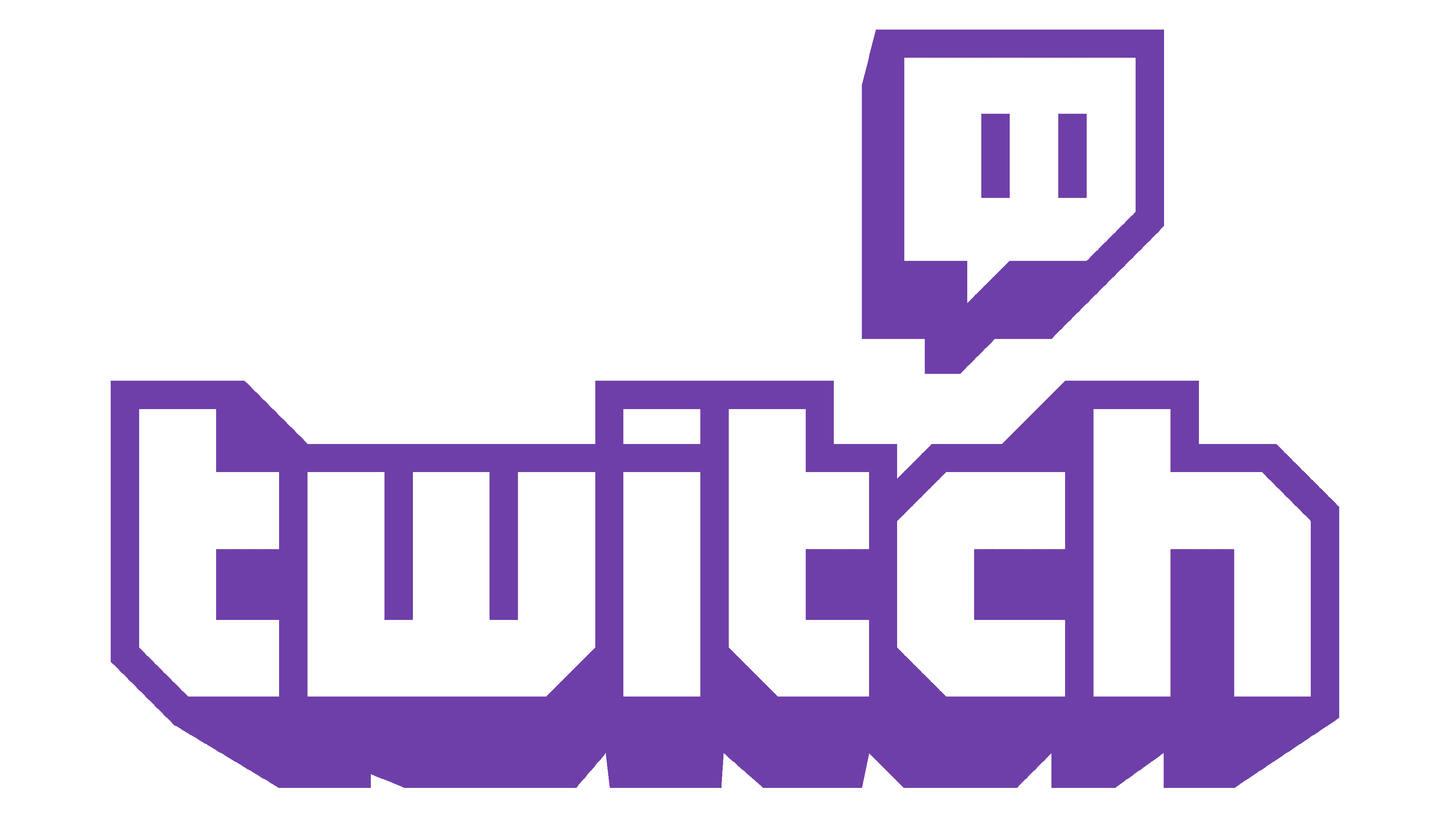
2019 – Today
![]()
Some minimal modifications have been made in 2019. First of all, the purple color was now livelier and brighter. It was much more suitable for the gaming world. The designers also made the characters slightly wider and bolder and placed the diagonal cut on the “W” on the left. Just like the previous version, the logo featured only lowercase characters.
Font and Color
The metallic silver, which is the main color of the first logo, represents that which is innovative, refined, sleek, and sophisticated. There is also a dark green that adds some stability and reliability. The platform then began to use purple as its main color. It is a powerful color that is associated with ambitions, sophistication, and mystery and encourages creativity.
The font used in the latest logo looks very similar to MaxiGamer from DeviantArt or Dimitri by Ben Balvanz. It is a geometric font with straight, clean lines and diagonally cut corners. The font choice gives the logo a modern feel.