TikTok Logo
Tags: content creators | online platform | short videos
TikTok is the fastest-growing social network in the world that provides a very easy platform for posting and sharing content. The platform allows users to create short videos with music, filters, and some other features. As statistics show, it is very easy to get addicted to this endless feed of content. It is available in over 140 countries around the world, the main audience is Generation Z, young people aged 16-24. It is also available in 75 languages, which covers most of the world’s population.
Meaning and History
![]()
TikTok’s history begins with Musical.ly, an app created by Chinese entrepreneurs Alex Zhu and Louis Yang. In parallel with Zhu and Yang, the no less intelligent and talented start-up artist Zhang Yiming makes himself known in China. By 2016, Iming’s assets include hosting platform Douyin with short videos and options for overlaying music, text, and visual effects. It entered the international market in 2018 as TikTok, merging with the well-known Musical.ly. Today, it is a global social network, whose offices are open in Los Angeles, Tokyo, New York, Seoul, London, Jakarta, Paris, Dubai, and Berlin. As for the name, it was originally written separately as “Tik Tok”, then both parts were connected. This word does not have any meaning. The only association is with the hero of the same name from Baum’s book about the Magic Land of Oz. Interestingly, TikTok has an alter ego, Douyin. In fact, these are two parts of one whole, with the only difference being that TikTok is an international platform, and Douyinf is purely Chinese.
What is TikTok?
TikTok is an internet platform for creating and publishing short videos, the rights to which are owned by ByteDance. TikTok competes with big market players like YouTube, Instagram, and Snapchat. However, the platform serves a slightly different purpose as it primarily focuses on content creators. The ease with which anyone can become one is one of the main factors that make TikTok so popular.
September – December 2016
![]()
2016 – Today
![]()
From the very start, the logo had a musical note. It was black and overlapped light blue and red notes. Such design created an upbeat, dynamic feeling and represented the variety of content one can publish and see on TikTok.
2017 – 2018
![]()
In 2017, the company decided to add “Tik Tok” under the music note to separate the international version from the Chinese Douyin. They chose a sans-serif font with bold strokes that had a rounded upper left corner. It is worth noting that originally, the name was spelled with spacing between “Tik” and “Tok”.
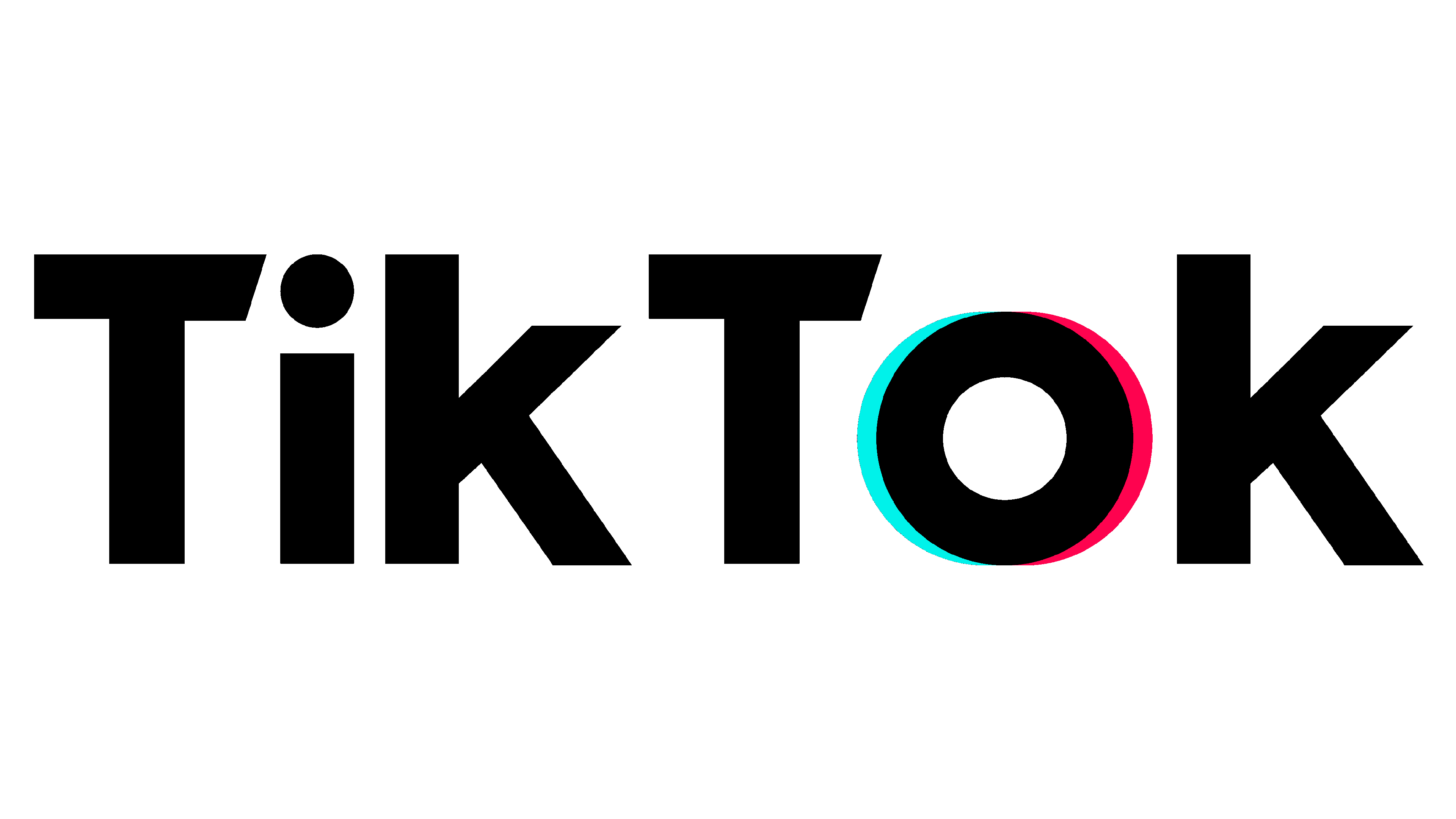
2018 – Today
![]()
The redesigned logo introduced a new font. Instead of rounded corners, the designers used a diagonal cut to give the logo some uniqueness. In addition, they added a blue line on the left of the “O” and a red on the right of it. Such a small detail created a connection between the name and the TikTok symbol and was another unique, beautiful touch.
Font and Color
The font seen in the 2017 logo looks like a modified version of the Core Gothic E Extra Bold. The modifications consisted of rounding the upper left corner and making the joints between the strokes also rounded. The font used in the next logo is similar to Gibson SemiBold, Proxima Nova – Semibold, but with unique modifications once again.