The NY Islanders are a high-tier ice hockey team, contesting in the NHL. They participate in the league’s Metropolitan Division. Since its foundation in 1972, it went through a storied path to becoming an iconic NHL member. The Islanders won numerous Stanley Cup trophies, winning their first one in the 80s. Their hub stadium is UBS, based in NYC. They hold a gigantic fanbase and carry on to compete in the league’s most prestigious tournaments.
Meaning and history
![]()
The title “New York Islanders” combines their geographical roots with hockey. “New York” signifies a vibrant urban base, while the “Islanders” mirrors their origin on Long Island, signifying a deep connection to the local neighborhood.
Set in 1972 as an expansion in the NHL, the Islanders swiftly arose as a power to be reckoned with. Fueled by a blend of exceptional talent and great supervision, they soared to great heights. Guided by Al Arbour, the Islanders triumphed, securing four Stanley Cup titles in the 1980-1983 period.
NY Islanders have displayed extraordinary hockey players who have left a memorable imprint on history. From the goaltending prowess of Billy Smith to the scoring brilliance of Mike Bossy and the inspiring supervision of Bryan Trottier, they have an array of talents.
Today, the New York Islanders continue to captivate fans with their exhilarating style of play and unwavering commitment to victory. As they forge ahead, the Islanders honor their illustrious past while embracing a promising future, uniting fans and inspiring the next generation of hockey enthusiasts.
What is New York Islanders?
New York Islanders are the ice hockey team that plays high-tier matches in the NHL. They appeared in 1973, and since then they won numerous Stanley Cups. Their home stadium is UBS, placed in NYC.
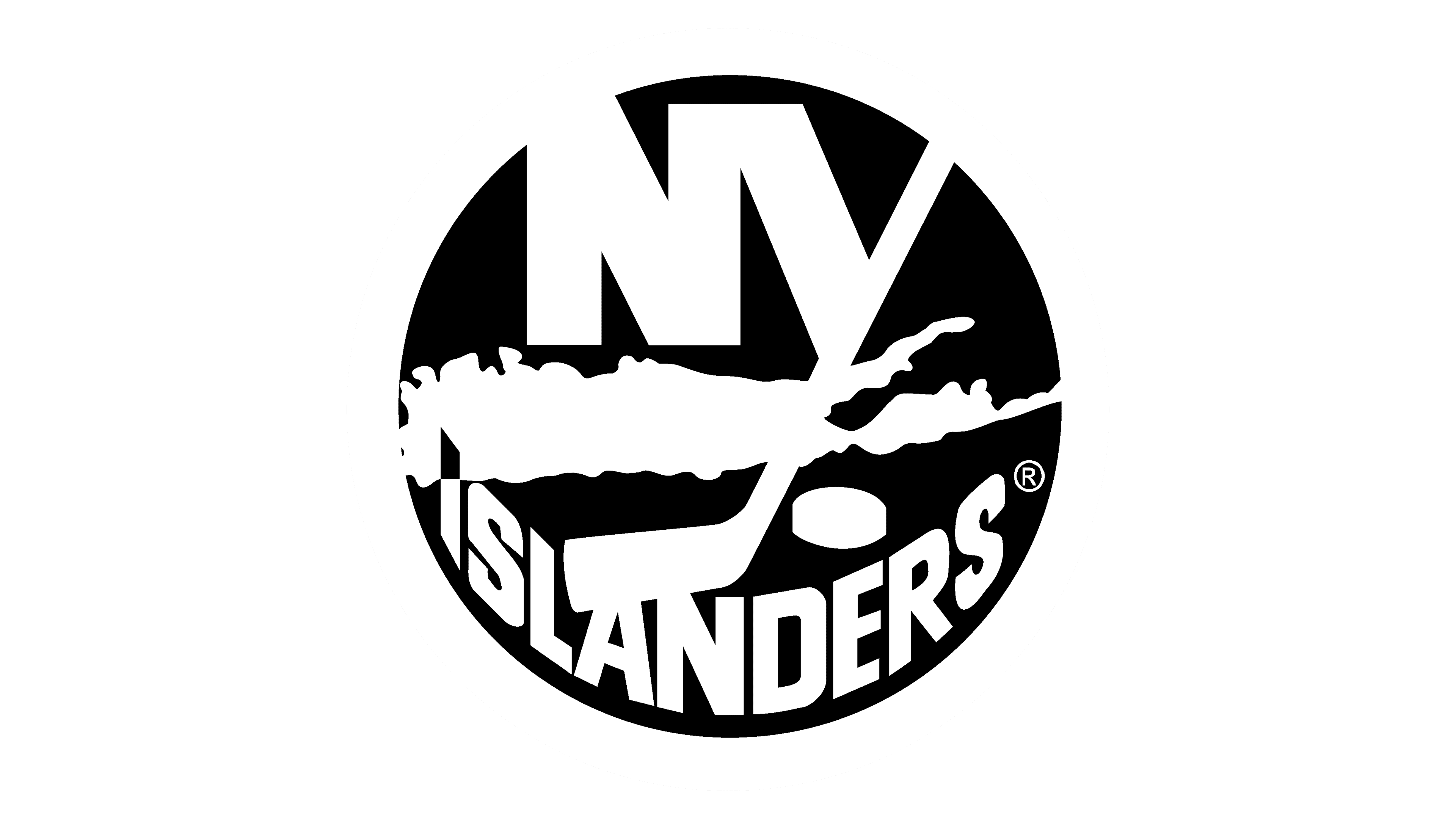
1973 – 1995
![]()
The pioneering logotype of the New York Islanders displayed a bright blue circle with the shape of the Long Island placed centrally on it. Above it, an acronym ‘NY’ in extra bold characters showed up. The lower bar of the ‘Y’ was elongated to create a stick coming over the island’s contours, and it had four stripes in its lower part. A puck was aside the stick’s tip. Their circled name caption found its place along the circle’s bottom edges.
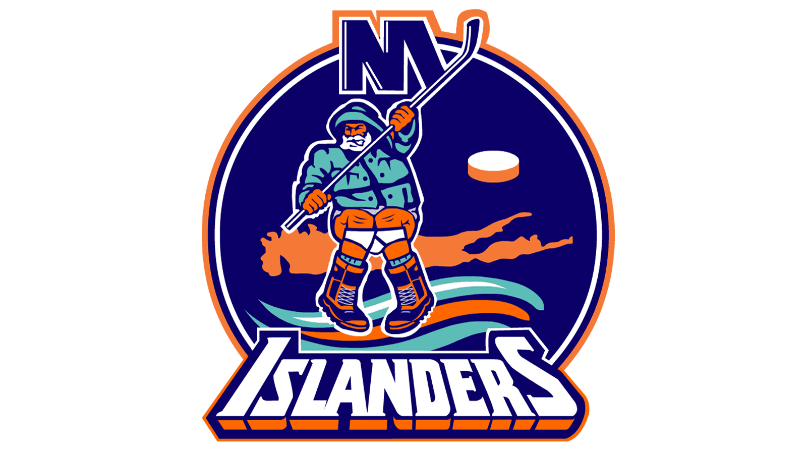
1995 – 1997
![]()
The new logo displayed a fisher, clad in a slicker and hat, grasping a blue hockey stick amidst a red-and-blue goal. The fisher went out from under the wordmark “Islanders,” executed in white, accentuated by vibrant orange and blue outlines. Yet, this logo failed to resonate with fans, undermining the brand’s credibility and drawing unfavorable attention.
1997 – 2010
![]()
The next redesign occurred in 1997. It was based mostly on the original logotype but showed a darkened color code and a thick inner contour of the circle, which was made smaller a bit.
2010 – 2017
![]()
The following logotype depicted the bright color code. Additionally, the inner circle became a frame.
2017 – today
![]()
The latter version features the contour coming along the circle’s edges, but not framing it. Additionally, the logotype was made smaller again.
Font
The brand’s name caption is executed in a capitalized block script without serifs. The letterforms have angular tips and edges, and they’re separated by small gaps in between.
Color
Their distinctive chromatic combination includes extra bright orange and blue for the circle, lines, and a part of the puck, and white for the letters and the second part of the puck.