The Detroit Red Wings are an American ice hockey club from the city of the same name. Their first arena was called the Olympia. The team’s outstanding performances, renowned players, and contributions to hockey are recognized not only by their fans but also by the larger hockey community. An interesting fact about this team is that there was a documentary that tells the story of the five Russian hockey players who were signed by the Red Wings and turned around the struggling team’s fortunes by winning one Stanley Cup after another.
Meaning and History
![]()
Their history dates back to 1926. Back then, the players were called “Detroit Cougars”. The name was adopted from the Victoria Cougars team, who competed in the late 19th and early 20th century. Several businessmen purchased the franchise from Victoria and renamed it the Detroit Cougars once the city was granted the privilege of having its own NHL club. After businessman James Norris got ownership rights in 1932, he gave them the name the team carries today. Norris was a member of the Montreal Wings Wheels club, which received the first Stanley Cup ever. Giving the team their current name, Norris paid tribute to the team that made that achievement. This is why the team’s emblem featured a wheel and wings, which migrated to the Red Wings logo. During its existence, the Red Wings won 11 Stanley Cups.
What is Detroit Red Wings?
The Red Wings from Detroit are the legendary and most titled American hockey club representing the NHL. There were many decisions and moments that contributed to the long-term success of this Detroit hockey team.
1926 – 1927
![]()
Before the team was renamed, the logo featured just one letter. However, it still looked grand and impressive. First of all, the designers used a powerful red color that instantly attracted attention. Secondly, they chose a Gothic font style that gave a feeling of sophistication. It was a perfect way to make a small symbol represent the great achievements of the team.
1928 – 1930
![]()
The logo was upgraded a couple of years later. The “D” symbol was slightly embellished with a red shield serving as a background. The letter color was inverted to stand out against the bold base. The white color was supported by a border line. The shield shape was used by many sports teams and this hockey team was no exception.
1930 – 1932
![]()
This version represents another name of the team before it became the club everyone knows today. Here, the team used yellow as the main color, and red served as a thin outline. The designer went for a geometric font with slab serifs to create an image of a confident team. The arch of the top line added a feeling of movement to the overall image.
1932 – 1934
![]()
With a new owners, the team got its wings. They were added to the wheel and referred to the previous activities of the new owner. The red and white color palette reminded of the roots of the team. It was hard to miss such a logo no matter where it was placed. It has been almost a century since this logo was first designed.
1934 – 1948
![]()
There were no noticeable changes to the actual shape of the logo. However, it presents the club as a stronger and more daring team thanks to the darker, close to burgundy, shade of red. It also created a feeling of professionalism. There is a feeling of movement, speed, and desire to reach the highest heights.
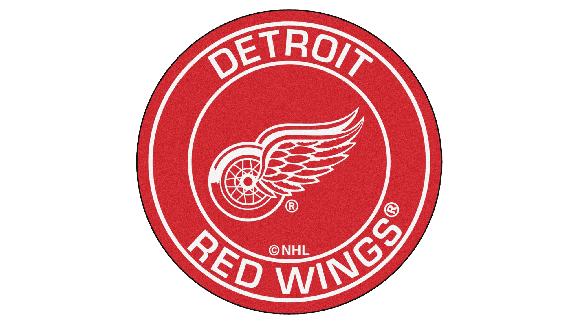
1948 – Today
![]()
The logo was updated at the end of the 1940s. First of all, the club returned to a lighter shade of red. The wing shape was redrawn and the designers gave them an elongated shape, creating a balance between the two elements. The latter, by the way, was slightly redone to have a wider red stripe at the bottom and a thinner one at the top. The logo acquired lightness and reflected the achievement of new heights by the team.
Font and Color
Except for a short period in the early 1930s, the club always used a red-and-white as its main colors. A bold and powerful color choice made the logo instantly recognizable and visible across the whole stadium. It stood for the courage, energy, and determination to win all the trophies.
Until 1930, the logos featured a Gothic font style. This font can make any logo look magnificent and majestic. It was then replaced by a bold geometric font with slab serifs that reflected the confidence and strength of the club. After 1933, the Detroit Red Wings did not have any inscriptions.