Anaheim Ducks Logo
Tags: Disney | hockey club | ice hockey | professional club
The Anaheim Ducks play in the National Hockey League and are a member of the Pacific Division of the Western Conference. Its best achievement was reaching the Stanley Cup Finals in 2003. After changing the name, logo, and uniform colors in the 2006-2007 season, the team immediately became the strongest in the league, winning the series against the Ottawa Senators 4-1 in the final.
Meaning and History
![]()
In 1992, Disney CEO Michael Eisner came up with the idea of creating an NHL team in Anaheim, especially considering that a new $103 million stadium was built in the city and was often empty due to the lack of permanent “tenants”. The Anaheim Ducks hockey club from the city of Anaheim (California, USA) was founded in 1993, it has had its current name since 2006 (formerly the Mighty Ducks of Anaheim). The ducks got their name from the movie The Mighty Ducks, produced by Walt Disney Pictures, which owned the club. Eisner decided to play on the popularity of this film among Americans and was not mistaken. Season 05/06 was a year of change. Anaheim got new owners, Henry and Susan Samuelly, a new general manager, head coach, and a new leader, Scott Niedermeier, the NHL’s top defenseman in 2004.
What is Anaheim Ducks?
Anaheim Ducks is a professional ice hockey club. The Anaheim Ducks mascot, Wild Wing, is an anthropomorphic duck. The Mighty Ducks club has gained millions of fans since the first day of its existence, and the team’s jerseys have become one of the most popular among fans around the world.
1993 – 2006
![]()
The first emblem featured an antique duck-like goalkeeper’s mask with crossed yellow clubs in the background. The serious look of the duck was supported by a black circle in the background and an inverted dark green rectangle that balanced the hockey clubs. The logo gave the impression that it belongs to a team that one would not want to mess with.
2006 – 2010
![]()
The name of the club is printed in two lines at a diagonal. While the “Anaheim” is done using a comparably simple font, the accent is placed on the word “Ducks” using a very interesting, multilayer font. the letters themselves are done in golden and feature pointed serifs and stoke ends that give the logo a daring look. In addition, they are accented by an orange line and have a black background that repeats the shape of the letters.
2010 – 2013
![]()
Not a lot changed in 2010 as the club merely changed some of the colors in its emblem. All the colors got darker and more vivid. The most noticeable change was the bright orange color that gave the logo more energy and made the letters pop. The light gray seen in the previous version got darker and looked more like silver. The star of the logo is the letter “D” which is drawn to resemble the duck’s webbed foot.
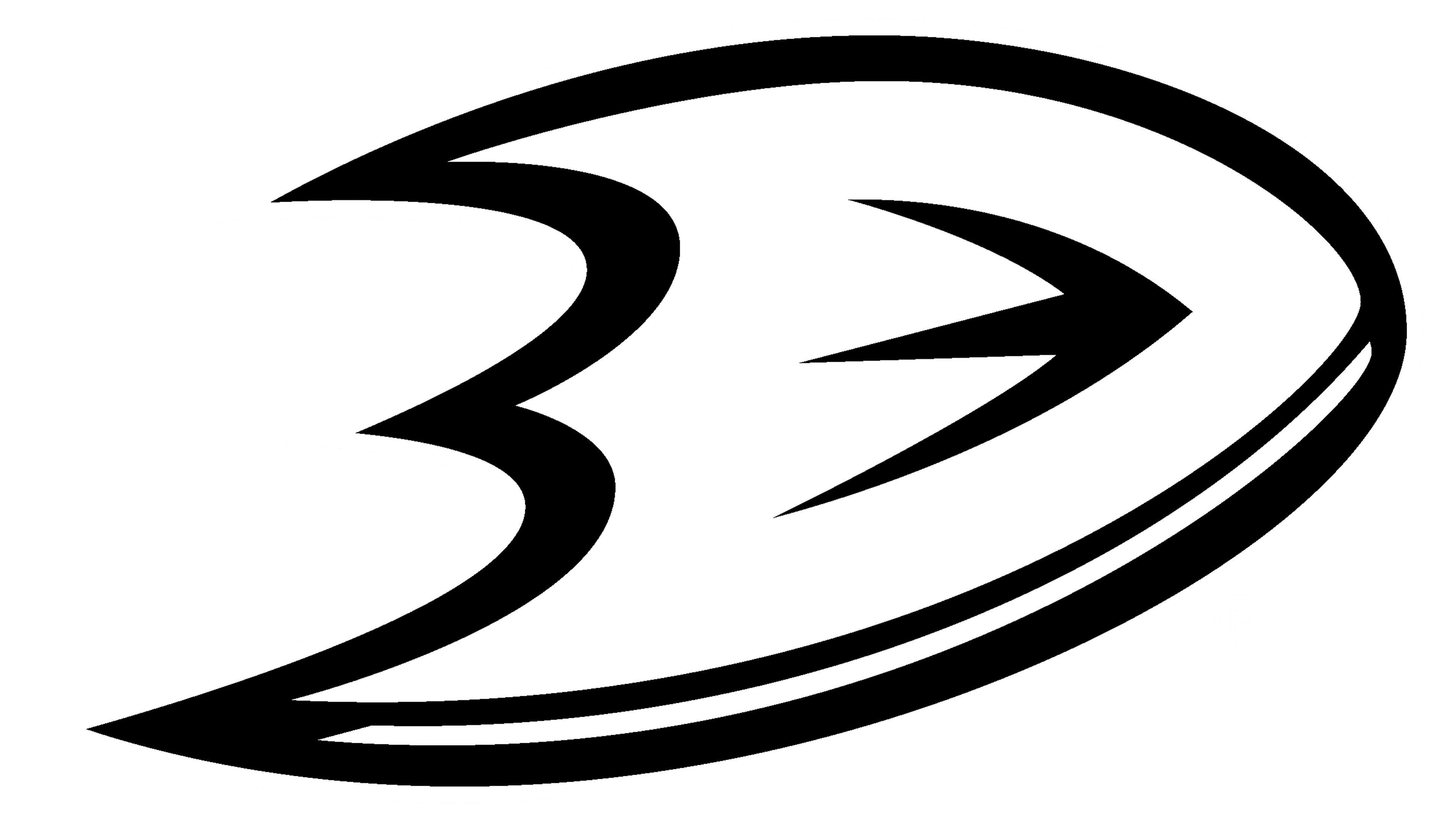
2013 – 2024
![]()
The logo is a stylized D-shaped Webbed Foot. It was already featured in the previous logos as the first letter of the name. Given the popularity of the club, this symbol was already more than enough to let everyone know whom it represented. In addition, the shape of the letter had a lot of dynamics to it and reflected the speed and agility of the players.
2024 – Today
![]()
This logo for the Anaheim Ducks showcases a stylized duck mask with a fierce expression, positioned against a solid black circular background. The white mask, dotted with black vent holes, features intense red eye slits that give it a menacing and determined appearance. Crossed hockey sticks behind the mask add to the dynamic feel of the logo, with their vibrant red color and contrasting white tape. The bold color scheme of black, white, and red highlights the team’s competitive edge and determination. This design serves as a modern reinterpretation of the original 1993 logo, preserving the legacy while presenting a sleek and contemporary look that resonates with fans and players alike.
Font and Color
Club colors are black, gold, orange, and silver. These colors create a bold, dangerous, and energetic look. At the same time, these colors give it a sophisticated, rich, and formal touch. For the font, the club went for a custom serif techno font that uses bold strokes and has a three-dimensional appearance. It was designed by Jayde Garrow.