The Boston Bruins are a highly acknowledged hockey team that competes in the NHL as a part of the Atlantic Division, They boast a rich and illustrious history within professional ice hockey, which includes 6 Stanley Cups and dozens of conference and division-wide victories. Their home games are hosted at the esteemed TD Garden, and they boast a rich and illustrious history in the realm of professional ice hockey.
Meaning and History
![]()
In 1924, Charles Adams, the owner of a Boston grocery store chain, ventured into hockey and endeavored to bring a professional team to Boston. As a result, the Boston Bruins were founded on November 1, 1924. Charles Adams persuaded the NHL to expand into the United States, with Art Ross assuming the roles of general manager and coach. The team’s name, “Bruins,” was chosen to reflect qualities of strength and draws inspiration from English folklore, particularly bears. This annual is exemplified in their logo, which has evolved but features a brown bear, symbolizing their strength.
What is the Boston Bruins?
The Boston Bruins, founded in 1924, are a prestigious American ice hockey team in the NHL. They belong to the Atlantic Division in the Eastern Conference and call Boston, Massachusetts, home. Their games are played at the renowned TD Garden, and they have a significant legacy in professional ice hockey.
1924 – 1926
![]()
The original Boston Bruins logo featured a brown bear in mid-stride, set against a yellow-scripted ‘Boston’ wordmark. The bear appeared to walk on the brown-colored ‘Bruins’ against a yellow background.
1926 – 1932
![]()
The second logo retained the core elements of the original design, with the brown bear remaining the central focus. However, alterations were made to the fonts used for the ‘Boston’ and ‘Bruins’ wordmarks. Notably, this logo celebrated Boston’s first Stanley Cup victory in 1929 by inverting the color scheme and switching the yellow and brown elements.
1932 – 1934
![]()
In this phase, the franchise adopted a more minimalist approach, discarding the bear motif and favoring a blocky brown ‘B’ with a thick yellow outline as the logo. The interpretation of the ‘B’ remained somewhat ambiguous, representing either Boston or Bruins, or both.
1934 – 1948
![]()
The blocky yellow-outlined ‘B’ was retained, although it changed its primary color, transitioning from brown to black.
1948 – 1949
![]()
A special anniversary logo was introduced for the Boston Bruins’ 25th season. This emblem featured a yellow ‘B’ placed within a wheel, with the letter adorned by black outlines and a distinctive font with large serifs. To the left of the ‘B’ was the number ’24,’ signifying the year of the team’s debut, while ’49’ to the right denoted the jubilee season. Eight black knitting needles with matching black edging formed the background for the letter.
1949 – 1995
![]()
The iconic hub-and-spoke design was introduced, featuring a black ‘B’ with a yellow outline within a black circle. This emblem endured for 45 years, symbolizing Boston as a major transportation hub and the center where all roads converged. Over the years, this emblem underwent several modifications, ultimately taking on a modern shape.
1995 – 2007
![]()
In 1996, the logo underwent a slight update, with a taller ‘B’ closely resembling the original B-logo font. The letter took on a more contemporary and refined appearance. Other changes included new black trim accents around the ‘B,’ the spokes, and the border, along with a thin yellow outline surrounding the black circle.
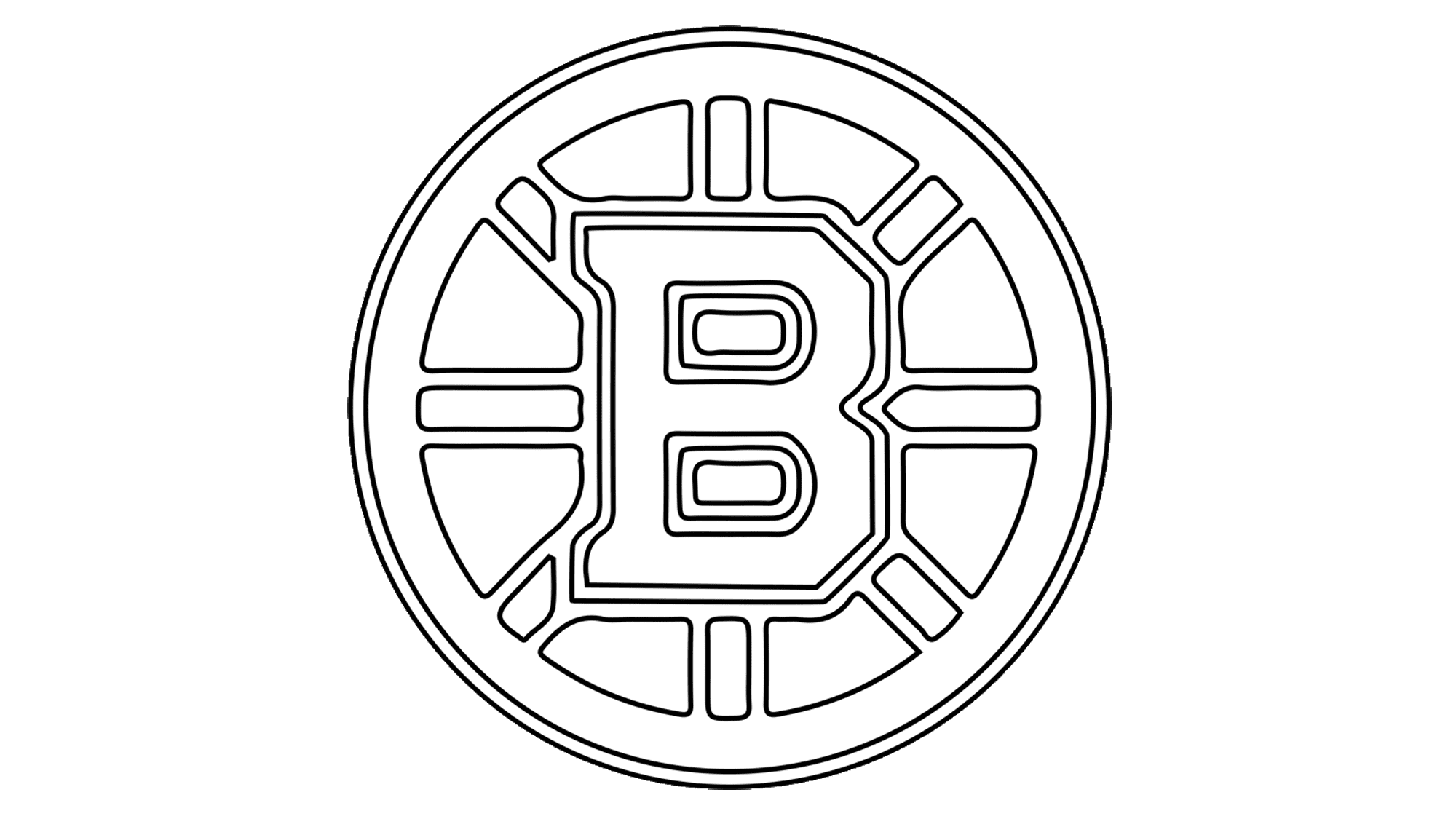
2007 – today
![]()
The introduction of Reebok Edge jerseys in 2008 brought further alterations to the logo. The design integrated elements from the 1996 and 1933 logos, featuring a smaller ‘B’ with bolder black accents, resulting in a more voluminous and assertive appearance. The black outline of the spokes became thicker, as did the outer yellow border, and the spokes themselves were rendered symmetrical.
Font

The Boston Bruins logo, while predominantly graphic, incorporates an angular uppercase typeface for the letter ‘B’ within its design.
Color
The team’s distinctive color palette comprises black for the contours, gold for the bars and additional contours, and white serving as the default backdrop.