The fast food chain Taco Bell is well-known for its brand and is easy to find worldwide. Although there are franchises in Europe, most restaurants are located in the United States and other North American nations. There are close to 6.5 thousand restaurant chains worldwide at the moment. They are mostly found in the US and can be spotted in both big and small cities. The restaurant’s menu is composed of Mexican-inspired dishes and pizza, as well as a variety of appetizers and Mexican-style entrees with hot sauces. In 2012, the chain celebrated its 50th anniversary, and CEO Greg Creed wanted to create something fresh and original. To develop the taco shell for Doritos Locos Tacos, it went through forty rounds of recipe testing.
Meaning and History
Taco Bell, a Mexican fast food chain, was founded in the late 1940s in California by Glen Bell, a WWII veteran and former sailor. Inspired by McDonald’s, the restaurant initially served hot dogs, fries, and hamburgers, but later shifted its focus to Spanish-speaking Americans who enjoyed Mexican food. Bell’s Drive-In has been serving tacos, nachos, and burritos since 1952. In 1955, Bell sold his business and launched El Tacos, a Mexican-themed chain. In 1962, he sold his stake in El Tacos and launched his own restaurant. In 1964, he offered franchises to anyone wanting to start their own Taco Bell restaurant. The network expanded rapidly across the nation, and in 1977, Taco Bell made its international debut.
What is Taco Bell?
Taco Bell (pronounced Taco Bell) is an international chain of fast-food restaurants serving Mexican cuisine, owned by Yum! Brands. From the exclusive flavors of Mountain Dew to the undeniably addictive Doritos taco shell, this creative and innovative company has a lot to learn. This restaurant chain was the first to hire female managers.
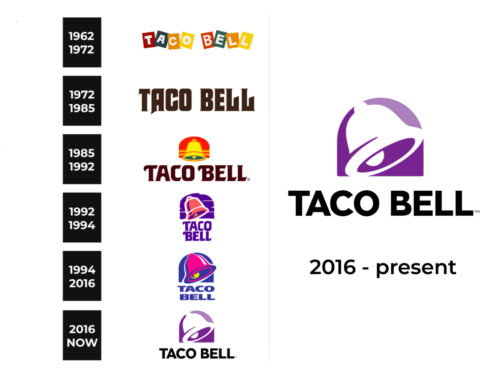
1962 – 1972
The earliest logo of the restaurant was fun and colorful. All the letters were placed on slightly distorted rectangular shapes and had a white color. The rectangular bases were overlapping and placed at different angles, adding to the easy-going and friendly atmosphere. The natural shades of red, green, orange, and yellow made an association with tasty vegetables and vibrant meals that could be purchased at Taco Bell.
1972 – 1985
The feel of the logo completely changed in 1972. The vibrant color palette was replaced by a strict black or dark brown inscription on a white background. The font choice enhanced the sophisticated and elegant look of the emblem. All the characters were uppercase and the letters had delicate serifs that were complimented by diagonal or slightly curved cuts. This was a very impressive and grand logo.
1985 – 1992
The inscription was slightly simplified and had more rounded elements. The most important and notable update was the addition of a bell, which is quite symbolic. The bell itself is yellow with green and red accents. It has a red arch shape in the background that attracts attention. This was the beginning of a new era of Taco Bell logos.
1992 – 1994
A more familiar purpled color palette was introduced in 1992. It also included white, a splash of yellow, and peach orange color. The arched backdrop behind the bell resembled a wooden texture while the bell got larger and was placed at an angle to make it appear that it was actually ringing. The name was stacked, which created a more cohesive appearance.
1994 – 2016
The peach color was replaced by bright pink and the bell was now going way beyond the arched base. The designers also changed the purple color to dark blue. There was another modification and that was the font. It got even simpler, although the designers preserved characteristic diagonal cuts and smooth curves of the letters.
2016 – Today
A more minimalistic logo was presented in 2016. The new sans-serif font features clean, straight lines and cuts as well as black color. The bell is done in white with purple accents. The background is also done in a purple gradient. Although the purple color was used earlier only for around two years, it surely became associated with this restaurant chain. The fact that the company had a drawing of the bell since 1985, the brand image was engraved in the minds of the customers.
Font and Color
The purple color is unordinary and original in the logo of a restaurant chain. It is also a color that combines the confidence, reliability, communication, and calmness of blue as well as the excitement, energy, youthfulness, power, and passion of red.
For the first ten years, the company used the most basic, sans serif font. Since then and until 2016, the designers turned to more sophisticated fonts with attractive serifs. The latest logo of the brand brought back a more modest appearance and features a bold, sans-serif font similar to Fragmatika Bold.


