T-Mobile Logo
Tags: connection | mobile provider | USA | wireless
T-Mobile is an American mobile provider, as well as part of the larger brand operating under the German company Telekom. It unites several providers all over Europe, including in Poland, Austria, Croatia, Montenegro and more. In many instances, these companies are called ‘Telekom’ or have other connection to the brand. Its biggest success, however, is in the USA, where most of Telekom’s clients currently are.
Meaning and History
![]()
Telekom was created in 1996 in Germany as one of the primary mobile providers. In 1999, the holding company called T-Mobile was created to manage the ever-growing number of Telekom subsidiaries in other companies, including primarily United States, Croatia and Czechia. The US branch is the biggest entity by far, serving over 100 million clients. It was formerly known as VoiceStream.
What is T-Mobile?
T-Mobile is known primarily as an American mobile provider, founded in 2001. However, it’s only part of the bigger brand, also called T-Mobile, which unites similar companies all over the world, owned by the German telecommunications corporation Telekom.
1994 – 2001
![]()
VoiceStream was an independent entity until its acquisition by Telekom in 2001. Until that point, the company has a unique logo that included their own name, written in slanted blue letters. The font was a pretty common sans-serif type, with moderately bold characters and tall proportions.
There were notably few gaps between the letters, including between the two would-be words. The name here was styled just as in the name of the company. The capitalized letters were naturally bigger, extending above and below the limits of other characters nearby.
They’ve also had a word ‘wireless’ written in small, but capitalized letters beneath the lowercase part of the ‘Stream’. It was a more common sans-serif script, but the letters were still slanted and black. However, there were also large gaps between each character to fit the length of the word above.
The final touch was the three curved lines above the center of the logo. They were red and had thin tails on the left. They were supposed to represent the wireless connection, no doubt.
2001 – 2002
![]()
When Telekom acquired the company, they first combined the logotypes of both brands. This design was scrapped a year later.
It was basically the same logo (sans the ‘wireless’ bit) with the whole new part beneath. The latter included the words ‘Global Wireless by’ and the T-Mobile logo right after that. The written part used a very simple, black and upright font of the sans-serif variety. The specifics of the T-Mobile bit are described below, as they didn’t change at all until 2013.
2001 – 2013
![]()
In 2001, they adopted the regular T-Mobile logo as used in various other companies of this brand around the world.
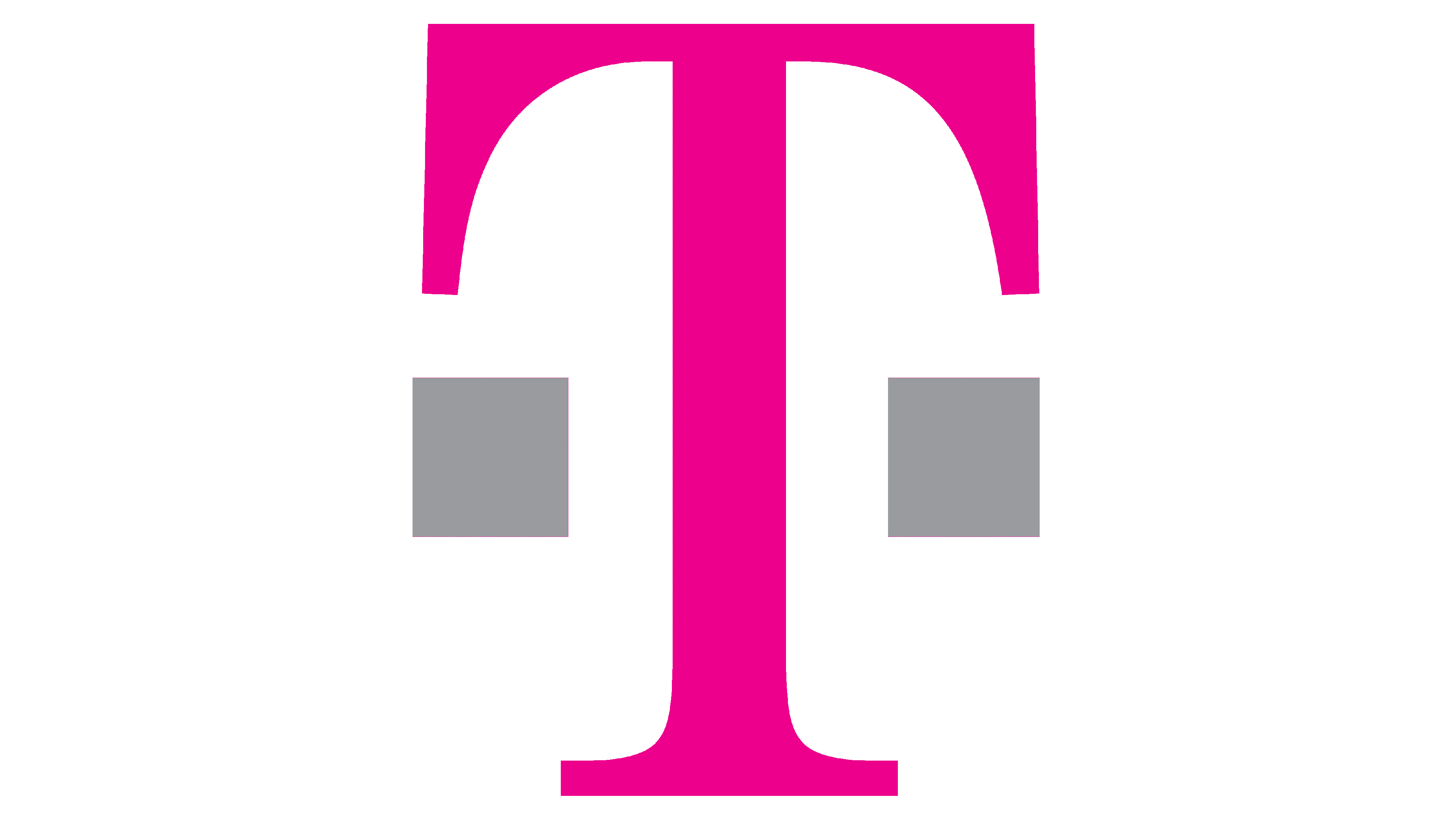
On the far left, it shows the letter ‘T’, the usual symbol for Telekom. It’s a generic capitalized serif letter with drooping tips. It’s colored a bright magenta. There are also small grey squares on each side of its central stem. Another such square is placed between this part and the word ‘Mobile’ on the far right.
That one follows the same style as the letter ‘T’ on the left, including proportions and the font. The only big difference is that it’s like grey. All the letters besides the ‘M’ are lowercase. There are two more squares on each side of the word, similar to how they’re positioned near the ‘T’. All these squares are supposed to represent wireless connection.
2013 – 2020
![]()
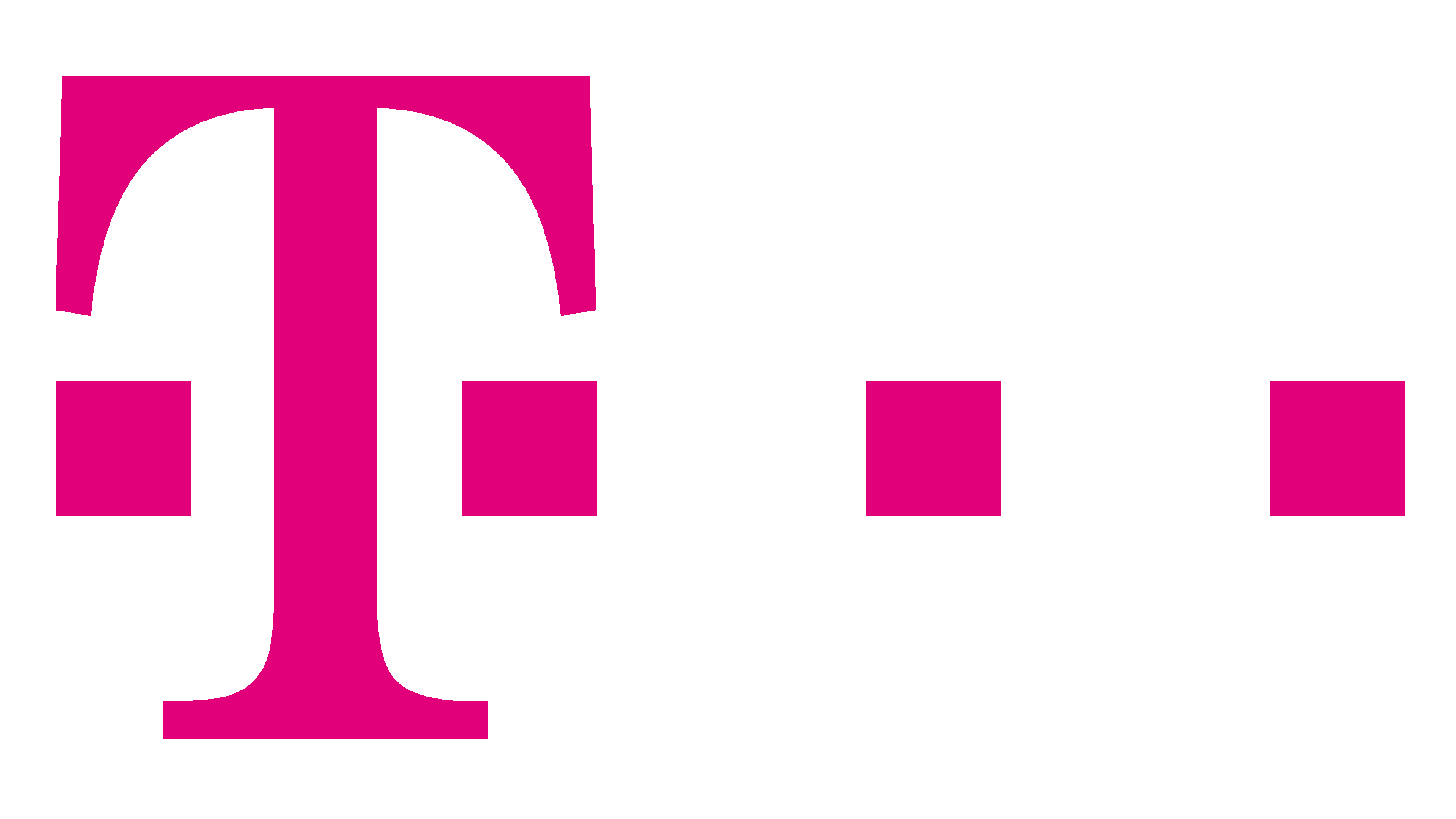
It’s largely the same logo, except everything in it was painted the same pinkish magenta as the letter ‘T’ in the previous design.
2020 – 2022
![]()
The 2020 redesign saw several key changes. Firstly, all those small squares are now gone, besides the two on each side of the letter ‘T’. Secondly, the color was tweaked to a slightly darker type of magenta. Lastly, both elements of the logotype are much closer together this time.
2022 – 2023
![]()
Compared to the 2020 design, this logotype is visibly bolder and uses a slightly darker shade of purple (once again). Beyond that, not much was altered.
2023 – now
![]()
The redesign of 2023 has followed the rename of the famous company into Odido. The new badge is based on a designer wordmark, drawn in stylized gradient letters. Each character on the logo is executed as a solid geometric figure, with the two letters “D”, set on the sides from the rectangular “I” — placed mirroring each other. The characters on the new badge are colored in gradients, switching from blue on the left to purple on the right, with the central elements featuring orange shades.
Color
The color palette of the Odido logo doesn’t remind of the T-Mobile era at all. The new badge featured smooth yet bright gradients of blue and green on the left, orange in the middle, and purple on the right.
Font
The Odido logo, introduced in 2023, is based on a stylized geometric lettering, which has no commercial analogs for its typeface. Each letter in the inscription is a solid figure — a circle, a rectangle, or a verticality-oriented half-circle, with no negative space inside.