Mario Kart, an iconic Nintendo franchise, is a racing game series that has enthralled players of all generations since its introduction in 1992. The game features Mario and his comrades participating in go-kart races filled with power-ups and obstacles.
Meaning and History
![]()
This beloved series has seen multiple iterations, offering new tracks, characters, and gameplay mechanics, ensuring its appeal to both casual and hardcore gamers. It has been available on various Nintendo consoles, from the Nintendo 64 to the Nintendo Switch, consistently delivering engaging multiplayer experiences that have become synonymous with Mario Kart.
Mario Kart’s enduring success extends beyond commercial achievements; it has also achieved cultural significance, with characters like Mario, Luigi, and Bowser becoming iconic figures in the gaming world. Its illustrious history is characterized by innovation and an unwavering commitment to providing players with unforgettable racing adventures.
What is Mario Cart?
Mario Cart is a game series developed by Nintendo mainly for their consoles. The game sets Mario and his comrades to participate in a go-kart competition, with each map filled with obstacles, bonus items, and power-ups. Users can play in co-op, solo, or online.
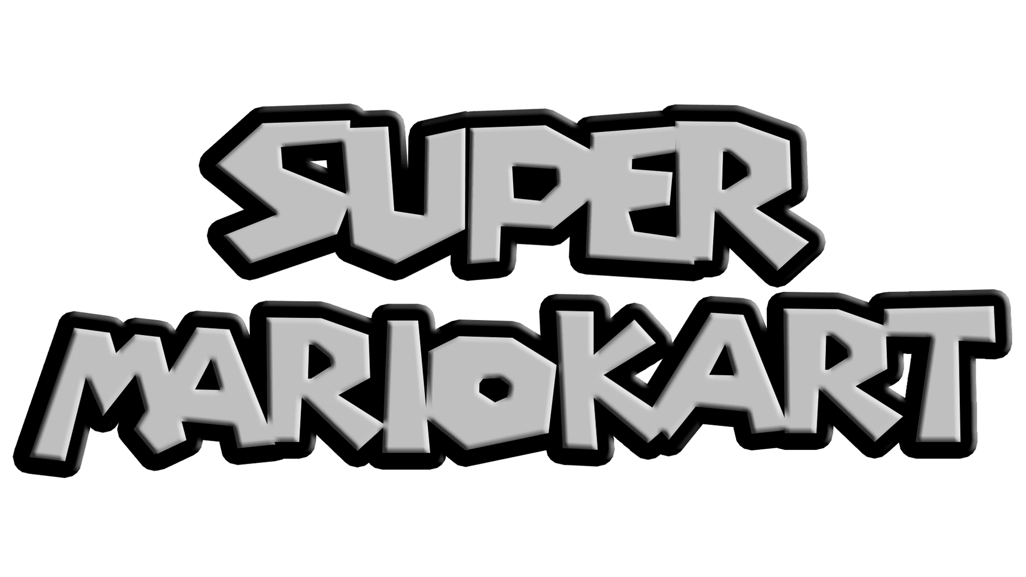
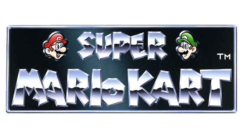
1992 – 1996
![]()
The ‘Super Mario Kart’ logo from these years features a three-dimensional, chrome-effect typography. ‘SUPER’ stands above ‘MARIO KART,’ both set in a dynamic, quirky font that suggests motion and speed. The metallic style, combined with drop shadows, gives the logo a sense of depth.
1996 – 2003
![]()
During this time, the ‘Mario Kart’ logo shines with a spectrum of colors across each letter, transitioning from green to yellow to orange, which stands out against the dark contouring. The font style hasn’t changed dramatically since the previous edition. Each character is still playful and bold, with sharp angles and black outlines that give a sense of bursting forward, mirroring the game’s lively and fast-paced nature.
2003 – 2005
![]()
For this game’s logo, the main title is infused with an intense orange and yellow gradient, reminiscent of speed and the rush of racing. The ‘Double Dash’ bloc below features sharp edges and a slanted orientation, enhancing the visual impact of the double exclamation points.
2005 – 2014
![]()
In this logo, ‘Mario Kart’ adopts a sophisticated, sleek silver font that reflects a modern and clean look. The letters have a glassy effect, with subtle blue highlights that suggest a refined, contemporary gaming experience, indicative of the franchise’s evolution in this period.
2013 – today
![]()
They’ve simplified the logo to a bold, white name against a stark black background. This minimalist design strips away embellishments, presenting a confident and iconic image. Its strong, unadorned typeface stands as a testament to the franchise’s status as a staple in gaming culture.
Font
The ‘Mario Kart’ series sees its fonts morph with each iteration. Starting with the 1992-1996 logo, the typeface has a metallic, three-dimensional quality, creating a sense of speed and volume. Sharp, angular lines contribute to the dynamic feel, capturing the essence of racing. Transitioning into the 1996-2003 period, the font takes on a lively character, with each letter bursting forward in a playful, colorful manner.
For ‘Double Dash!!’ from 2003-2005, the typographists have chosen a slanted stance, injecting a visual sense of the game’s increased intensity and action. The 2005-2014 logo smoothens into a sophisticated, mirrored font, reflecting the series’ technological advancements. Finally, the current logo opts for simplicity with a bold, sans-serif font.
Color
Regarding color, the early ‘Mario Kart’ logo is tinged with a cool, metallic gray, resonating with the era’s affinity for shiny, chrome-like graphics. As the franchise blossoms from 1996-2003, it dons a vibrant gradient, with colors flowing across the letters to mirror the game’s dynamic and inclusive play.
With the advent of ‘Double Dash!!’, the palette shifts to an intense combination of orange and yellow, echoing the game’s fiery excitement. The following period introduces a chrome effect, now with a hint of blue, suggesting sleekness and speed. In the latest design, the logo stands out in stark white against a black backdrop, a testament to the brand’s matured confidence and timeless appeal.