It is referred to the famous logo of the Korean TV series “Squid game”. This South Korean series from Netflix has been watched by over 142 million people.
What is the influence of the series as a marketing activity?
On the rise of the hype of the series, Netflix launched a line of products based on it together with Wallmart Online you can buy, for example, a T-shirt or a cap with the “Squid game” logo. Other brands also supported the wave, starting to use references to the series in social networks. Thus, Pepsi published cookies with its logo, and Domino’s Pizza in Malaysia leveraged a circle-triangle-square — three figures often found in the series.
Meaning and History
Employees with a mask, where a square is depicted, are considered the main, the highest level of the working hierarchy in the series. It is understandable, because this geometric figure means organization, punctuality, strict observance of rules, rationality, perseverance and firmness in decisions. All these qualities are inherent in people with leadership qualities. The sign of separate supremacy is often found in the logos of luxury brands: for example, Givenchy, Tommy Hilfiger.
Fans of the drama “Squid game” like to look for hidden meaning in each frame and think up various theories. Symbolism is one of the significant factors that has conquered cinema lovers all over the world. Here, any geometric figure carries a certain meaning. This trend concerns brands and their logos. That is why it is important to understand that any logo is primarily a simple form.
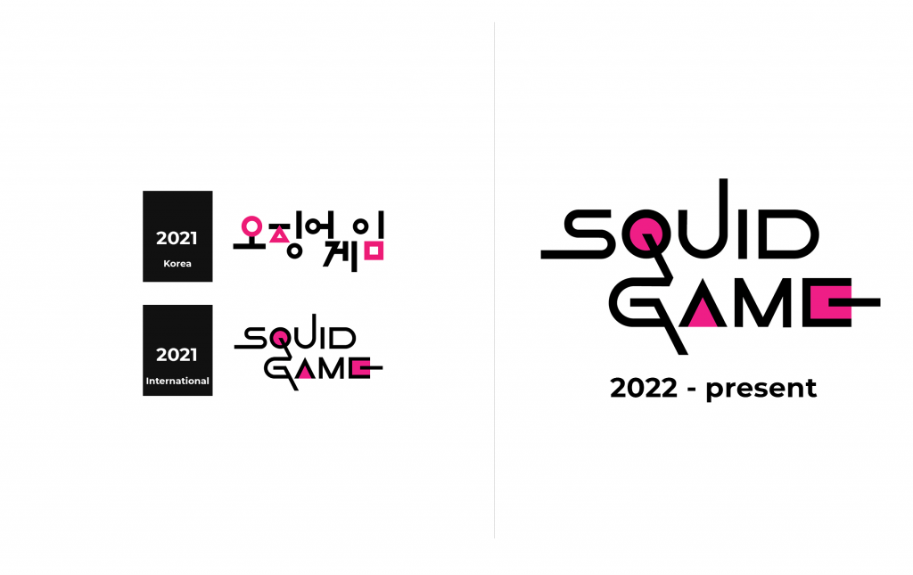
2021 (Korea)
The elements of the logo include 3 shapes: circle, triangle, square. They also mean the characters “ㅇ”, “ㅈ” and “ㅁ”, which were used in the Korean title of the series “오징어게임”. There is a deep meaning in geometric figures. All the staff in the game has a hierarchy:
- The circle means the workers. They do all the basic work, starting from cooking and ending with getting rid of the eliminated participants. That is, the shape with the least number of vertices means the lowest rank.
- Triangle means soldiers. Unlike the workers, they are armed. Their main task is to keep order.
- The square is the figure with the largest number of vertices, which represents the guards with the highest rank. They can be called the heads of the rest of the staff.
A circle is the personification of caring, a propensity for social work. That is why circles perform the functions of cleaning and cooking in the “Squid game”. Circles have weak political power, which means that the circle cannot control others and is considered the lowest step in the hierarchy of the series. A circle can also be called a feminine and maternal sign, which is why in the field of children’s goods, we most often see round or oval logos.
The triangle is considered a symbol of the hierarchy of the world. Thus, the triangle recognizes that in the world, and in our case in the game, there must be a clear hierarchy, where everything is subordinate to something of a higher rank.
The triangle represents ambition, which often becomes an element of speculation with young soldiers. The triangle denotes the ability to stand firmly in place, fight back, and push away any difficulties. This figure symbolizes the fixation on victory, pragmatism, self-confidence, determination, courage and is associated with military fortitude. It will be difficult to meet logos of triangular shape, for example, in the field of nutrition.
2021 (International)
Font and Color
The logo has pink, white and black colors. Black and white have the function of creating shades and background to highlight the pink color. Pink is one of the main colors of the series and of the logo. The theme music dedicated to the warders is called “Pink Soldiers”. The pink color itself is associated with the system (wardens).


