Spotify offers its users an opportunity to listen online to tracks from a huge music catalog, which includes a lot of albums that are not available on other platforms. The main advantage of Spotify is its music selection algorithms, which are tailored to listeners’ tastes.
Meaning and history
Spotify is a digital music streaming service that gives you access to millions of songs, podcasts, and videos from artists around the world. The service was introduced in 2008. Over the years, it has undergone a lot of changes and has gained more than 450 million users.
Spotify came about through the efforts of Daniel Ek and Martin Laurentsson. Both were millionaires by the time of its launch. Eck and Laurentson were inspired by the example of Napster: launched in 1999, the service allowed quick and easy sharing of tracks and quickly became popular. Spotify launched in October 2008 in eight European countries. A year later, the service gained its first million subscribers, and three years later it was launched in the United States.
The main features of all streaming services came early to Spotify – curated selections, radio by track, custom playlists, and podcasts.
All in all, it’s the largest library of audio content, with over 80 million tracks and 5 million podcasts already available. It’s impossible not to find what you want on Spotify.
What is Spotify?
Spotify is a Swedish music service available in almost 120 countries. Its catalog contains more than 50 million songs and 4 billion playlists with tracks by Russian and international artists. The service can be used on the web, desktops, mobile devices, game consoles, TVs, and stereos.
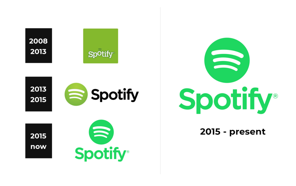
In terms of visual identity, Spotify has been loyal to its green color palette, adopted with the first logo, created in 2008. But over the years the badge of the service has become brighter and more modern, reflecting the ability of the platform to change, develop and grow.
2008 — 2013
The original Spotify logo, introduced in 2008, featured an outlined white lettering set against a solid green square. The shade of green was quite bright yet smooth and calming. The serif characters of the wordmark were set in one horizontal line, with just the “O” jumping a bit higher. This letter was also decorated by three arched dark-green lines above it, standing for the sound and connection, and being the basis for the graphical icon of the application.
2013 — 2015
The redesign of 2013 has modernized the Spotify logo, keeping it recognizable. It was the same shade of green, used in the previous version, but the color palette got extended to green, white and black, where black was for the wordmark, set in a modern geometric serif font on the right from a minimalistic emblem. The new emblem depicted three white arched lines on a gradient green roundel. Both elements were placed on a plain white background.
2015 — Today
In 2015 the Spotify logo got even more laconic, with the new intense shade of green used for both the emblem and the lettering. The design concept remained the same, but all gradients were removed from the graphical part, and the characters of the inscription started looking more modern, even though the designers kept the font, used in the version from 2013.
Font and color
The bold title case lettering from the primary logo of the Spotify service is set in a modern geometric typeface, which looks very simple yet confident and stylish. The closest fonts to the one, used in this insignia, are, probably, Kaleko 105 Bold, or FF Neuwelt Bold, with some minor modifications.
As for the color palette of Spotify’s visual identity, it is based on an intense acid shade of green, which looks progressive and vibrant, representing the service as an innovative, energetic, and actual one.


