Snapchat’s main feature is a self-destructive photo or video messages. Messages that disappear after 10 seconds created a new culture of communication – more sincere, real, and liberated. Drunk selfies, intimate photos, and secret pictures will disappear and remain only in the memory of the viewer and not on the internet, where uploaded content is usually left forever. Snaps in history (your public snaps) live a day, and you can review them during this period as much as you like. You can add text to the photo, draw a pattern with your finger or apply a sticker or filter over the image. This works with the video too.
Meaning and History
This unpretentious application with the fastest-growing audience was created in 2011 by two American students and was conceived as a new social network. According to TechCrunch, by 2014, 23 investors invested almost $500 million in this application. A Business Insider reports that 2015 company profit amounted to $100 million. In January 2015, Snapchat introduced a service that allows one to view the stories of popular media companies.
What is Snapchat?
Shoot a ten-second video or take a photo, put a funny mask or lens on it, add text, and funny stickers, or finish something with your hand, and send this message to friends instead of a regular text – this is what Snapchat is all about. It does not end there as you can message your friends back and forth, send them a photo from the gallery and even make a call.
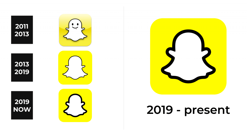
2011 – 2013
The logo looks happy and funny thanks to the yellow color and a smiling ghost character. The square background with rounded was done in yellow gradient with a darker line curving around the midline. As for the ghost, it was white with a thin black outline and a shadow. The most interesting part was its expression with a tongue slightly sticking out, which created a playful and user-friendly atmosphere. The ghost image was not chosen by chance. It was meant to represent the key feature of the service, which was disappearing messages. There were no inscriptions, but a successful logo design quickly got associated with the service.
2013 – 2019
The redesigned logo had a more minimalistic look with no facial features or a gradient in the background. Nonetheless, there was no doubt what the white shape represented. The shapes of the base and the ghost stayed the same, but there was no shadow behind the whimsical character.
2019 – Today
Another update was done in 2019. Although no major changes were done, a significantly thicker line of the ghost outline created a more serious and bold look. It reflected a strong position of the service and the confidence of the users that they are looking at a reliable platform.
Font and Color
The yellow color of the emblem sets a cheerful and energetic mood that brings happiness and optimism. It also inspires the users to be creative and come up with the most surprising and unexpected photo and video messages. There was also a white, which creates a balance, promotes open-mindedness, and makes others feel good. Snapchat has no inscriptions in its logos.


