According to a Monmouth University survey, Skittles is among America’s favorite Halloween candies. Skittles is a world-famous brand of chewable candies with a bright design and fruity taste. Skittles were first introduced to the market in 1974 by a British company and introduced to North America in 1979.
The candy brand is currently manufactured by Wrigley, a subsidiary of Mars, Incorporated. Wrigley was acquired by Mars in 2008 for $23 billion.
What is a curious fact about Skittles?
The Skittles shape is a much reduced version of the disc-shaped object used in the game called “Skittles”. This game has been played in England, Wales, Scotland and other European countries for several centuries. The rules are very similar to bowling. You need to throw a rubber or wooden sphere for 9 pins. They are often played outdoors or in pubs.
Thus, although Skittles and pubs are not particularly compatible, it is obvious that their shape and name were inspired by the game.
Meaning and History
The slogan “Rainbow Taste” appeared in 1982. At the same time, they made a completely new logo with a bold 3D font and a rainbow in the background.
The idea of a distinctive multicolored symbol and most of its variations belong to the advertising agency D’Arcy Masius Benton & Bowles. The slogan and logo were so successful that Skittles collaborated with the studio for another 20 years. However, when D’Arcy Masius Benton & Bowles was bought by Publicis and ceased to exist, Skittles had to look for another firm. For about a year they worked with BBDO Worldwide in New York, the part of the Omnicom Group.
Skittles then commissioned TBWA/Chiat/Day in New York to create a brand new advertising campaign, for which the brand paid about $20 million.
1974 – 1981
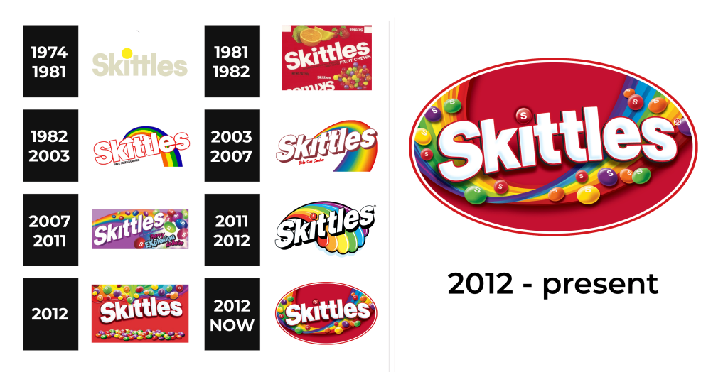
The Skittles logo features the brand name in a bold, beige, sans-serif font with a slightly rounded, chunky style, exuding a playful and approachable vibe against a white background. A single, vibrant yellow Skittle candy dots the top center, adding a pop of color that hints at the candy’s fruity essence and draws the eye with its simplicity.
1981 – 1982
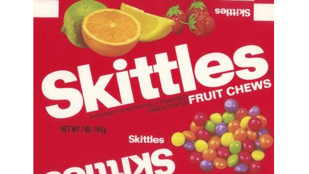
The Skittles logo on this packaging features the brand name “Skittles” in a bold, white, sans-serif font with a slight italic slant, prominently displayed across a vibrant red background that pops with energy. The design is flanked by colorful fruit illustrations—lime, orange, lemon, and strawberry—above the text, while a cluster of multicolored Skittles candies at the bottom adds a playful, tactile element.
1982 – 2003
The Skittles logo showcases the brand name “Skittles” in a bold, white, sans-serif font with a red outline, curving playfully across a white background. Above the text, a vibrant rainbow with a small cloud at its base arches gracefully, its multicolored stripes of red, orange, yellow, green, and blue reflecting the candy’s diverse flavors. Below, the phrase “BITE SIZE CANDIES” in smaller black text adds a subtle nod to the product, creating a unique, rainbow-infused design that celebrates the brand’s colorful identity.
2003 – 2007
The Skittles logo features the brand name “Skittles” in a bold, white, three-dimensional font with a red outline, giving it a striking, raised effect against a simple white background that enhances its vibrancy. A colorful rainbow, with smooth gradients of red, orange, yellow, green, and blue, arches gracefully above the text, symbolizing the candy’s diverse flavors with a whimsical touch. Below, the phrase “Bite Size Candies” in smaller red text adds a playful detail, creating a unique, candy-coated celebration of color and fun.
2007 – 2011
The Skittles logo showcases the brand name “Skittles” in a bold, white, three-dimensional font with a dark purple outline, set against a vibrant purple background that exudes a burst of fruity excitement. A colorful rainbow arches above the text, adorned with Skittles candies in various hues, while the phrase “Berry Explosion” in playful pink and purple lettering below adds a dynamic flavor twist.
2011 – 2012
The 2011 Skittles logo features the brand name “Skittles” in a bold, white, three-dimensional font with a black outline, creating a striking, raised effect against a deep green background. A vibrant rainbow, composed of red, orange, yellow, green, blue, and purple hues, arches above the text with a single red Skittle perched at its peak and a multicolored cloud-like cluster at its base, embodying the candy’s “taste the rainbow” slogan. This design, with its playful yet sleek composition, uniquely captures the brand’s colorful and whimsical identity during that era.
2012
The 2012 Skittles logo features bold, white, slightly italicized lettering with a thick red outline, set against a vibrant red background. Surrounding the text, colorful Skittles candies scatter in a dynamic explosion, accompanied by a rainbow trail that reinforces the brand’s iconic “Taste the Rainbow” slogan.
2012 – now
The Skittles logo showcases bold, white, 3D-styled lettering with a slight drop shadow, making it pop against a vivid red background. A dynamic rainbow swoops across the design, with colorful Skittles candies scattered along its path, reinforcing the brand’s signature “Taste the Rainbow” theme. The entire composition exudes excitement and playfulness, emphasizing the candy’s fun, fruity appeal.
Font and Logo
Just as forever as the candy itself, Skittles has been using Helvetica Black as the main font for quite some time. Since the label’s font has changed a lot, others may not have noticed that it’s Helvetica Black. However, this is just one of the facts about Skittles that may surprise you.
The font has a red candy instead of a dot above the letter “i”.
The logo palette is dominated by two colors: red and white. The name Skittles is highlighted in bold and white font to attract the attention of consumers.