Siemens Logo
Tags: electrical equipment | electronics | energy systems | Germany
Siemens is an 1847-founded technological business headquartered in Germany. It specializes in medical equipment, power machinery, electronics, and mechanics. They’re also developing projects in the fields of IT, transport, education, etc. The company’s production is considered worldwide due to its quality and simplicity.
Meaning and History
![]()
The emblem of Siemens has undergone multiple transformations throughout its extensive history, mirroring the brand’s evolution and its intrinsic values. Its inaugural creation dates back to 1899, serving as a foundation upon which successive iterations have been built, all the while upholding an essence of minimalistic and contemporary design.
Over time, each logo iteration was meticulously crafted in alignment with prevailing fashion trends of its respective era and in response to the dynamic shifts occurring within the organization itself.
What is Siemens?
Hailing from Germany, Siemens is a global entity renowned for its diverse range of offerings encompassing electronics, medical technologies, transportation solutions, energy systems, and electrical equipment. The company’s headquarters are located in Berlin and Munich.
1847 – 1899
![]()
At the very beginning, the company called itself Telegraphen-Bauanstalt von Siemens & Halske, and bore a logo in the form of a monogram. It included the capitalized symbols ‘H’ and ‘S’, whereas the former had its sidebars turned diagonally. The ‘S’ was laid over ‘H’, and had a simple design.
During the same period, signage was used with the title written in a variety of typographic styles incorporating some common elements: serifs, thickness, capitalized appearance, and numerous curlicues. The entire sign was surrounded by multiple strokes.
1899 – 1973
![]()
At the end of the 19th century, a new logotype emerged to depict a refreshed monogram. The character ‘S’, became the the largest element, and it was crossed by a diagonally oriented ‘H’.
1925 – 1936
![]()
In the 1920s and 1930s, this sign was placed in a circular frame.
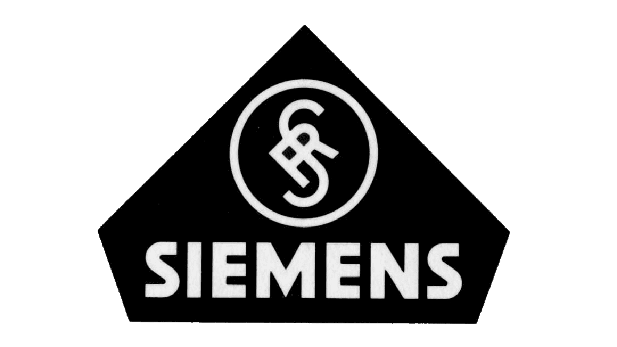
1928 – 1936
![]()
The year 1928 saw a new reinvention. The monogram inside a circle was placed in a larger figure with a peaked top. The emblem was put above a capitalized sans-serif wordmark, ‘Siemens’.
1936 – 1973
![]()
In 1936, Siemens purchased an advertising division, a significant milestone in its corporate journey. At the management of this division was Hans Wilhelm Karl Gustav Domizlaff, an influential figure who advocated for the adoption of a uniform Siemens trademark across all departments, culminating in the conception of a fresh logo design.
This transformative design decision encompassed the removal of the circle and pentagon elements, leaving behind solely the ‘SH’ monogram and accompanying lettering. Additionally, the marketer selected a new font, opting for thinner and smoother lines to enhance the logo’s visual finesse.
1936 – 1991
![]()
Along with the logotype, which includes both an emblem and wordmark, the company introduced a name-only version.
1991 – today
![]()
The logo underwent a refined transformation in 1991, building upon the design introduced in 1936. This iteration focused on enhancing the logo’s aesthetic clarity by streamlining its lines and bolstering its visual impact.
Font

The revamped rendition of the logo features a wordmark crafted in a contemporary and simple serif-free typeface.
Color
The logo offers three distinct options. The primary hue, a delicate and serene green, serves as the brand’s hallmark color, reflecting dependability, tranquility, and assurance. To complement this, a subdued light gray shade is used, symbolizing confidence and gravitas. Finally, the inclusion of black underscores power and refinement, featuring the brand’s authority and elegance.