Shopee is a prominent marketplace popular in Eastern and Southeastern Asia. It emerged into the digital landscape in 2015, thanks to Singaporean businessman Forrest Li. At its core, the platform is straightforward – a dynamic digital marketplace letting individuals from diverse nations, both within and outside of Asia take part in the seamless exchange of goods and services.
Meaning and History
![]()
In 2015, businessman Forrest Li laid the foundation for Shopee, a digital commercial marketplace that swiftly rose to prominence within Southeast Asia. Shopee garnered acclaim for its customer-friendly and intuitive design, facilitating seamless navigation and enhancing the overall shopping experience.
Offering an extensive spectrum of goods, Shopee catered to diverse consumer needs, contributing to its rapid growth.
Shopee’s remarkable journey witnessed notable milestones, such as surpassing 200 million downloads in 2019 and claiming the title of the top 1 installed shopping software in Southeast Asia and Taiwan.
One of its groundbreaking innovations was the introduction of “Shopee Live,” a pioneering feature that revolutionized online shopping. Through real-time broadcasting, merchants had the opportunity to demonstrate their products in real-time, engaging with customers and fostering a dynamic experience.
What is Shopee?
Shopee is a Singaporean marketplace where individuals and businesses can sell or buy goods. Its target market is South and Southeastern Asia, although the app is available globally. Since its launch in 2015, the service has invited 200 million users to use it.
2015 – 2019
![]()
The original Shopee brand mark depicted a blend of two distinct components — an image and the platform’s title positioned alongside it. The emblem took the form of a sleek silhouette representing a shopper enveloped entirely in orange. Within the bag’s center, a white uppercase “S” served as a focal point.
The marketplace’s title was written in a similar script to the prominent “S” on the bag. A harmonious combination of both lowercase and title case notes formed visual continuity.
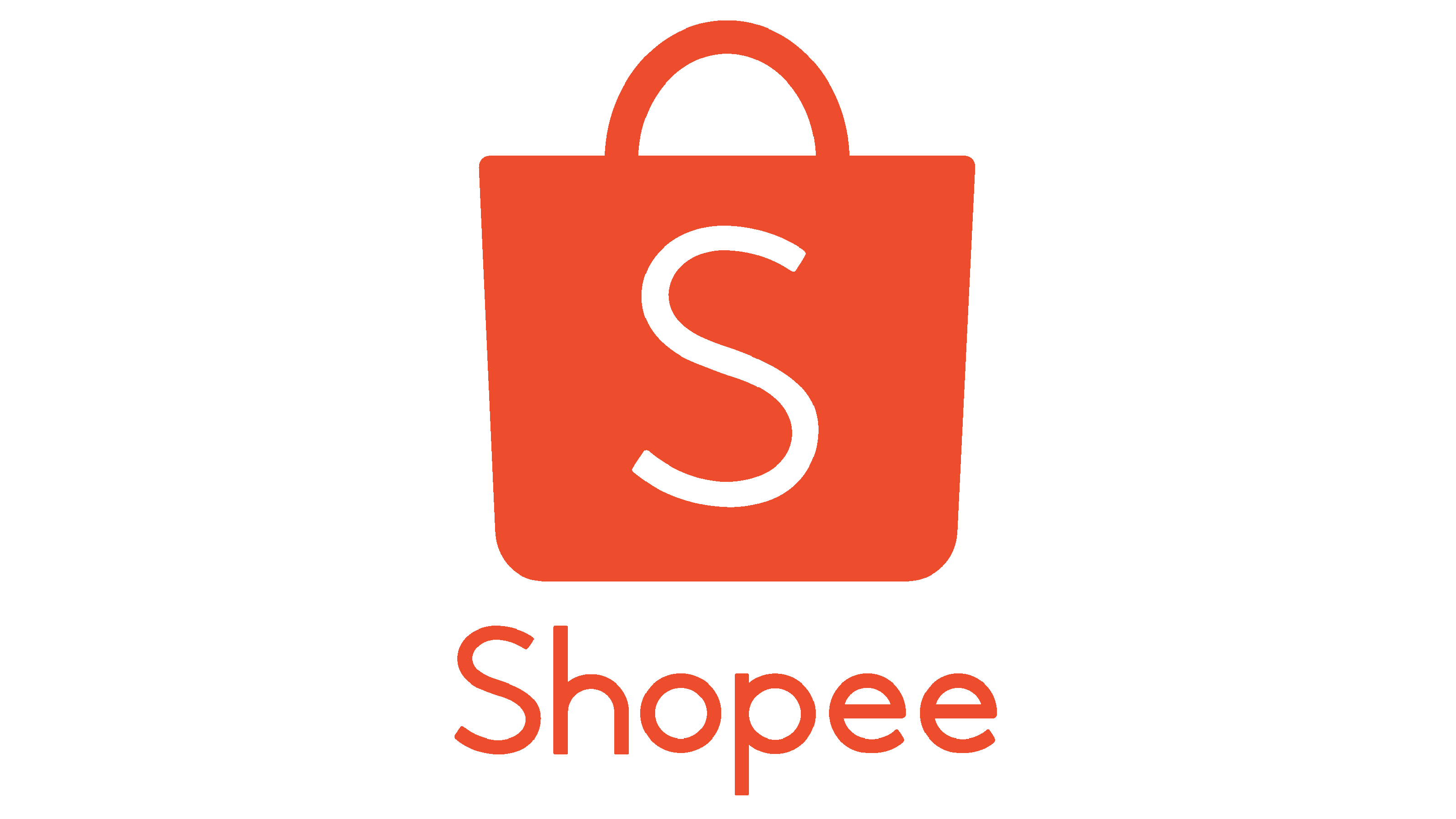
2019 – today
![]()
In 2019, the company rearranged its visual identity. The modification touches on the coloring, shifted from light orange to red, and the nameplate. It is shifted below the bag’s silhouette. Additionally, proportions were altered, and the emblem became considerably larger, while the writing got smaller comparably.
Color
The marketplace’s color code consists of a bit of pale red plus white, whereas white stands for the character ‘s’ on the shopper.
Font

The typography style of Shopee features clean and legible characters without serifs. Such a simple typeface is perfect for a digital platform run on different devices and screens.