OpenSea is a trading platform for non—interchangeable tokens. It was founded on December 20, 2017 by Devin Feather and Alex Atallah in New York. This is a platform for trading non-interchangeable tokens (NFT). The OpenSea platform allows you to sell, buy and create your own NFT tokens. They have disassembled the OpenSea tools and prepared instructions for working with the marketplace.
What is the main thing you should know about OpenSea?
The platform operates according to the principles of a decentralized community: cryptocurrency wallets, addresses and assets are controlled by the users themselves. The marketplace protocol supports the Ethereum, Polygon and Klaytn Blockchain.
Meaning and History
In the world of cryptocurrencies, the brand solves “a lot”. A brand is a promise, a mental image in the minds of the mass of people about a particular product, expressed in the information field through a name, an image, a system of symbols bearing a specific meaning. Being located in the financial segment requires high quality standards for products from brands.
Open Sea responsibly approached the choice of an image for the logo. The logo depicts a peacefully sailing ship on the waves of a calm ocean. This is an image of tranquility, reliability, new horizons, grandiose opportunities.
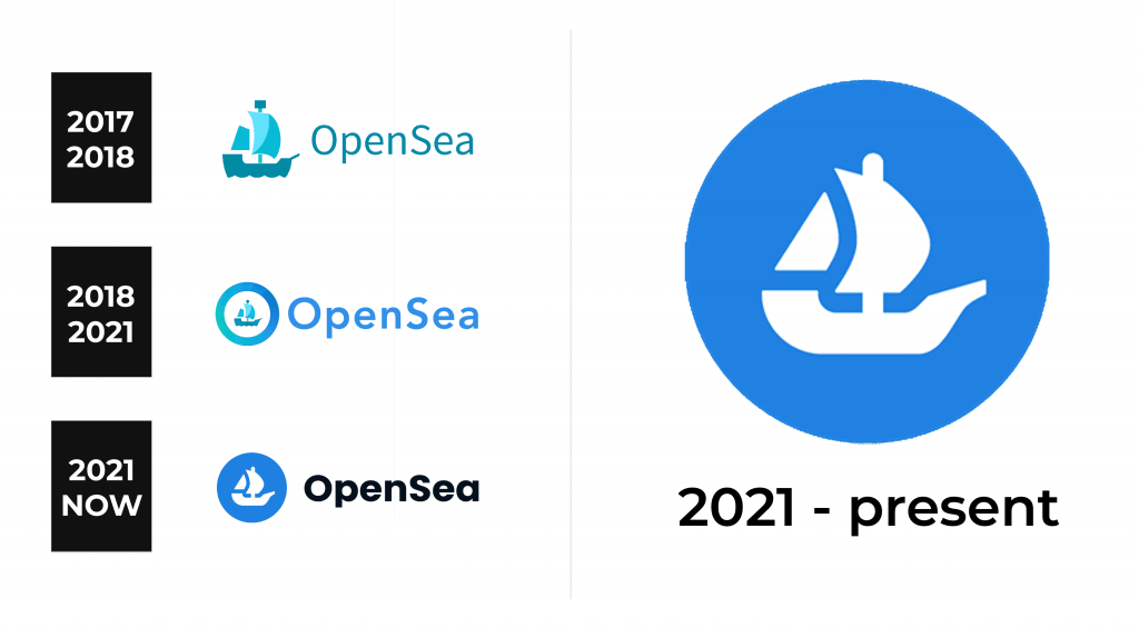
2017 – 2018
The original logo of the company has been well-designed. The company came up with a great symbolism for its visual identity. The logo consisted of a ship with sails and an inscription to the right of it. OpenSea is printed using a fine, sans-serif font that resembles Kareemah Medium by Sea Types. The whole emblem is done in light blue and turquoise. This color palette is well-balanced. Thanks to the blend of three colors, turquoise possesses the feeling of new growth that is typically associated with green and embodies the positive energy and creativity of yellow. It is much calmer than traditional blue used in the financial sector, but at the same time, it encourages honesty and transparency.
2018 – 2021
A few modifications were introduced a year later. First, the ship was made smaller and placed into a round frame. The latter featured a blue and turquoise gradient and symbolized wholeness, perfection, and timelessness. The name now featured a bolder font, closer to Avenir Pro 85 Heavy by Linotype, and a sky blue color, which is also seen in the round border to the left.
2021 – now
As the company advanced and changed, so did its logo. The designers decided to go for a more traditional color palette using blue, white, and black. The first color was used to create a solid round base for a ship. The latter was now a solid white and had a slightly different shape, primarily a clean bottom instead of wavy. They used the black to write OpenSea. The font was also updated and looked more like ITC Avant Garde Gothic Paneuropean Bold. The change consisted mainly of thicker strokes and straight cuts instead of diagonal. Despite modifications, the logo preserved its identity, but it was no longer as unique.
Font and Color
The OpenSea logo uses the color of purity, sky and ocean. There are three color options for the Open Sea logo:
- Blue logomark
- White logomark
- Transparent logomark
The main color of the logo palette is blue. At the same time, it is possible to use several variants of the blue, namely:
- Dark Sea
- Sea Blue
- Marine Blue
- Aqua
- Fog
The meaning of the blue color: strength, importance, peace, intelligence. This color is also associated with success, peace and security, confidence, power.


